AI & software · Brand identity, product, web
Brand identity for AI companies.
Most AI products do something nobody can watch happen: they read a document, compare options, sort out what matters and suggest the next step. The brand has to make that visible in a few seconds, on a landing page or in a demo, and still sit calmly next to a hundred other launches. So I start with what the product does for one person on an ordinary day, and the mark grows out of that.
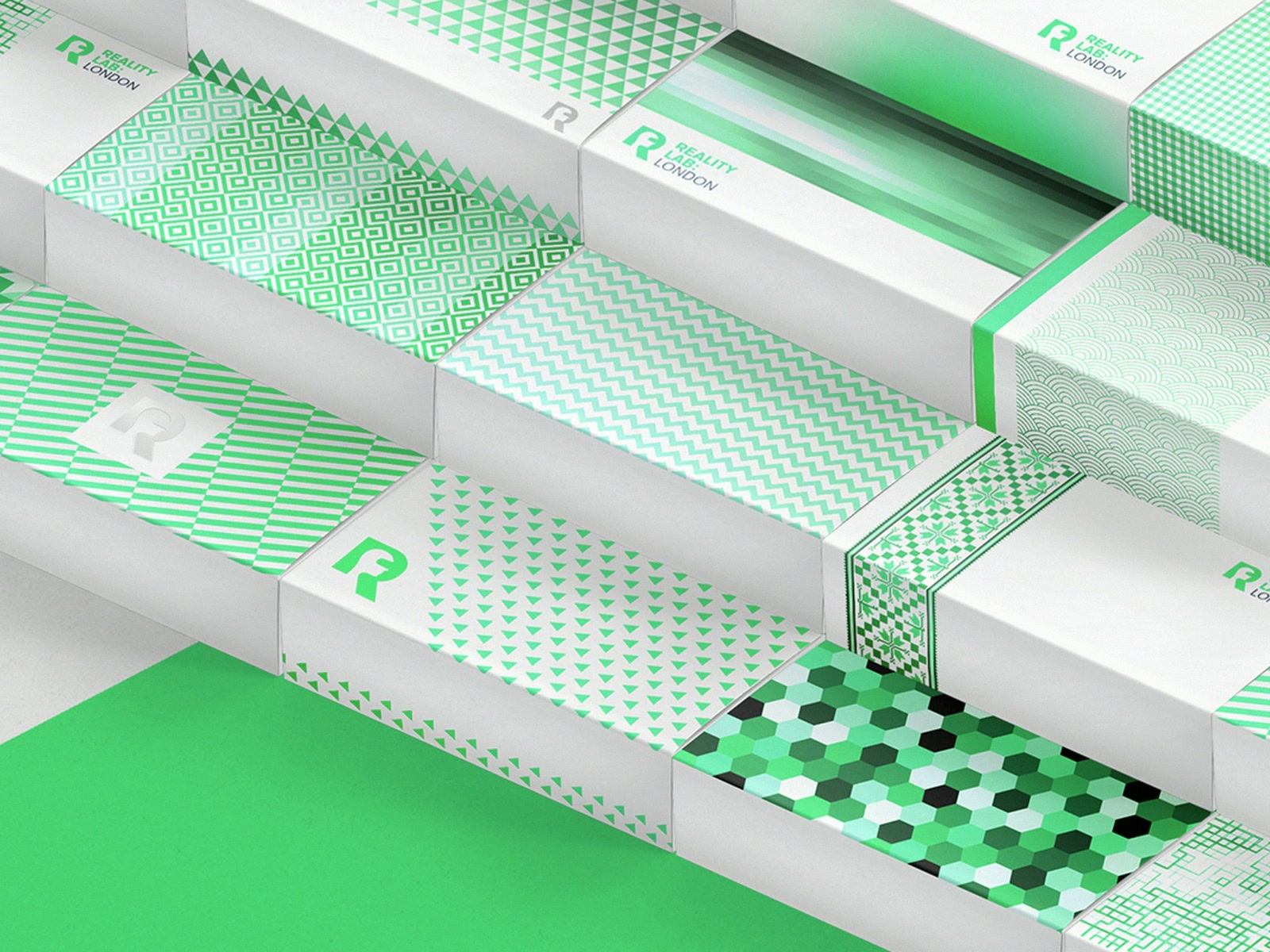
Two identities so far: PRORS, for a tool that spots shipments that may need another route, and Form Rooster, for an accounting app that reads receipts for freelancers. Earlier: an app concept called Sphere and the identity of Reality Lab London, a virtual reality studio.
What matters here.
01Draw what the product does
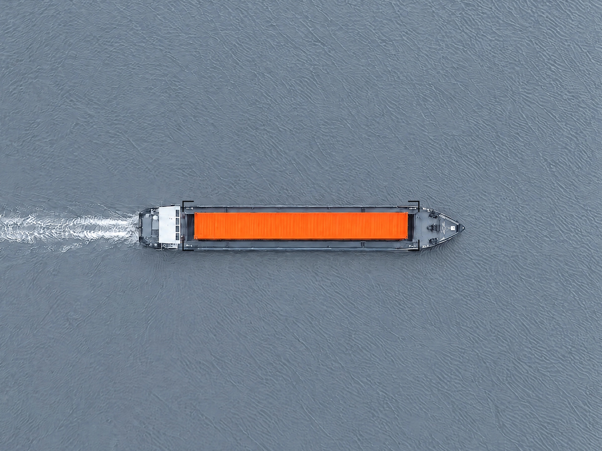
PRORS finds the one shipment among thousands that needs a second look. The whole identity rests on that: a frame moves across the containers and settles on one orange square. A buyer recognises their own problem in it before reading a word.
Designed for sixteen pixels
An AI tool is met in a browser tab, an app icon or a notification in the team chat far more often than on a poster. Form Rooster's rooster is two bends and a dot on a measured grid, so it holds up at that size and keeps its character.
The interface is part of the brand
Whether someone trusts an AI tool depends on what it shows them: plain labels, few colours, an answer they can check. I carry the identity into the first screens, with one typeface and words that say what has happened.
Ready for the demo and the deck
Investors and first customers usually meet the product in a demo or a pitch. The handover includes the deck, the landing page, social templates and a short animation of the mark, so those first meetings already look finished.
Work for AI and software.
02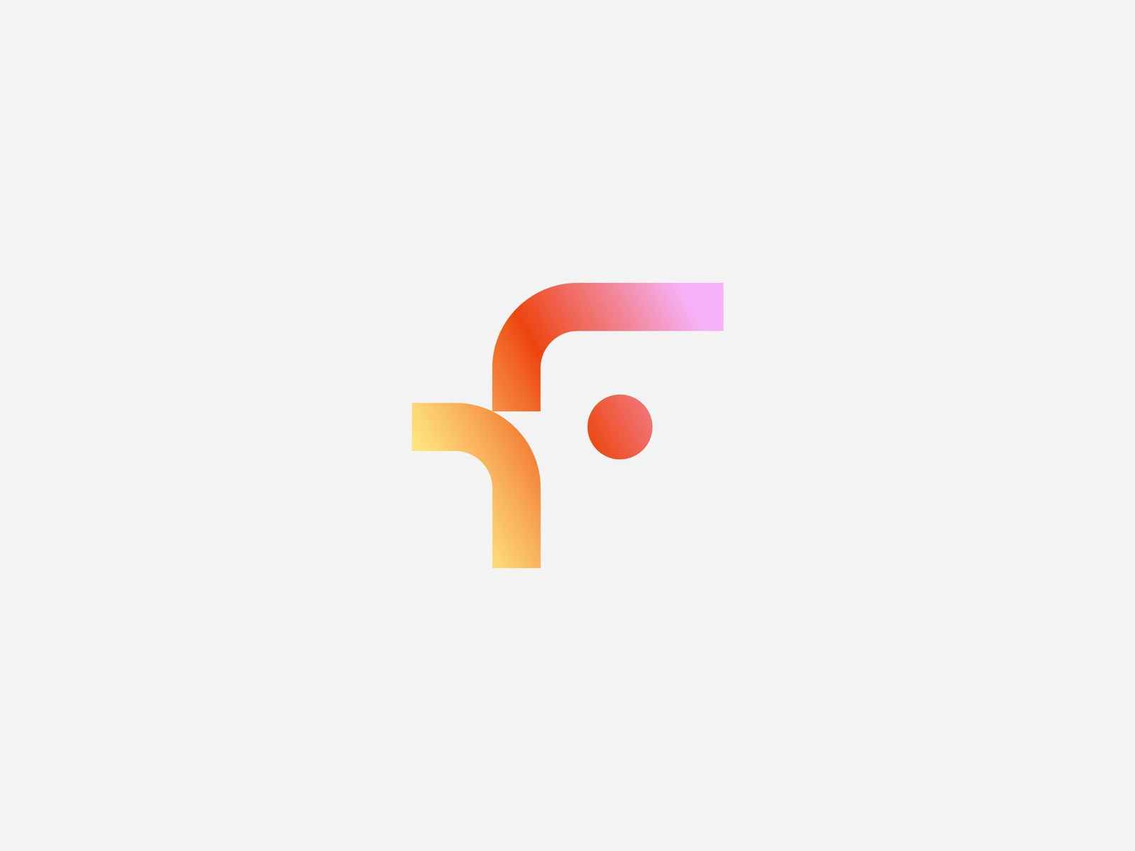
Questions.
03We have a working demo and no brand yet. Where do we start?
With the name, the mark and the colours, then the landing page and the deck. That is enough for the next three months; the rest follows once the product settles.
Every AI brand seems to use the same purple gradient. How do we look different?
By building on the one thing your product does better than the others. PRORS works with steel greys and a single orange square, Form Rooster with one gradient used sparingly. Each palette came out of its product's own story.
Can you design how the product shows its answers?
Yes, and that is often where the identity matters most. I design the first screens, the components for results and warnings, and the app icon, then hand the system over to your designers or stay on retainer.
Our product changes every month. Will the identity keep up?
It is built on the name, the type and a small set of shapes, so new features fit in without a redesign. PRORS uses the same square for a search, a selection and a change of route.
What does it cost?
After the first call you get a fixed quote for the scope we agree on. No price list, and no surprises on the invoice.
How long does it take?
First concepts within a week, the full identity in three to five weeks in most cases. If there is a launch or a funding round coming, give me the date and the plan starts from there.
Building an AI product? Write to me.
Two sentences are enough: what it is and by when. The rest comes out in the conversation.
Also for Food & drink · Dental practices · Sport · Architecture & construction · Startups & tech
Services Logo & brand identity · Web design & development · Motion design · Packaging design · Social media design · Brand strategy