Form Rooster
A rooster made of two bends and a dot, for accounting software built for freelancers.
2026
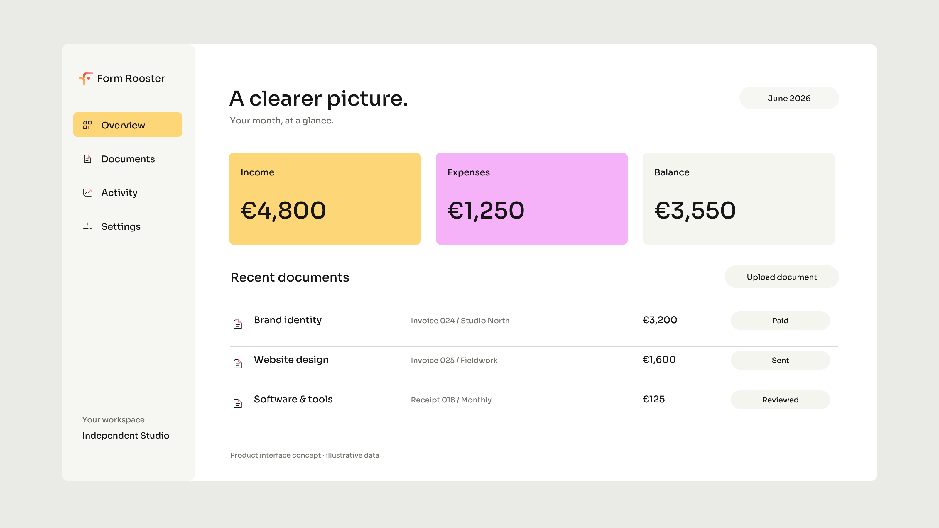
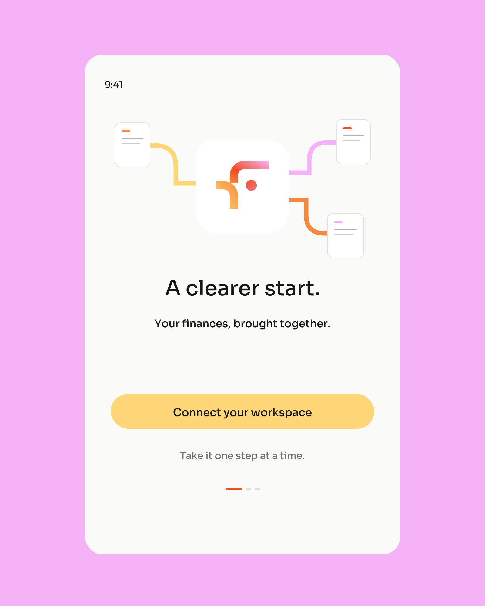
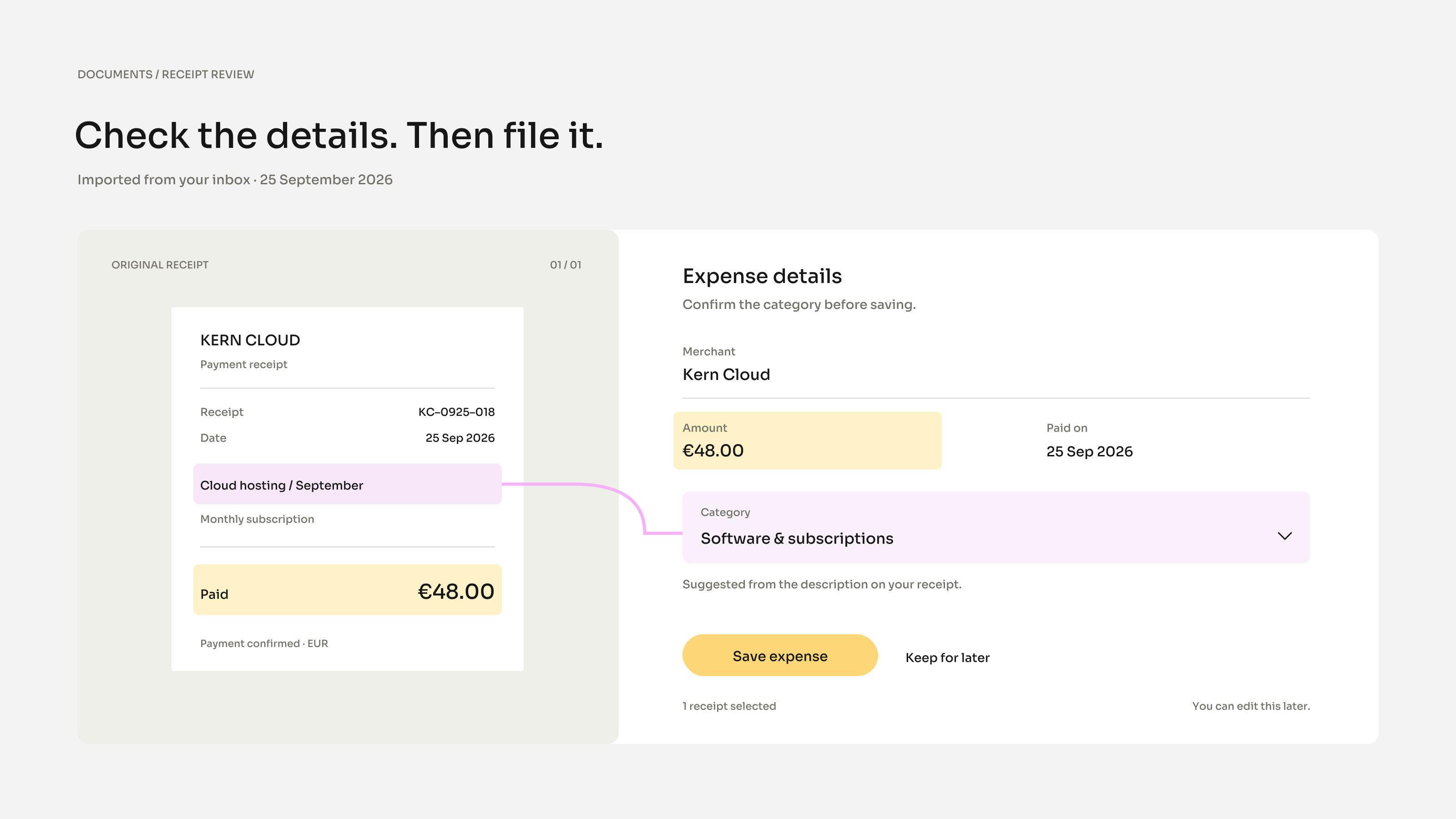
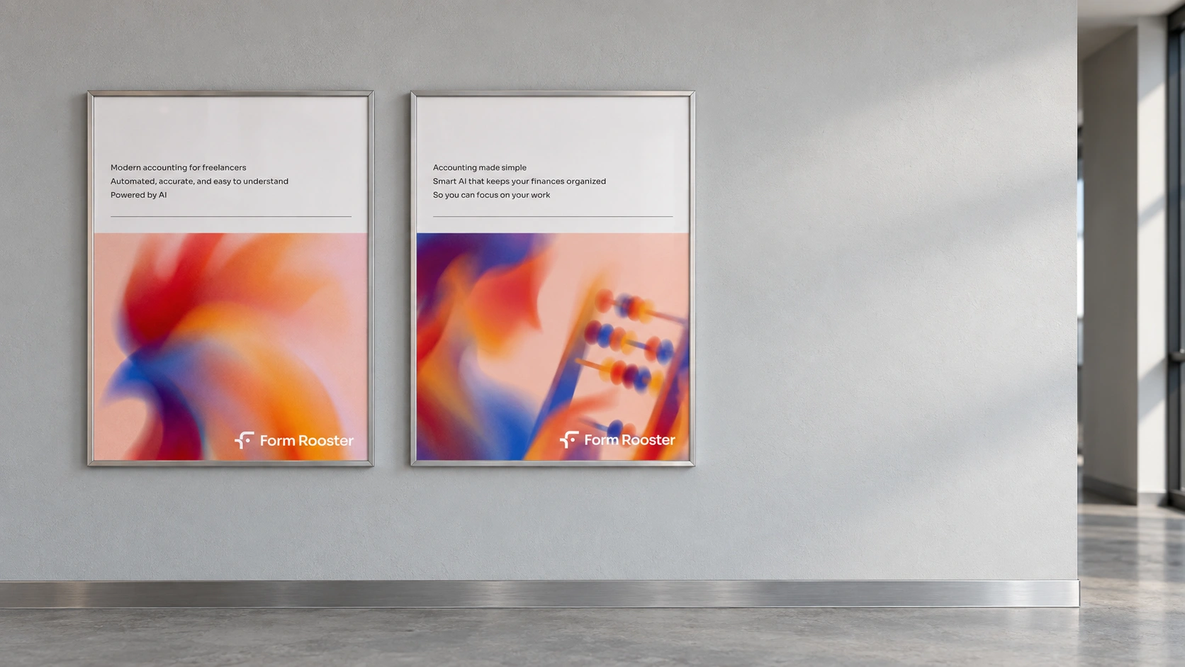
Form Rooster is an accounting app for freelancers: you photograph a receipt, it reads what it was and where it belongs, and you confirm it. This is the part of the month everybody puts off, so the identity had to make it feel like less of a chore without turning finance into a party.
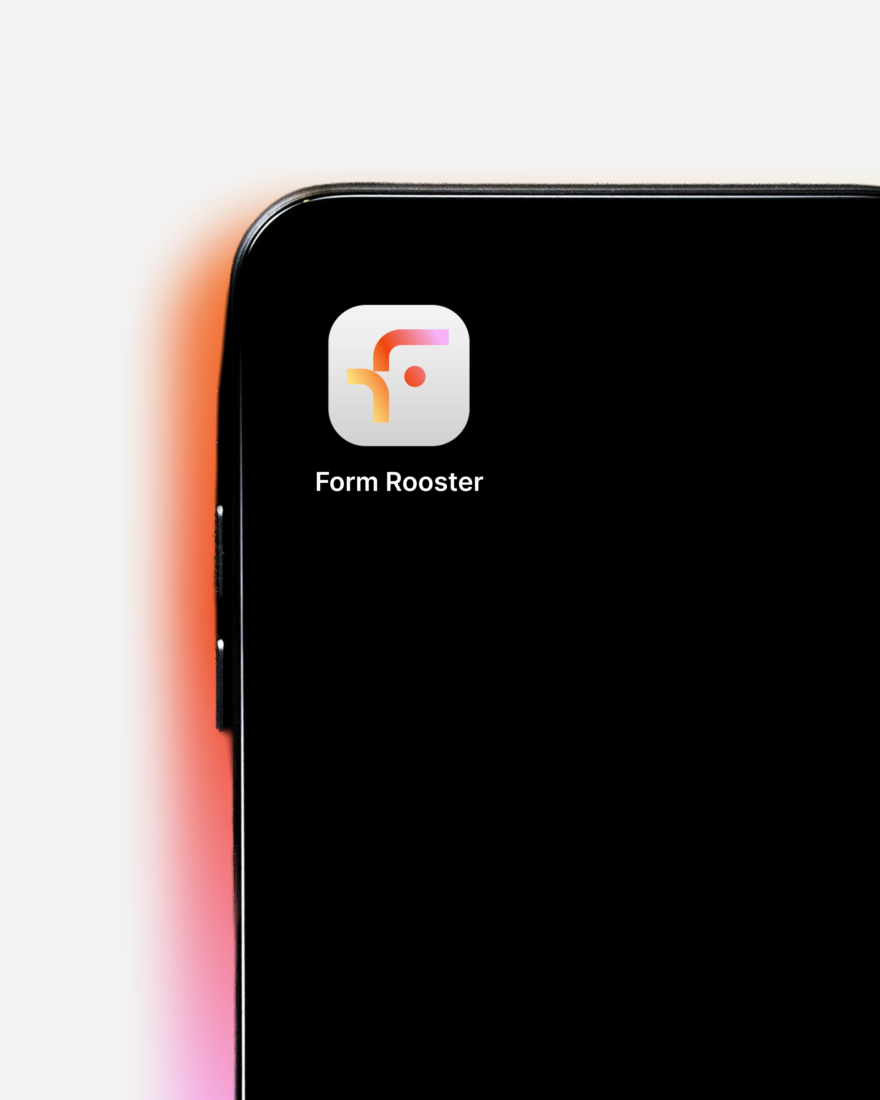
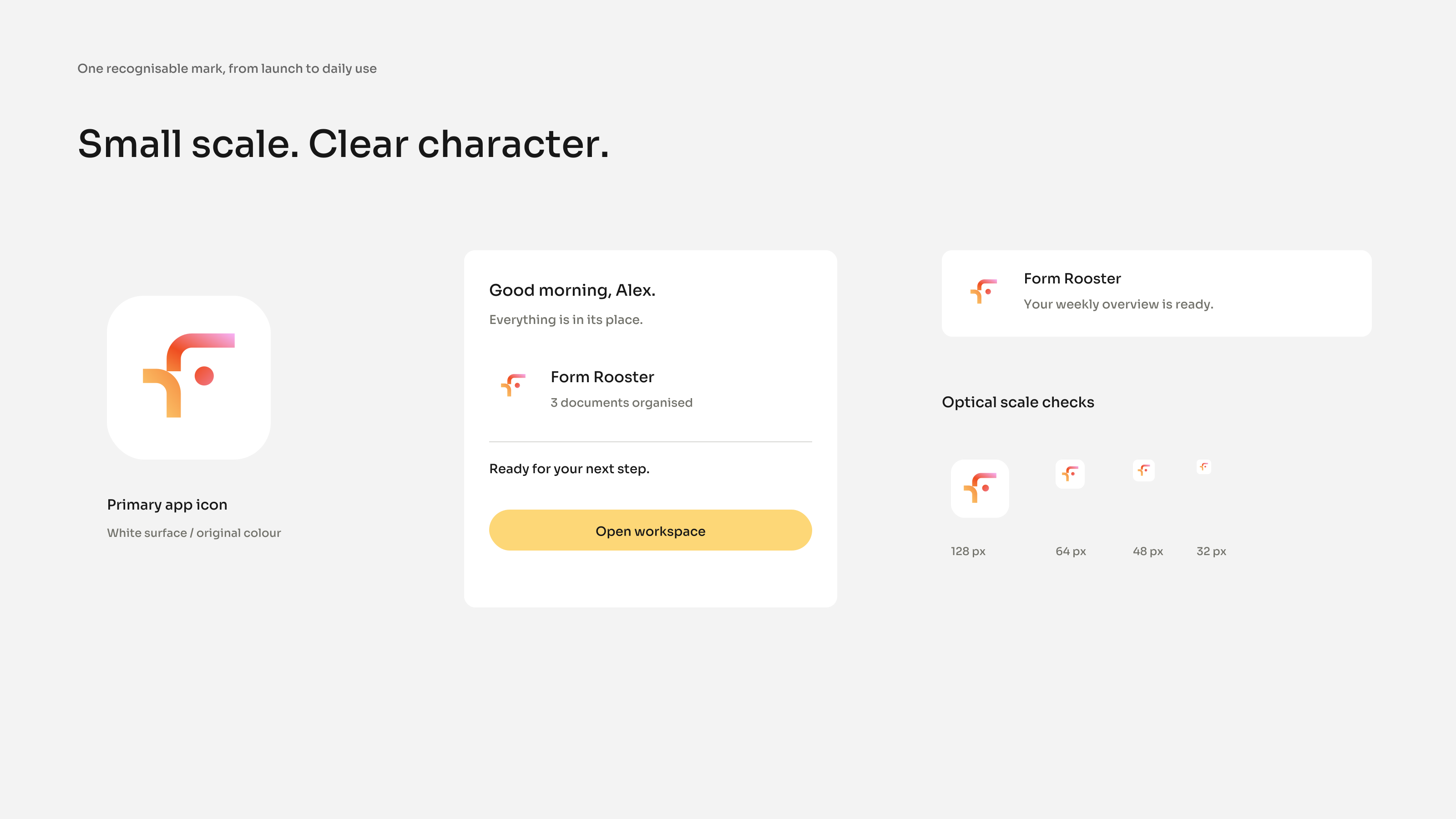
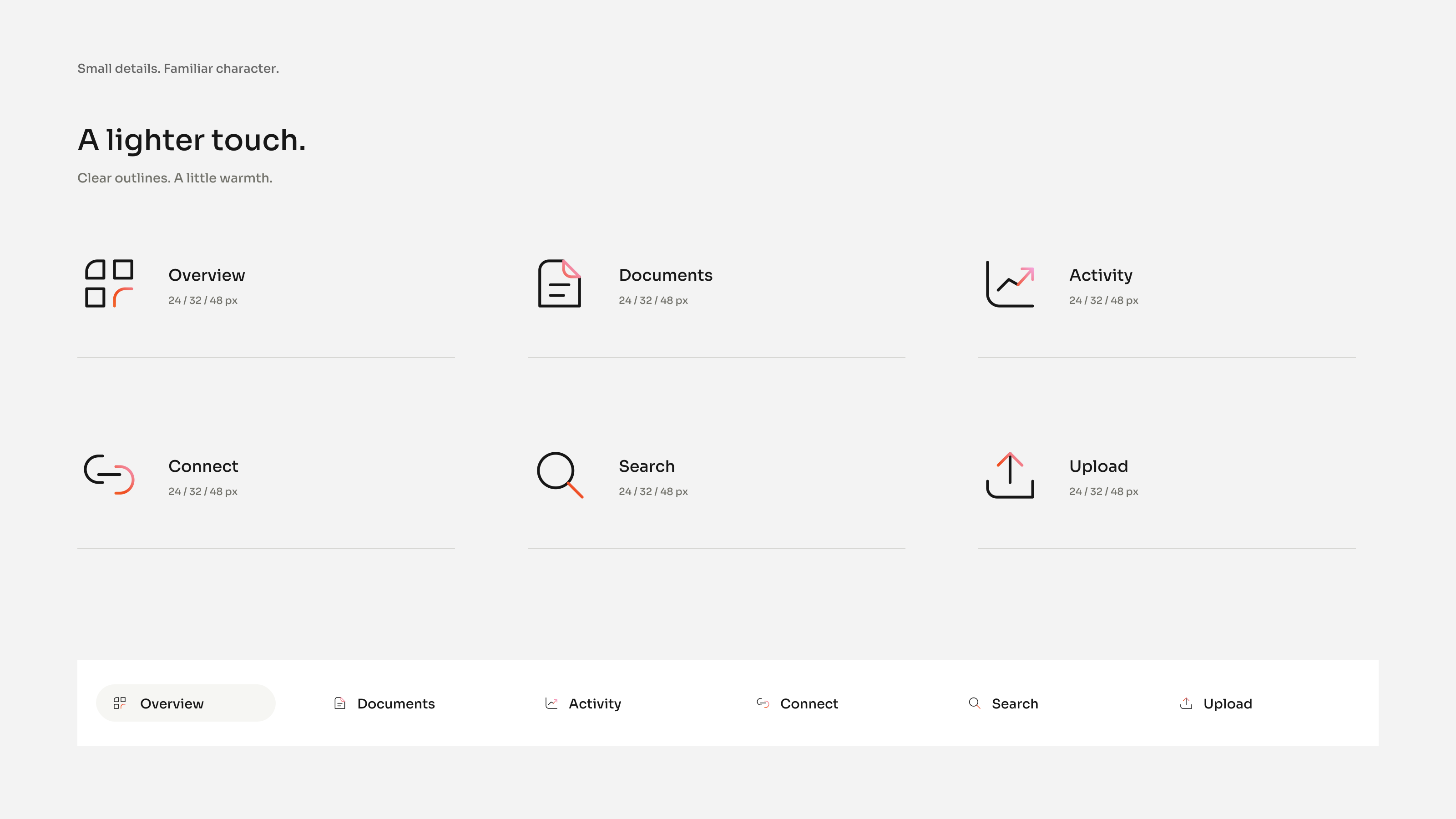
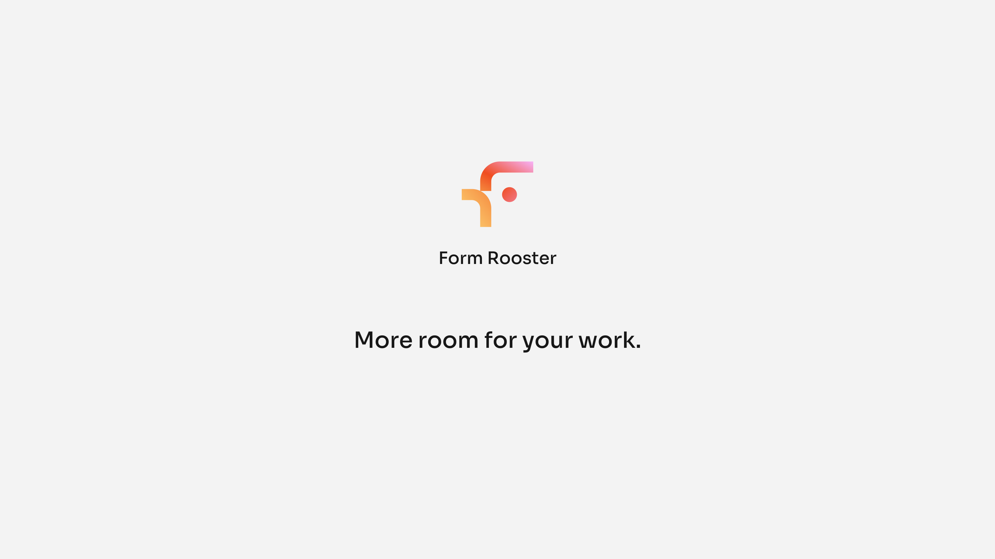
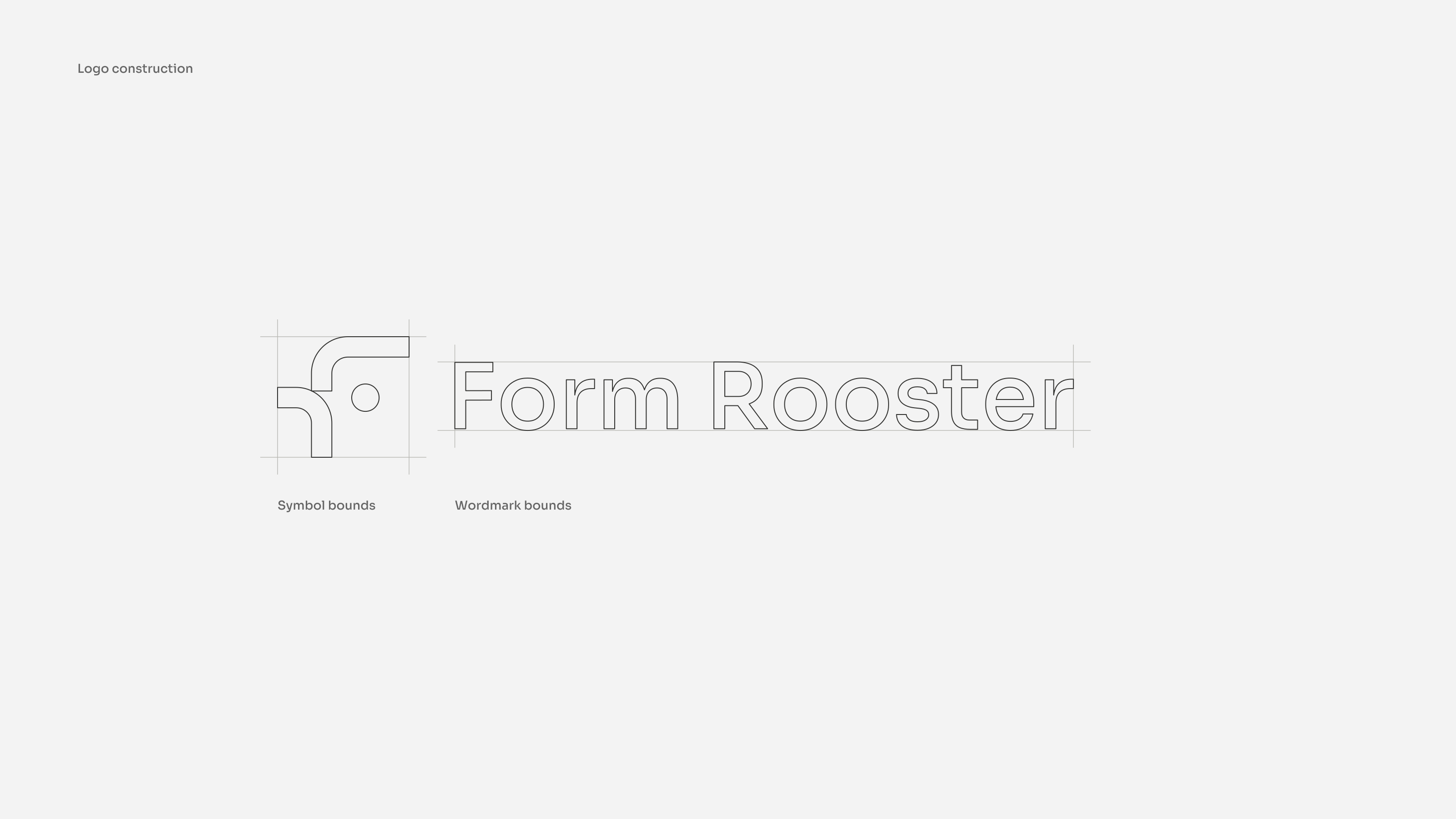
The mark is two bends and a dot. That is the whole rooster, and it was drawn to a measured grid because it spends its life small: an app icon, a notification, a row of interface marks. One more curve and it would turn to mush at that size.
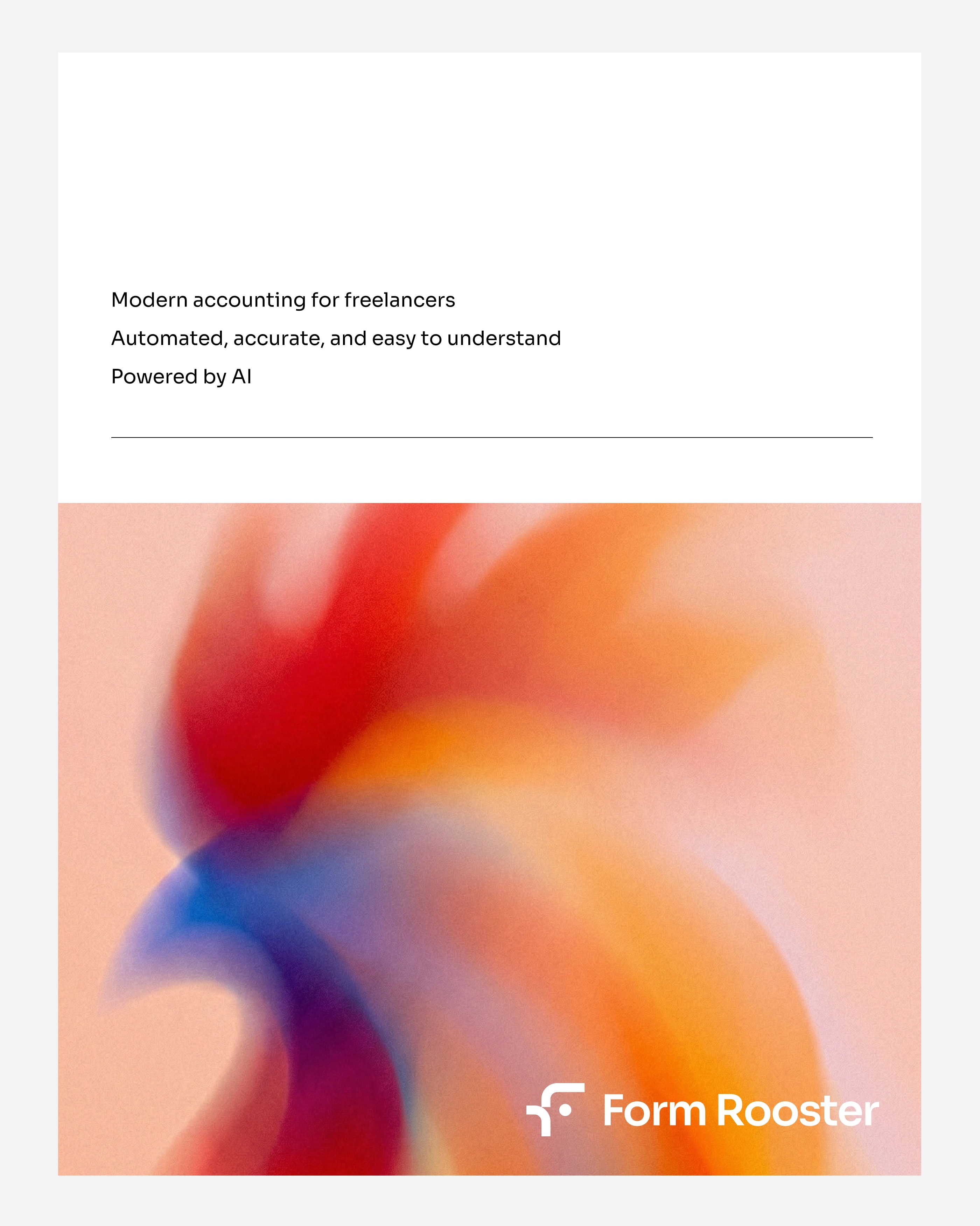
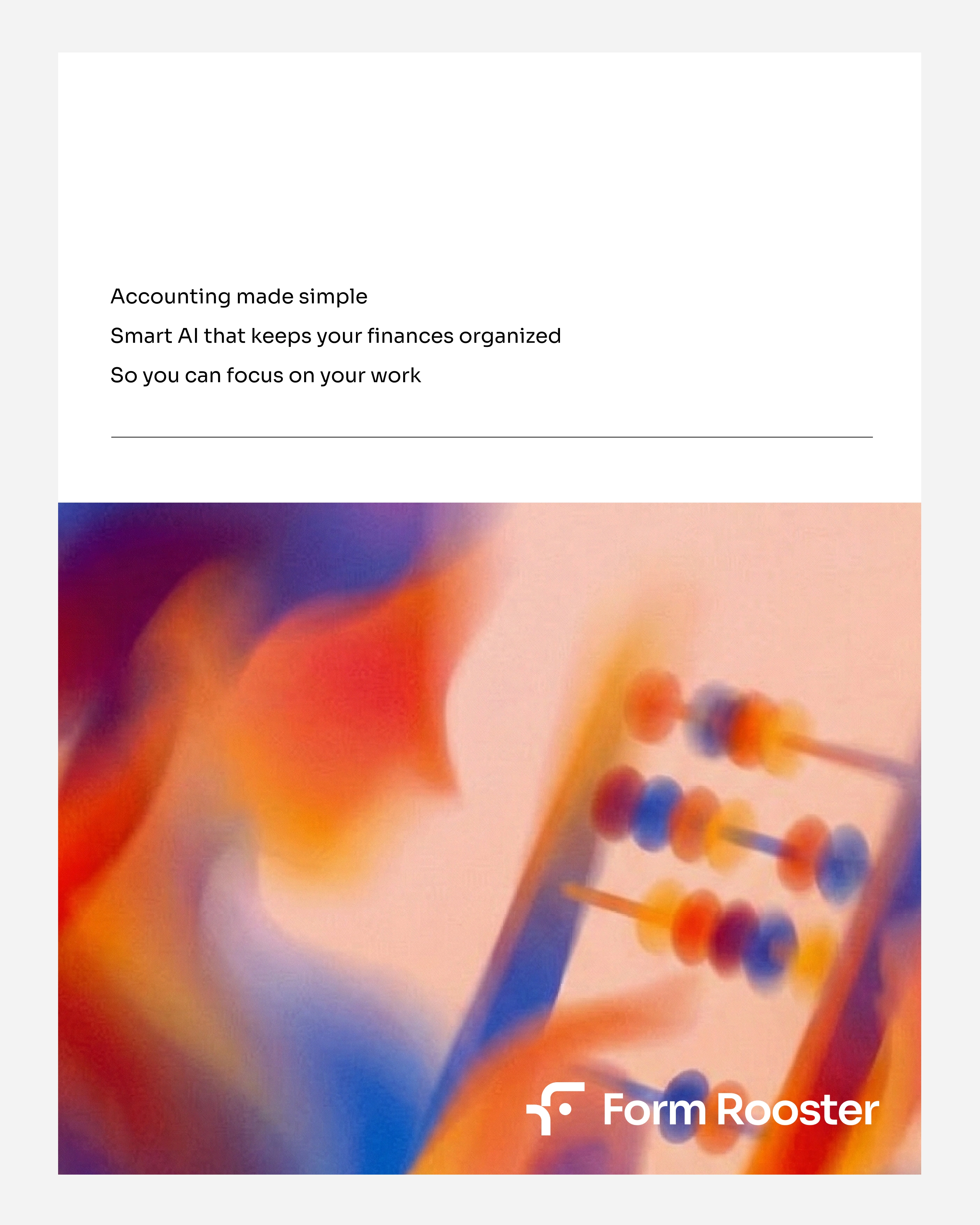
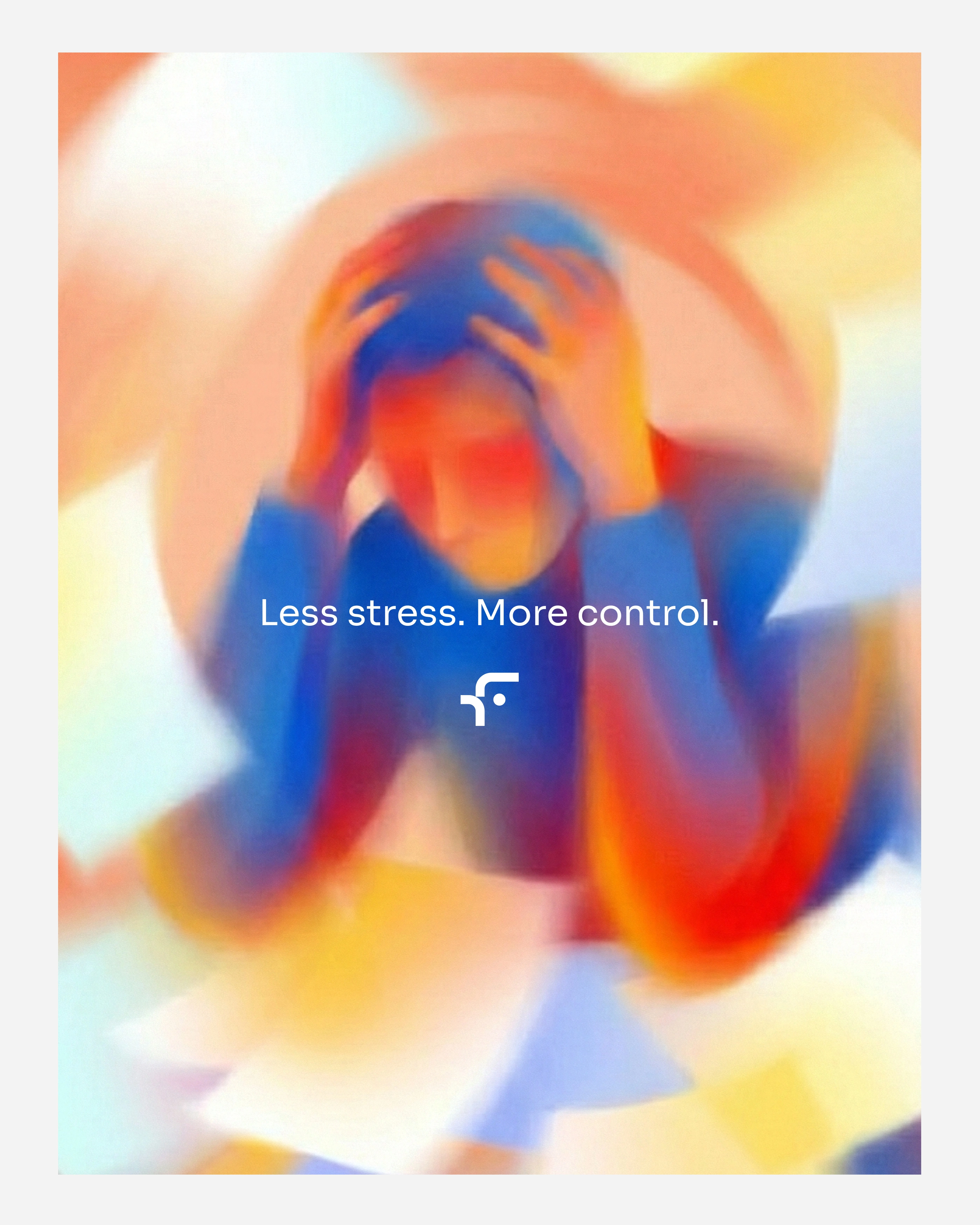
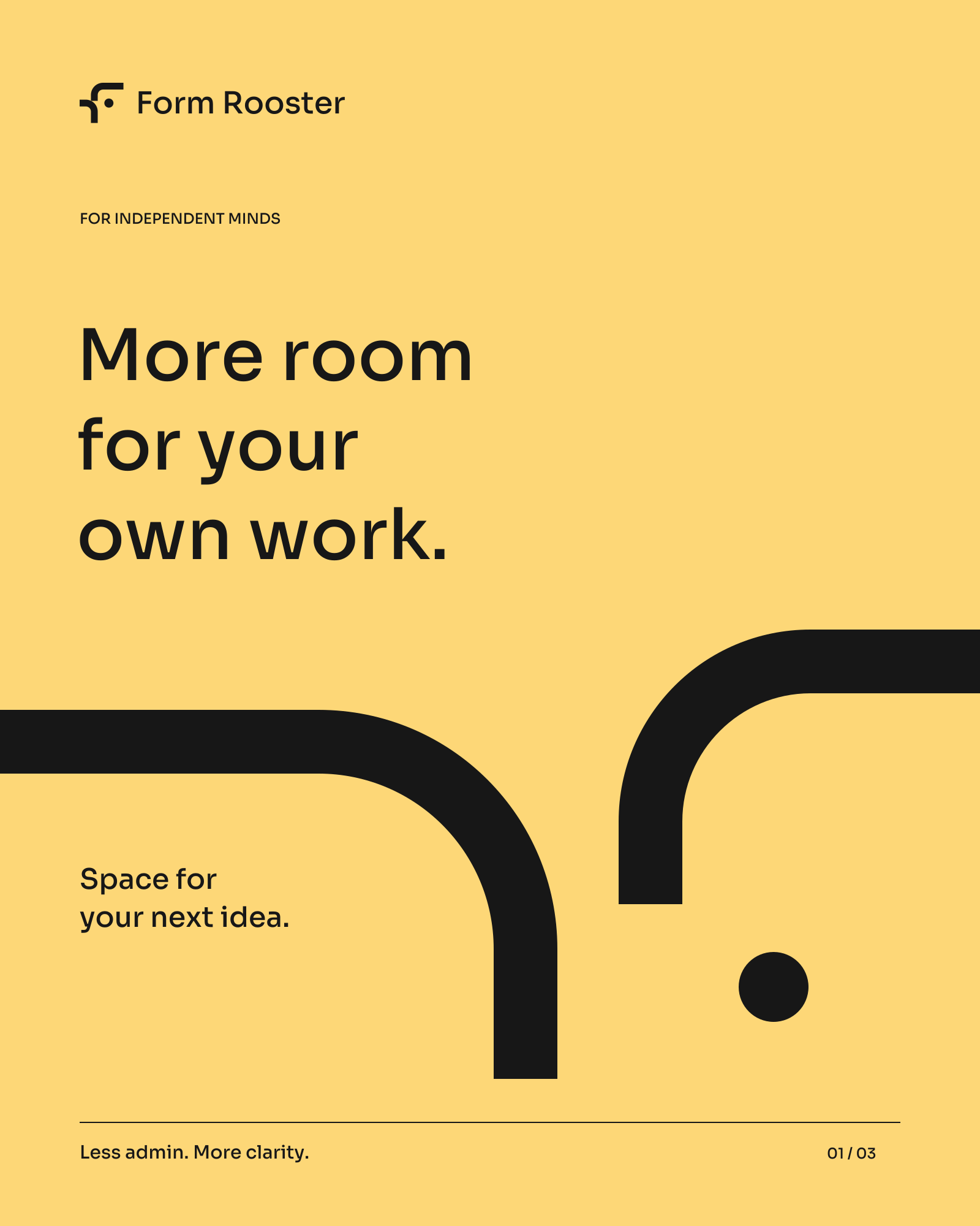
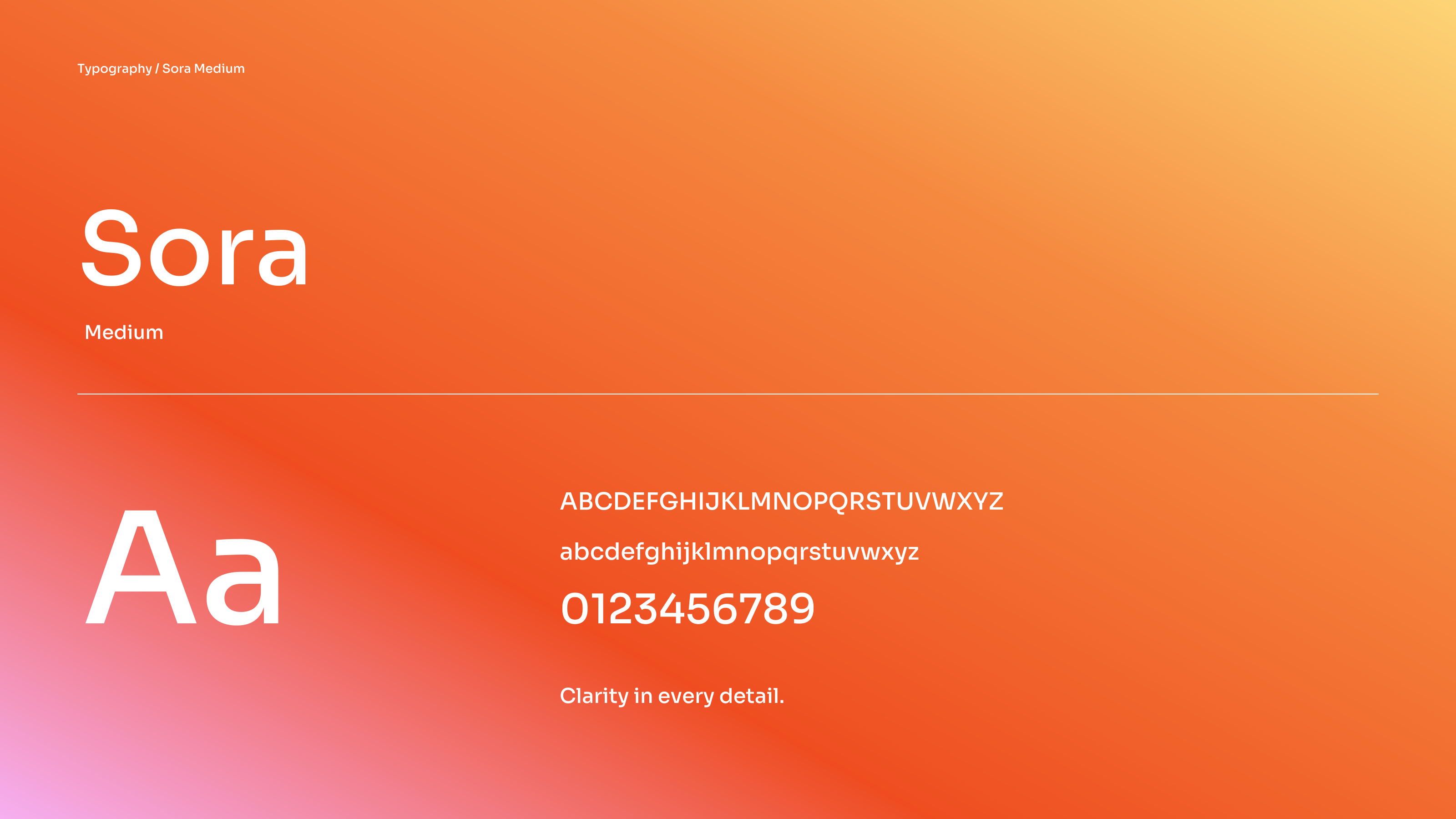
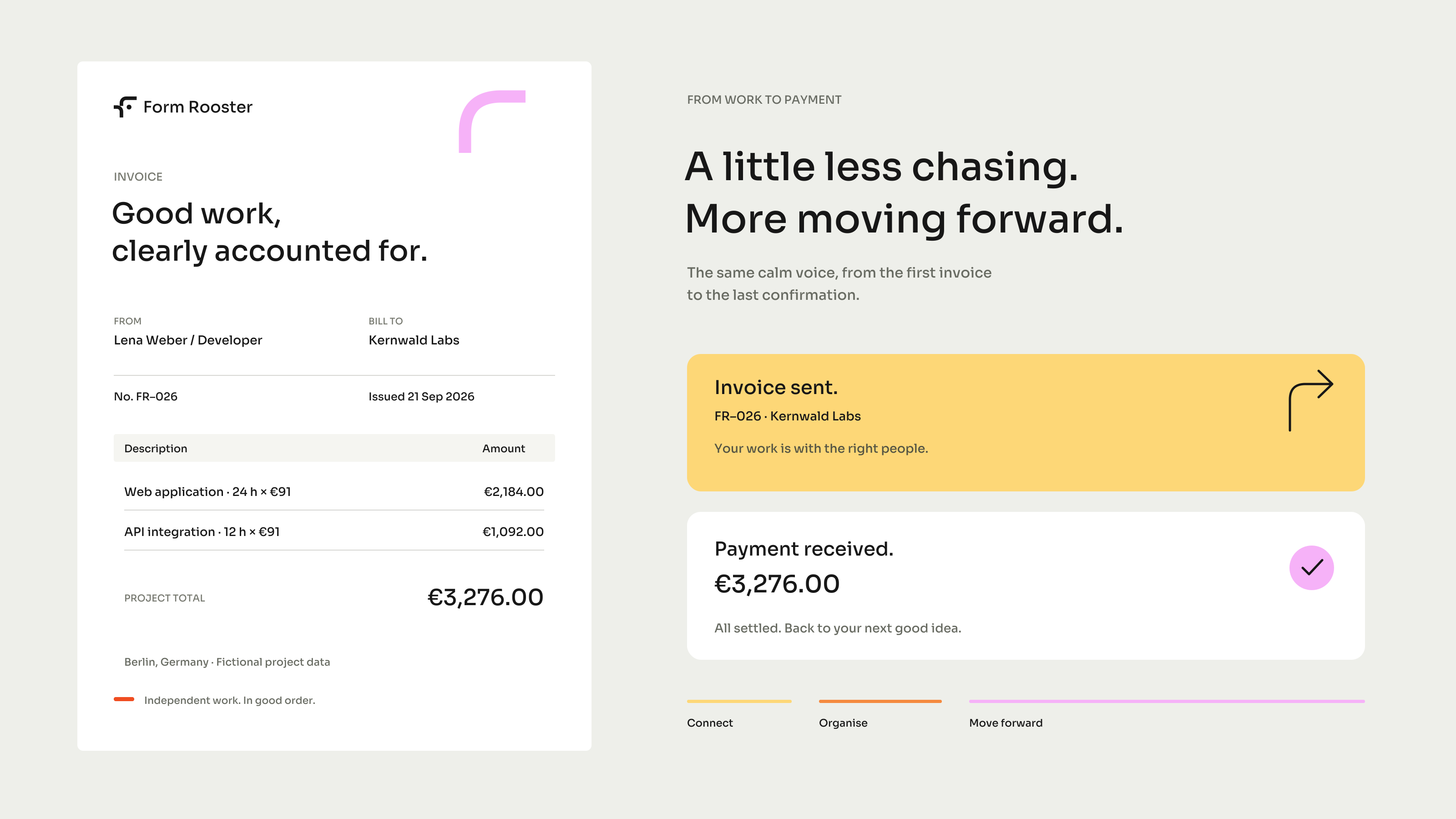
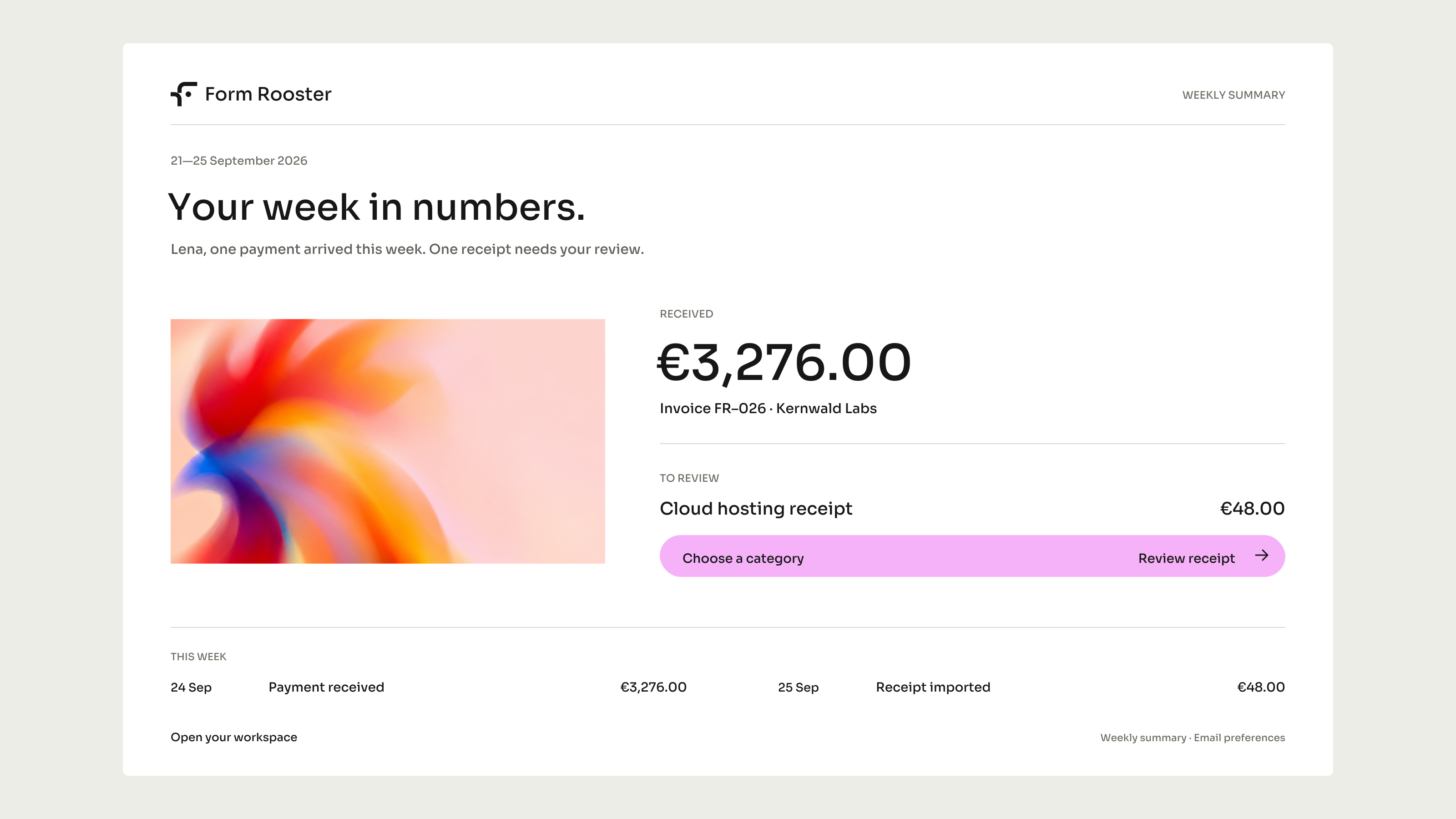
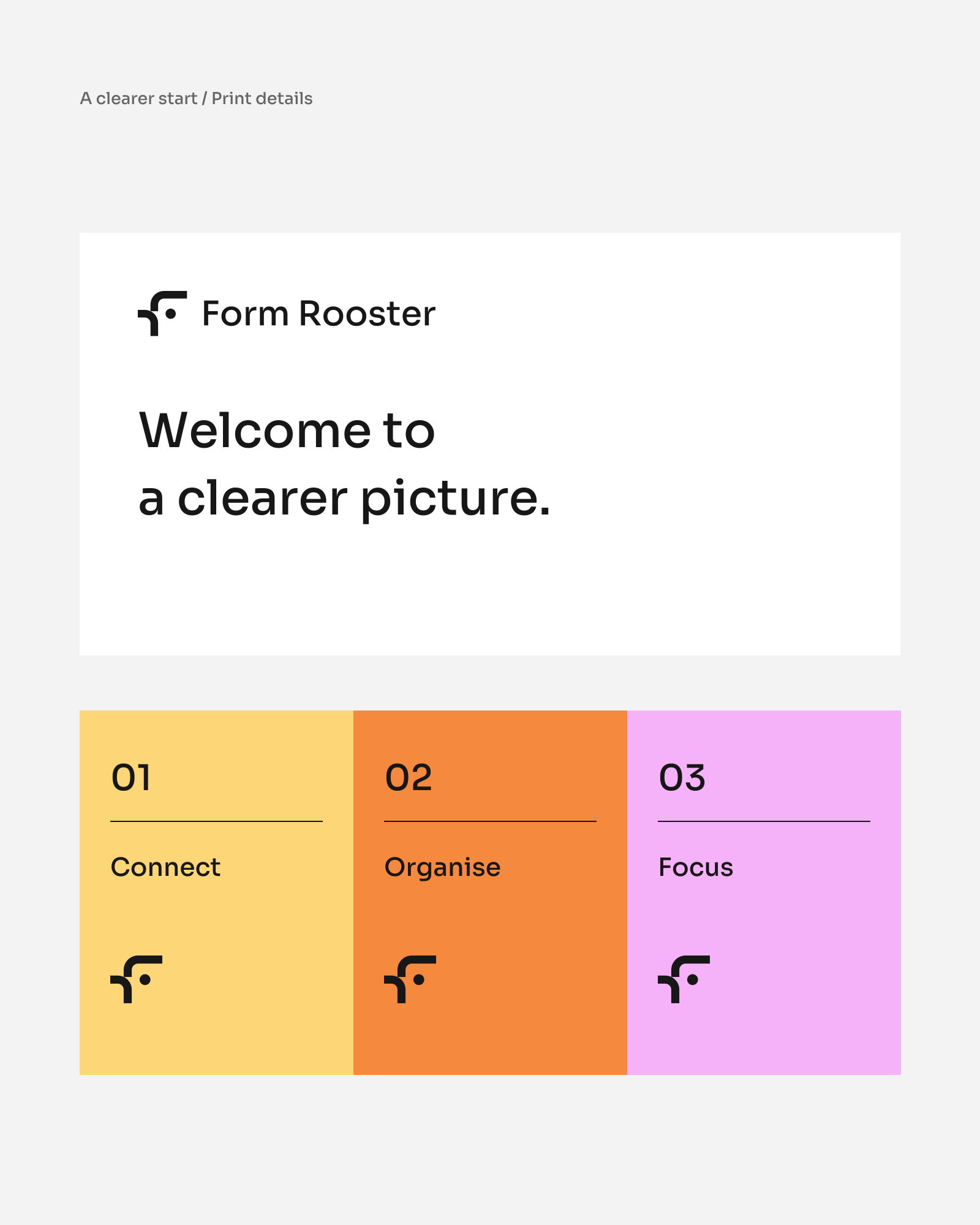
In the product the identity mostly gets out of the way. One typeface, one gradient used sparingly, plain words for what happened: work done, invoice sent, money in. The numbers on these screens are invented, and the app, the site and the films are extensions of the identity rather than a product already on sale.