Packaging design for drinks and food brands.
On a shelf nobody reads. A bottle has about as long as it takes to walk past it. In that moment the pack has to say which brand it is, which flavour it is, and why it costs what it costs. Here is how I build that, on four ranges I designed.
One system, many flavours
A brand rarely sells one product. It sells orange, blackcurrant, multivitamin and pomegranate, and next year two more. So the first thing to design is not a label but a rule that every flavour follows.
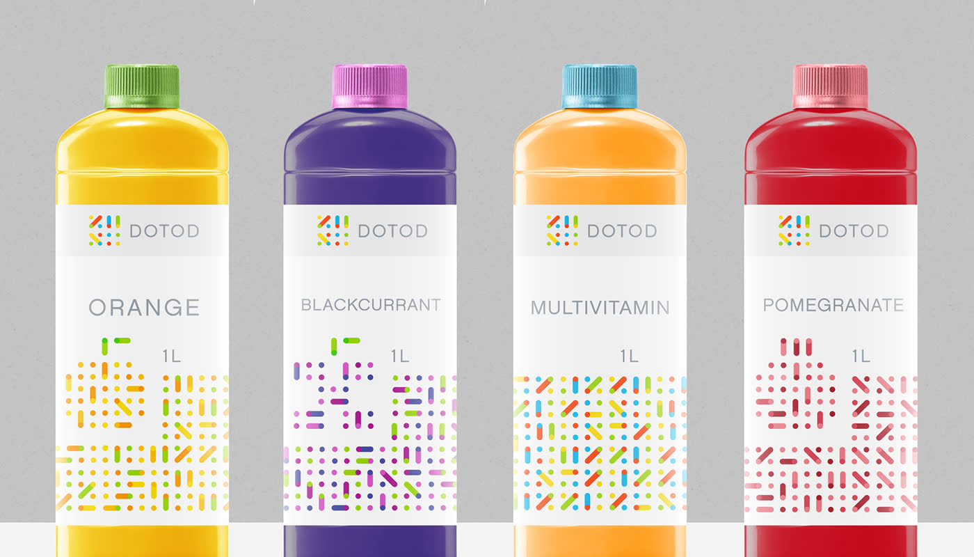
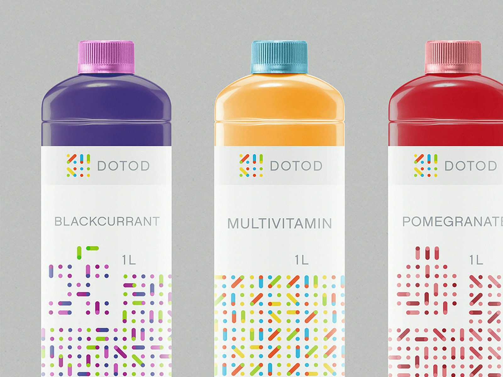
DOTOD is a juice brand from Munich that wanted to look healthy without becoming another green leaf on a bottle. Its whole system runs on dots. Every fruit has its own pattern and its own colours, and the dots are always connected, differently each time. The label stays white and the same on every bottle, so the row reads as one brand, and the pattern and the cap tell you which one to take.
The shape can be the argument
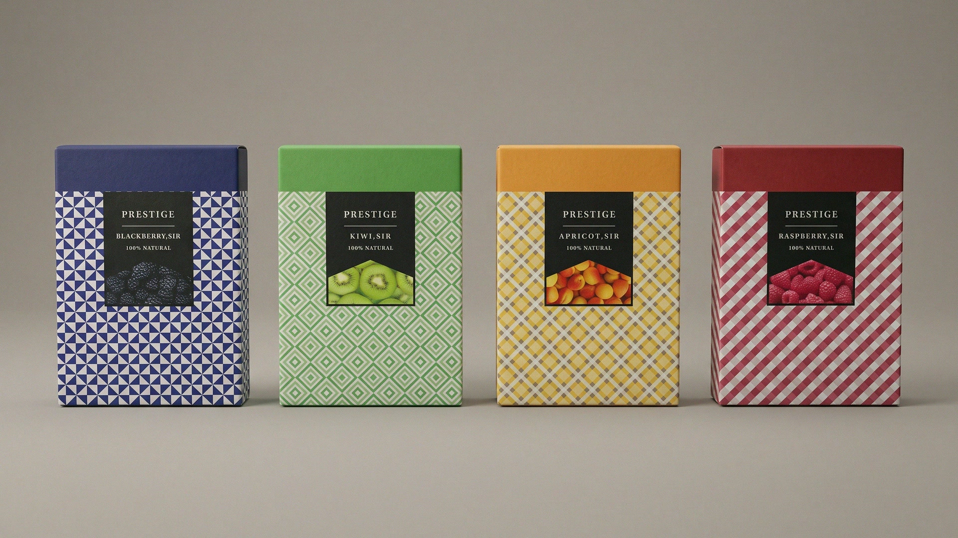
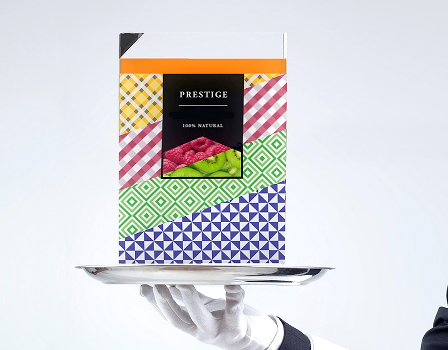
Most juice packs are rounded. Prestige, a premium juice, is built like a book: straight lines and not a single curve. It is easy to carry, takes little room, and looks like nothing beside it. Each flavour has its own pattern and a strong colour, and the patterns are what make a simple box feel made by hand.
Colour finds the flavour, the mark finds the brand
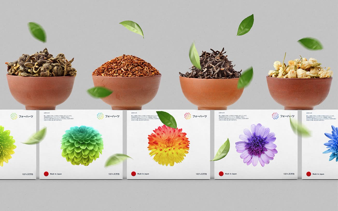
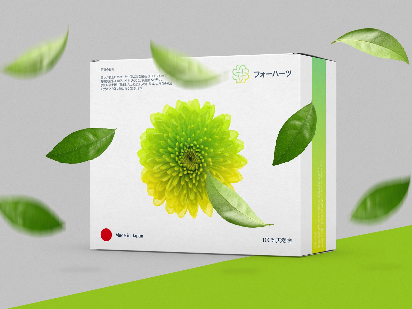
Fohatsu makes herbs for tea in Tokyo. The name means four hearts, and the mark is four hearts arranged into the shape of one character. For the boxes I kept three rules: simple, bright, original. Every tea has its own colour scheme on a white box, and the mark sits in the same corner on all of them.
It has to read from three metres
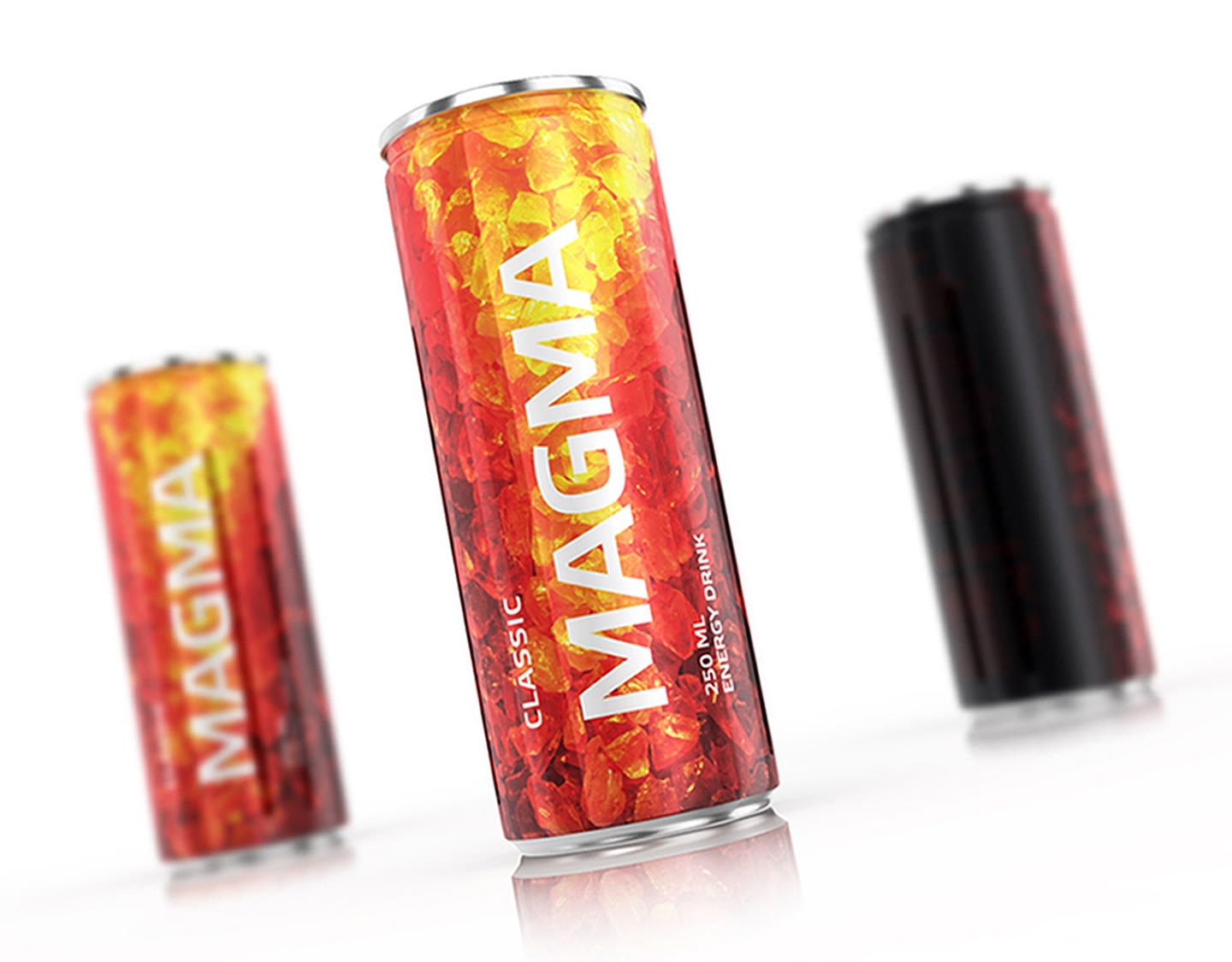
Magma is an energy drink, and its cans are built on one comparison: the drink is liquid energy the way magma is. Classic carries glowing lava crystals, Blueberry carries ice, and the Black edition keeps its embers almost hidden until light hits the can. Each one can be told apart from across the aisle, and they are still clearly one family.
What goes on the pack besides design
Ingredients, nutrition, volume, barcode, recycling marks and whatever the law of your market asks for. That text is yours to supply and to have checked. My part is to give it a place from the start, so the back of the pack is designed and not filled in at the end.
Files for the printer
You get print files on the die line of your bottler or printer, with the colours named as they will be printed, and a short guide for the next flavour: where the name goes, how a new colour is chosen, what never changes. With that, a new sort is a small job, not a new project.
How long it takes
First concepts come within a week, often sooner, usually on one flavour, so the idea can be judged before it is multiplied. The rest is planned around your launch. Printing and filling have their own lead times, so start from the day the product must be on the shelf and count back.
Packaging design · Branding for food and drink · Guide: branding for cafés and bakeries · Guide: dental branding and packaging