Dental branding and packaging: what a practice can put its name on.
Most dental practices look alike: a tooth in a circle, a blue that is meant to say clean, and a name in capitals. That is a pity, because a practice has something few businesses have. Every patient leaves with a small object in a bag, and uses it twice a day. Here is what a practice can do with that, shown on the identity I designed for White Rabbit Dental.
Start with what the patient is afraid of
People do not avoid the dentist because of the price or the parking. They avoid it because they expect it to be unpleasant. So the brief for White Rabbit Dental was one sentence: a calm identity for people who put off going. Everything after that, from the colour to the box, was checked against it.
A mark with one soft idea
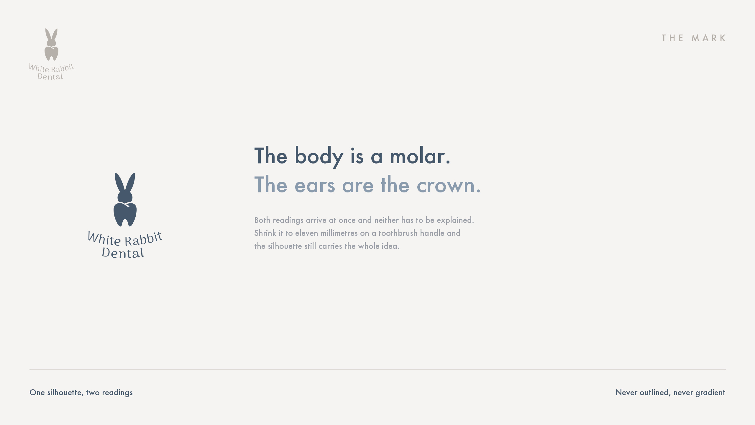
The mark is a molar. Its crown has two points, and those two points read as a rabbit's ears. You see a tooth, then an animal, and neither is frightening. One small idea of that kind does more for a practice than any amount of clinical blue.
Drawn for eleven millimetres
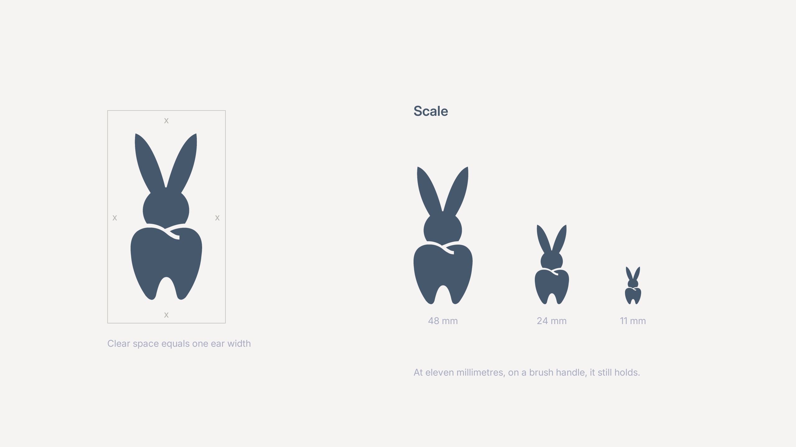
A dental logo spends its life small. It sits on the handle of a toothbrush, on the cap of a tube, in the corner of an appointment card. The White Rabbit mark was drawn with a scale row that goes down to eleven millimetres, and it had to stay a tooth and a rabbit all the way down.
What goes in the bag
Three things carry the practice home: a tube of toothpaste, a brush, and the box they come in. On the tube the mark sits alone with the name. On the brush it is on the handle, where the thumb rests. The box is a plain shipping box with the mark on it, because a practice that sends aligners or whitening kits by post needs one anyway.
None of this requires a practice to become a manufacturer. Tubes and brushes are made by suppliers who print a customer's design on a standard product. What they need is artwork that fits their template, in the colours they can actually print. That artwork is the designer's job.
The mark as a pattern
Repeated, the mark stops being a rabbit. The ears turn into a row of small ticks, and that row runs across the packing tape and the lining of the box. Only up close does the molar come back. It means the practice has a second, quieter way of being recognised, for the places where a logo would be too much.
Colour and words
The palette runs from porcelain to a deep ink, with nothing shrill in between. The words are few. A poster for the waiting room says gentle care and shows a white rabbit in a dusty blue niche. The cards carry the tagline, the values and, on one of them, only the word calm.
Where to begin
With the mark and the palette, then the things patients touch: the card, the brush, the bag. The website and the sign come next and are quick once those exist. If you already have a logo you like, the packaging can be built on it.
Branding and websites for dental practices · Packaging design · Healthcare and clinics