A website for a construction company: what it needs to show.
Anyone about to build a house, develop a block or renovate a facade looks at the builder's website first. Within two minutes they should know three things: whether the company builds projects like theirs, whether its dates and prices can be trusted, and whom to call. Here is what a website has to show for that, using the site I designed for Diker in Berlin.
Who you build for, right at the top
A construction company rarely has one kind of client. Diker has four: private owners, investors and developers, businesses and offices, and property managers. Each asks something different, and the site answers right under the headline, which reads, in German, "from a family home to a whole neighbourhood". Each group gets one line that takes up its biggest worry: a house without the stress of a building site for private owners, renovation while the tenants stay in for property managers.
Nobody has to search to find out whether they are in the right place, and each group goes straight to the services and projects that matter to it.
Projects with the figures people ask about
Photographs alone do not convince anyone who is about to build. They want to know how long the build took and whether the price held. So every project on the Diker site carries a small status card: for finished buildings the build time and the number of additions to the fixed price, for ongoing ones the progress and the planned move-in date.
Those two or three figures say more about reliability than any sentence. A company that shows them looks sure of itself. One that leaves them out leaves the client guessing.
Calm pictures, not building-site chaos
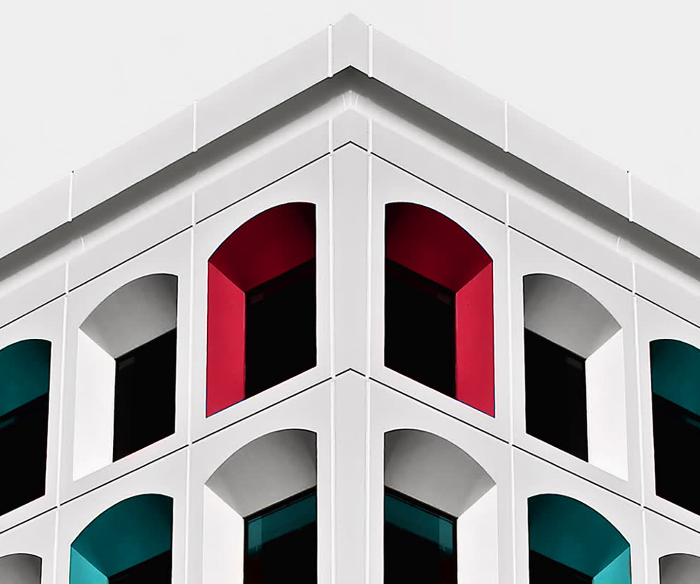
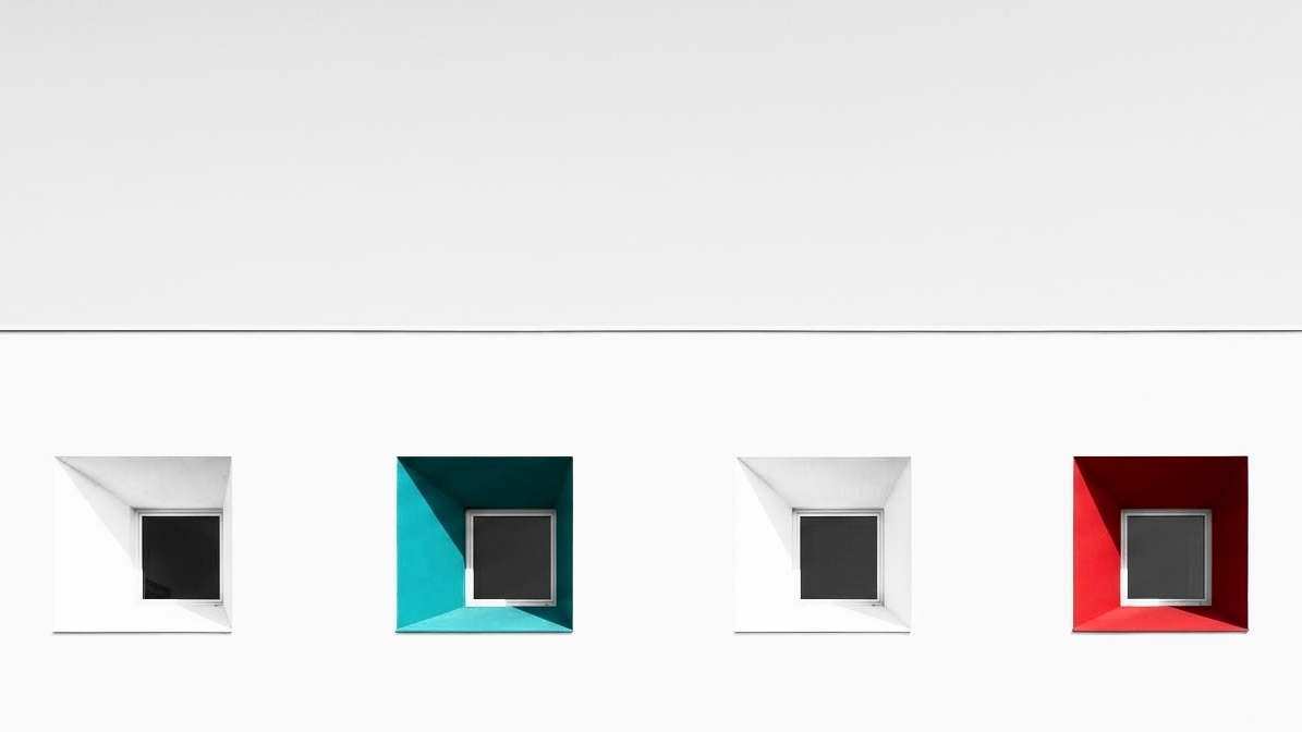
Photos of scaffolding, rubble and cables show work, not the result. For Diker the pictures keep to white walls, a pale sky and colour in exactly one place, a window recess or a front door. It looks orderly, and orderly is exactly what people hope for from a building site.
Services in the client's own words
New build, renovation, permits, shell construction, interior fit-out, site management: that is how people search, and that is what the services should be called, not "complete solutions". Each one gets its own short page with the projects that fit. It helps the visitor, and it helps Google show the company for exactly those searches.
One contact and one way to ask
"Planning, building and site management from one group. You have one contact for the whole project." Diker puts that sentence right under the headline, because it is what many clients fear most: five companies and nobody in charge.
The button to request a project sits at the top of every page, and the form asks only what a first conversation needs. Existing clients find their client portal next to it.
Fast on a phone and easy to keep up
Many people look at the site on a building site or on the way somewhere, so it has to load fast and read well on a phone. And the office should be able to add new projects itself, or the list of references stays where it was three years ago.
The mark has to work outside too
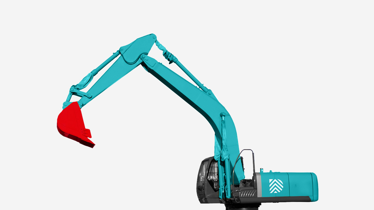
Most people see a construction company not online but on the hoarding, the digger or the helmet, where a wordmark is often too small. Diker's mark of stacked roof slopes stands on its own, and the site takes up the same colours, so the site board and the homepage belong together.
In the end a good website for a construction company is a book of references anyone can open at any time, with a clear way to the first conversation.