White Rabbit Dental
A calm identity for people who put off going to the dentist.
2026
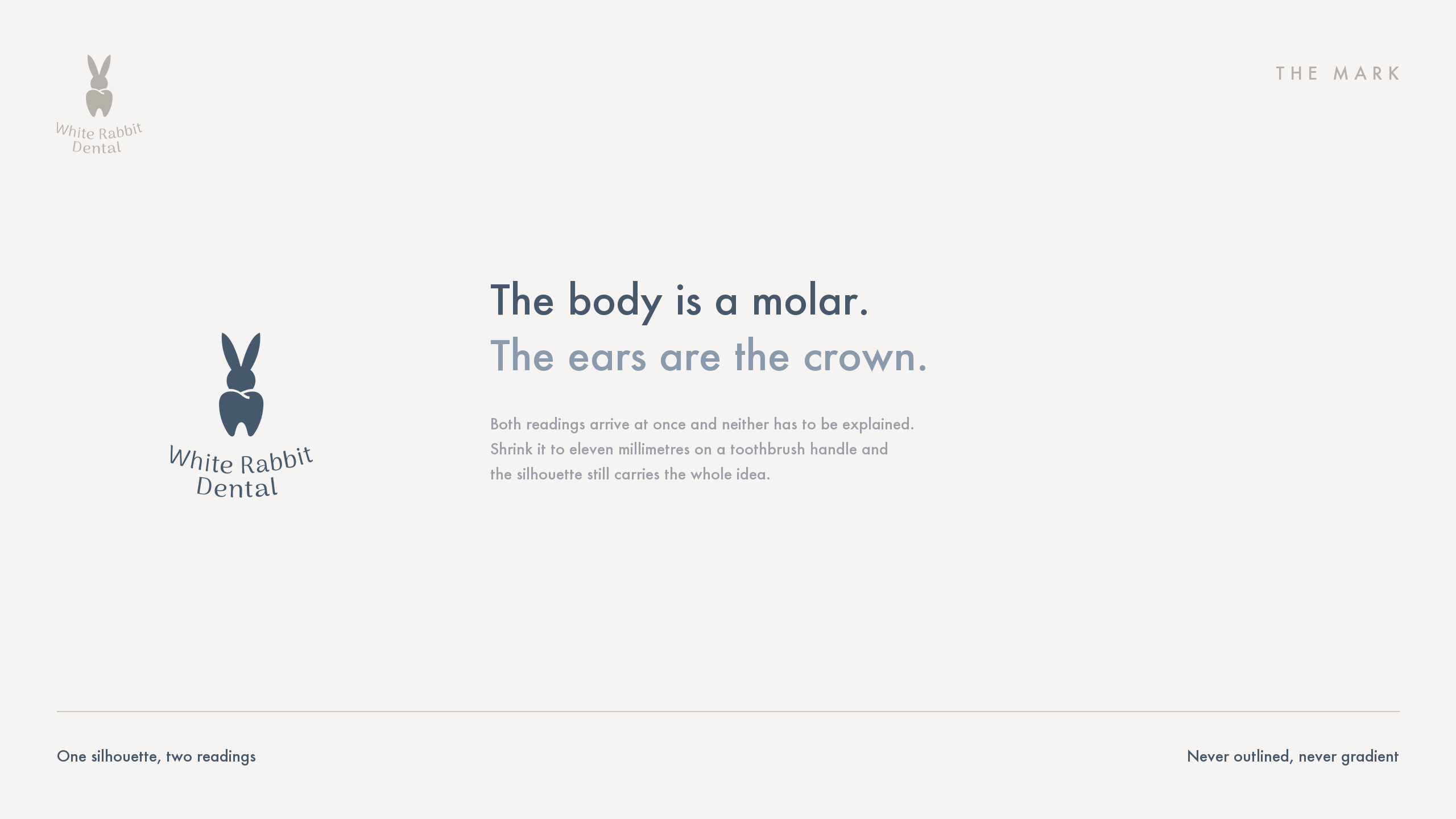
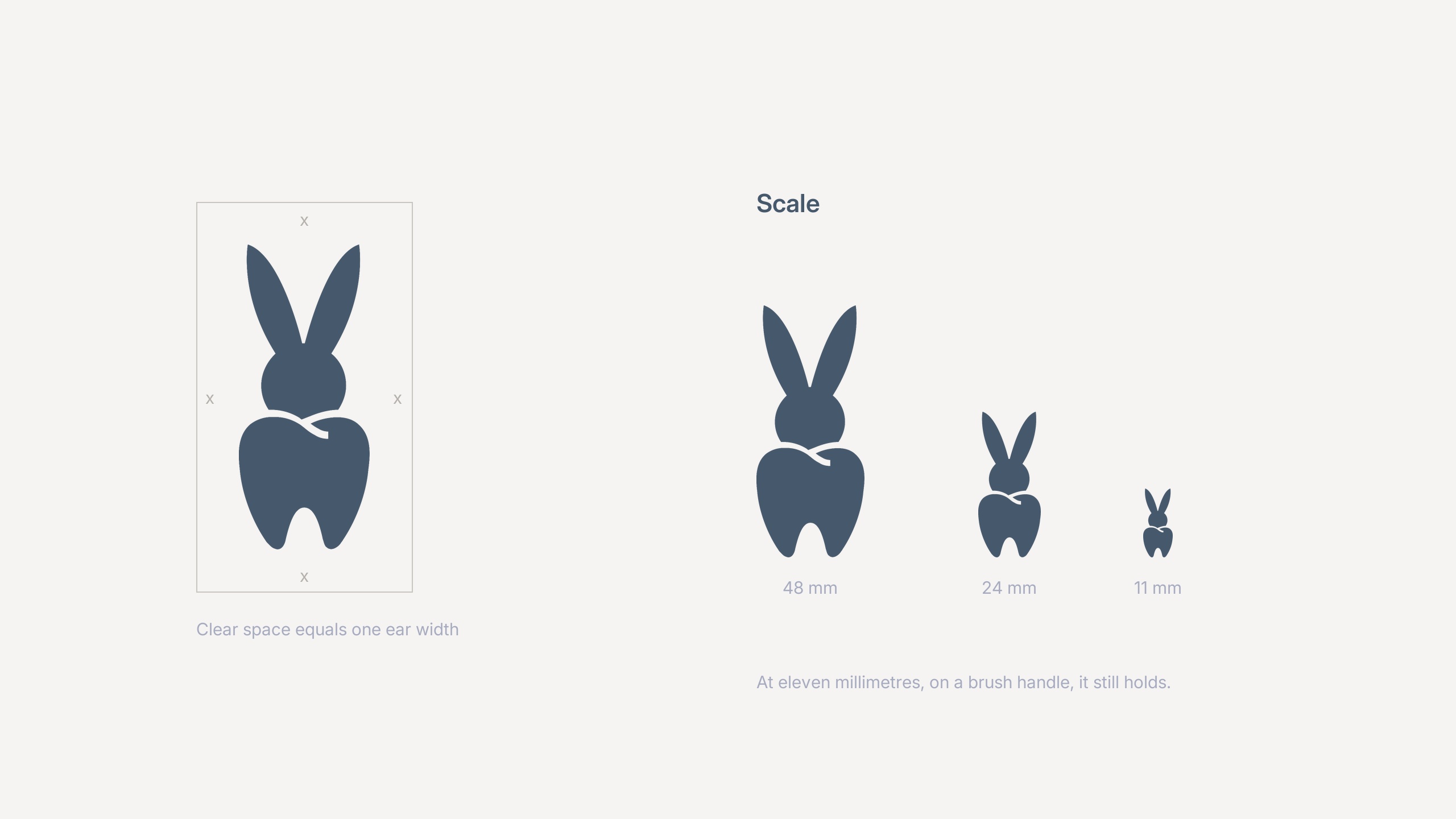
White Rabbit Dental is a practice for people who put off going to the dentist, and it makes its own toothpaste, brush and box. The mark is one silhouette read two ways: the body is a molar, the ears grow straight out of the crown, and nothing is added on top.
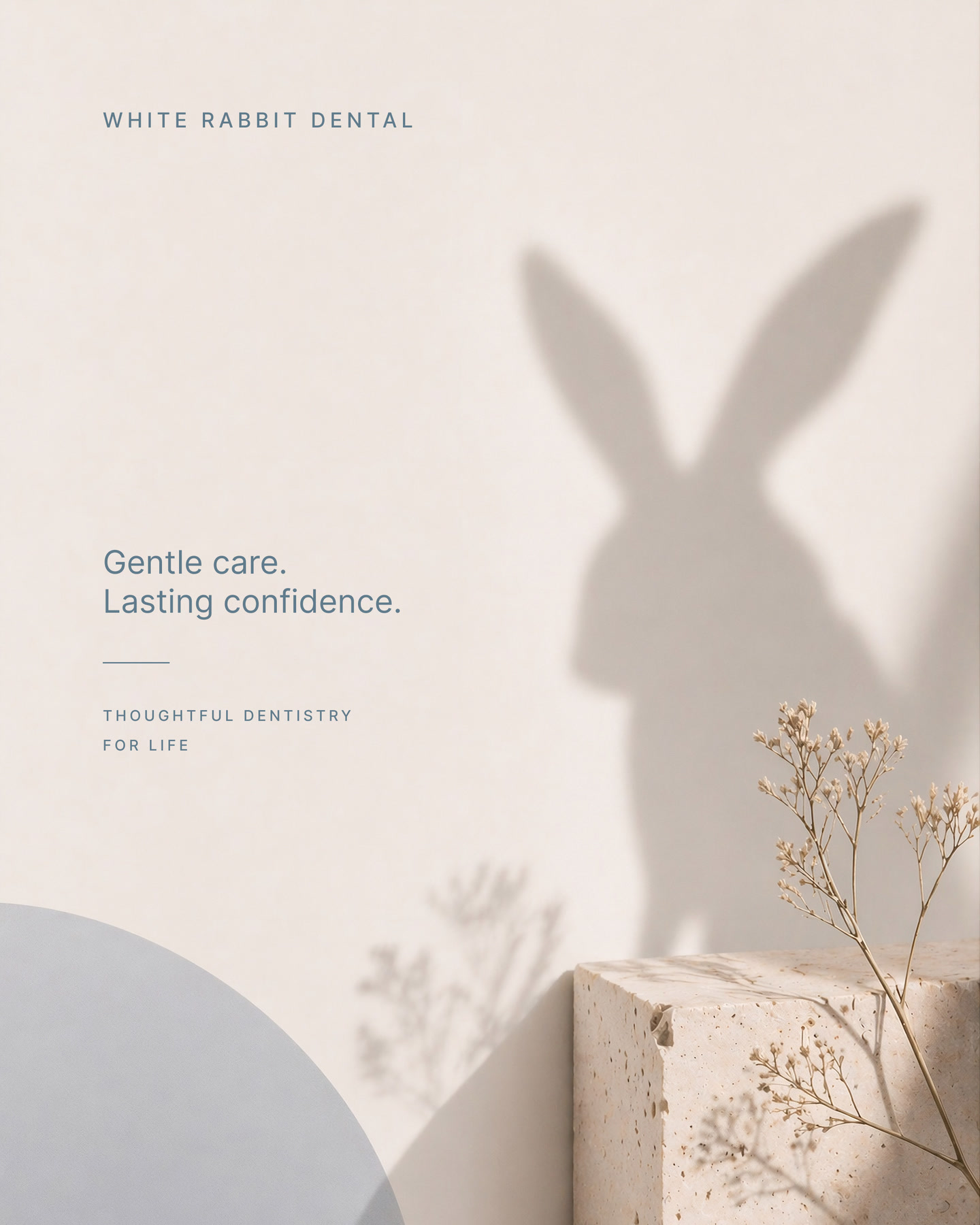
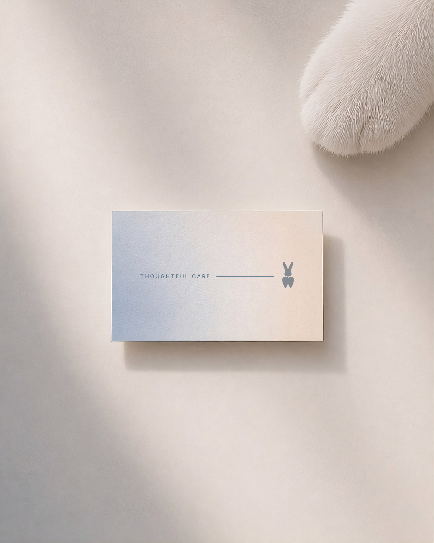
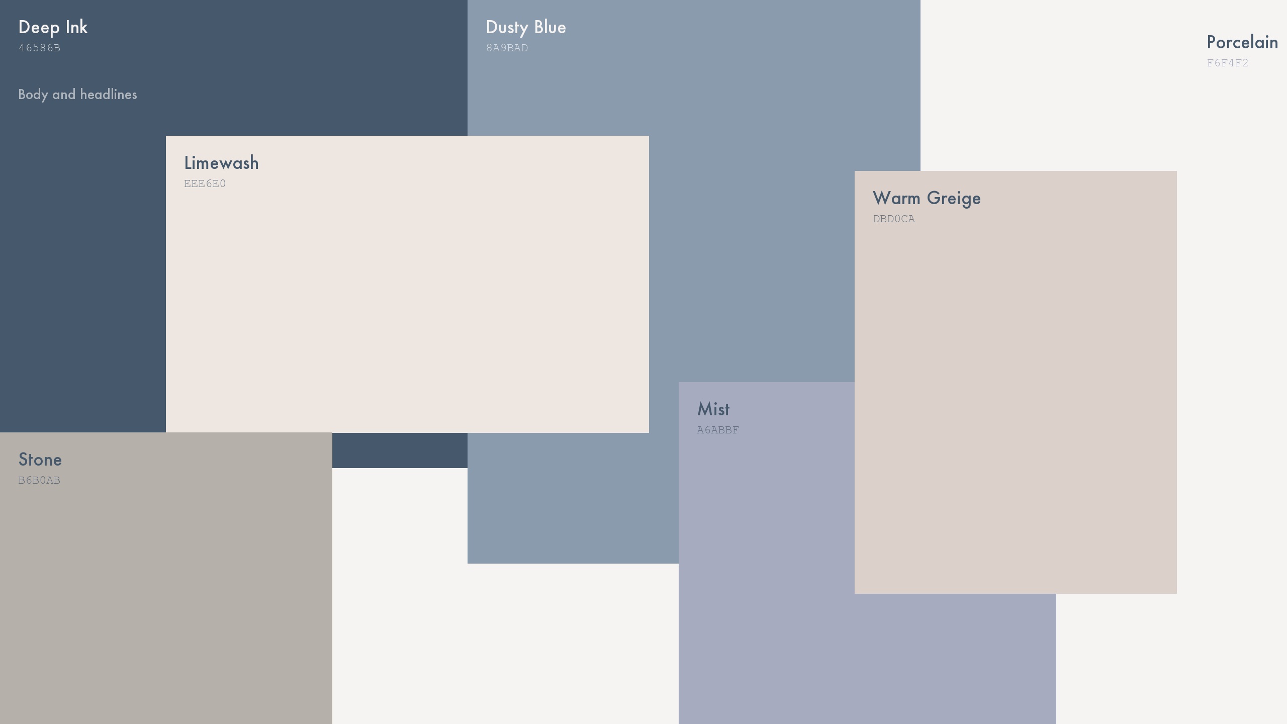
A dental room is bright, hard and clinical. The identity had to pull in the other direction without going soft or childish, so it runs on five cold colours that never raise their voice, from porcelain through mist to deep ink. There is no pure black and no pure white in the system, and that single rule keeps everything quiet.
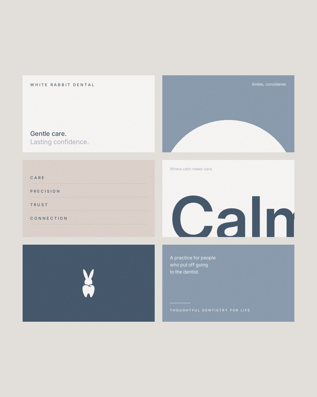
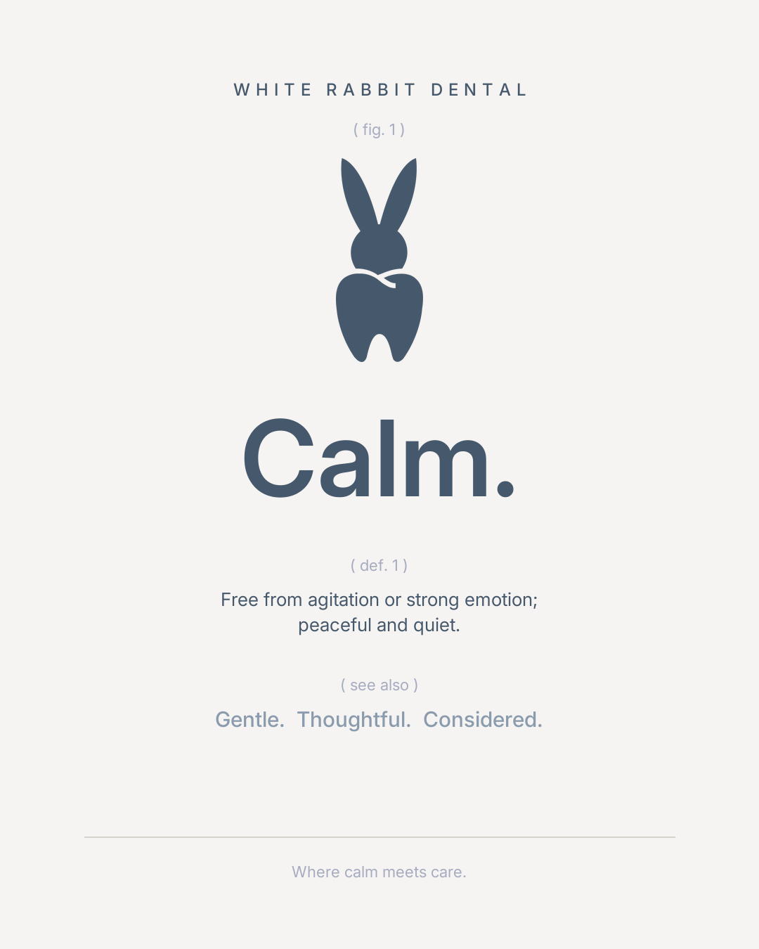
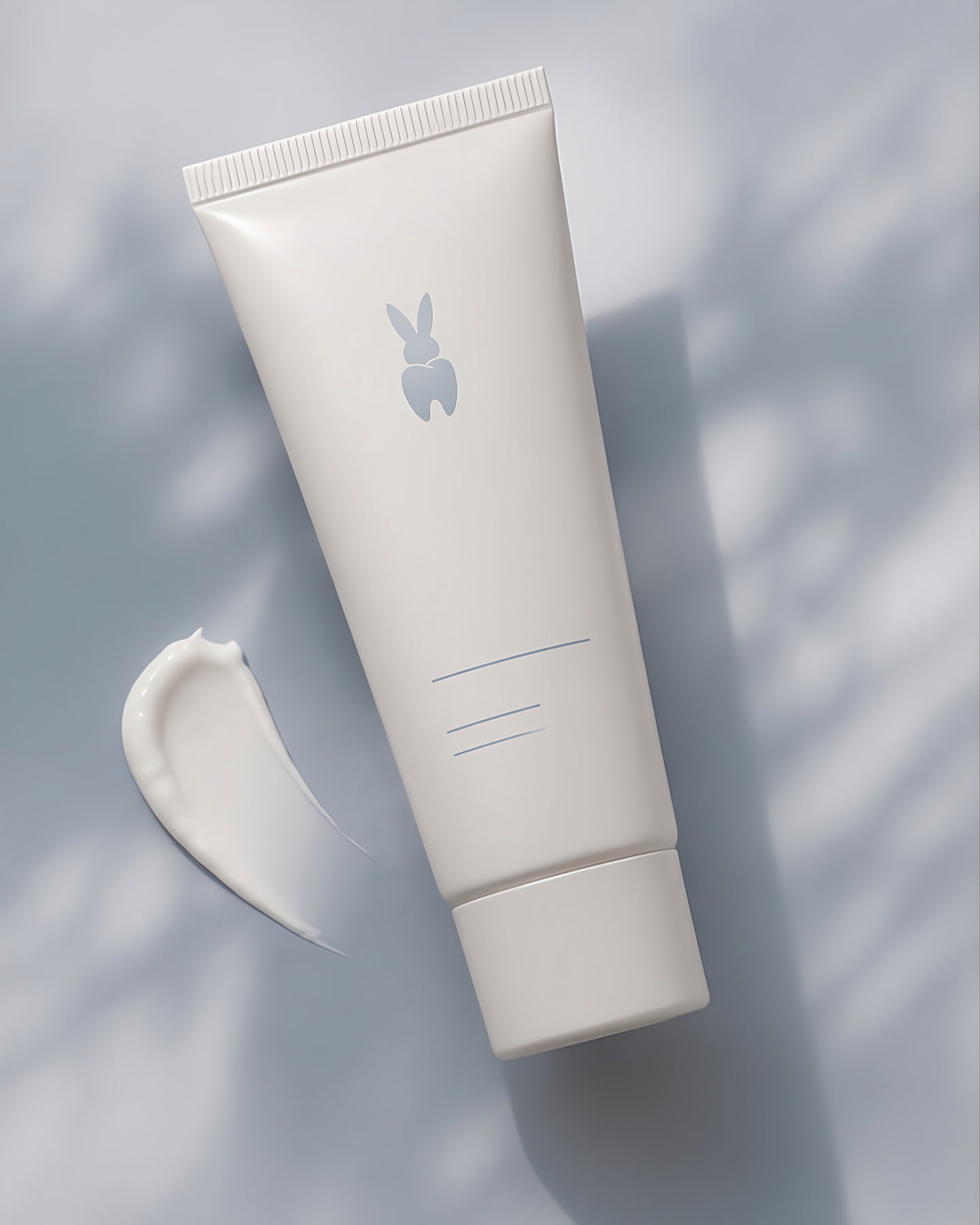
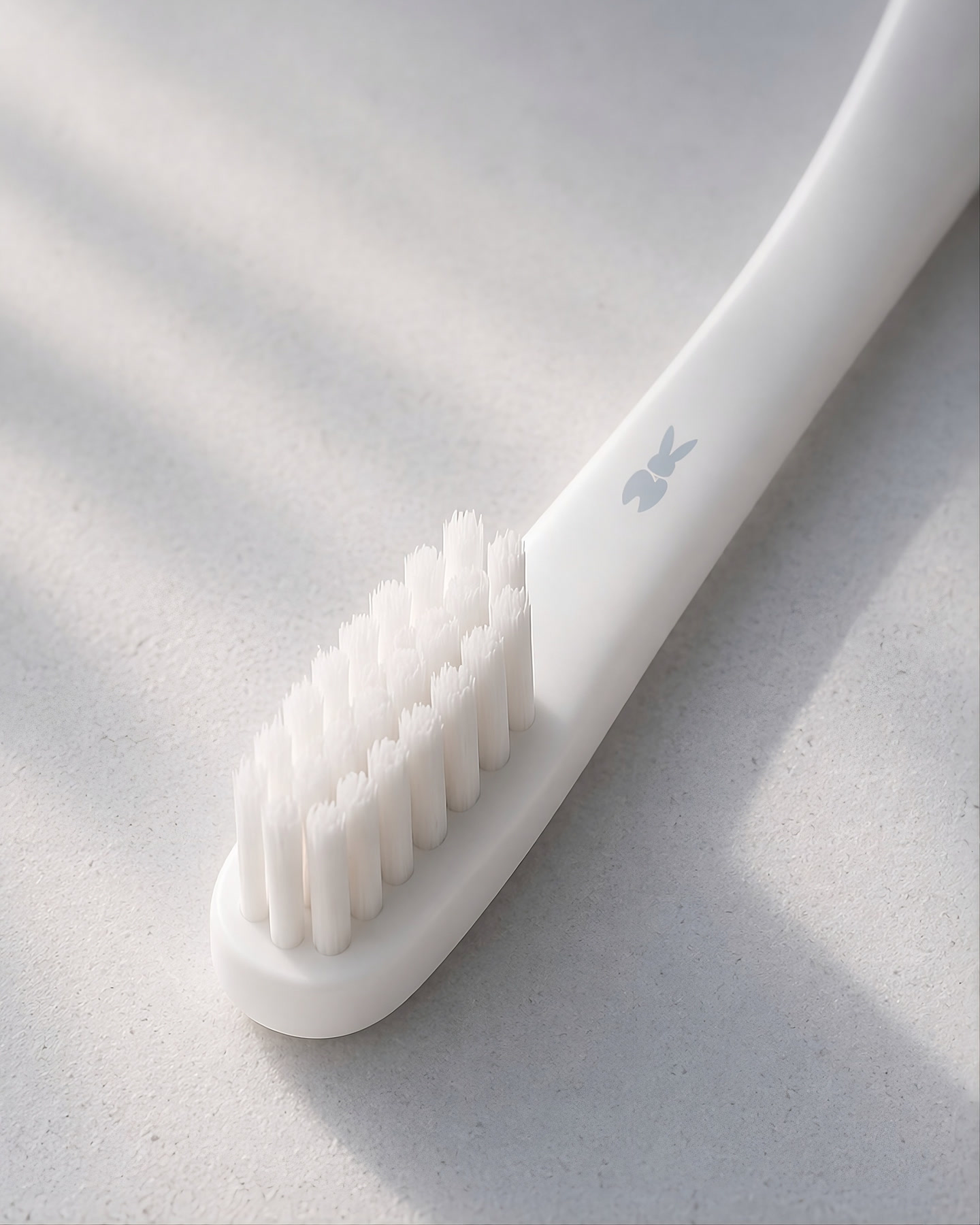
The mark is never outlined, never given a gradient and never set in two colours. At eleven millimetres on a brush handle it still holds, because the whole idea lives in the outline. From there it repeats across tape, box lining and paper, and the same restraint carries the card, the tube, the posters and the launch kit.
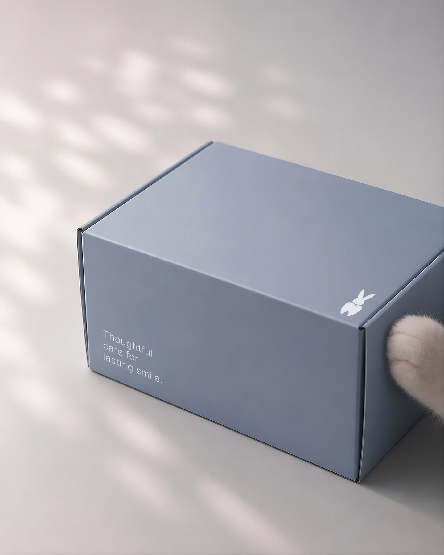
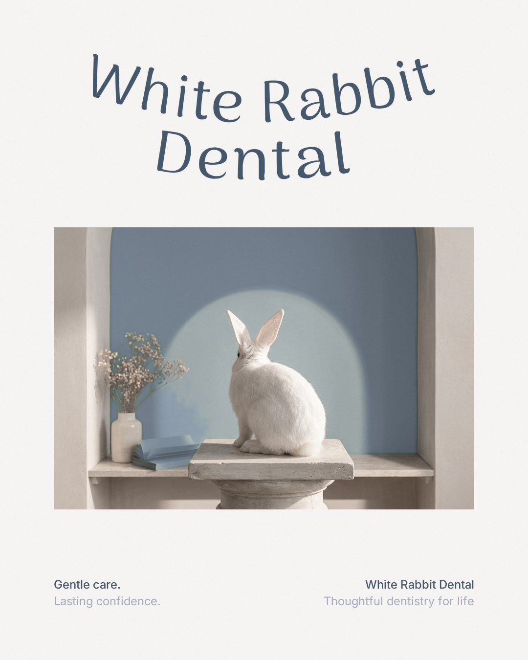
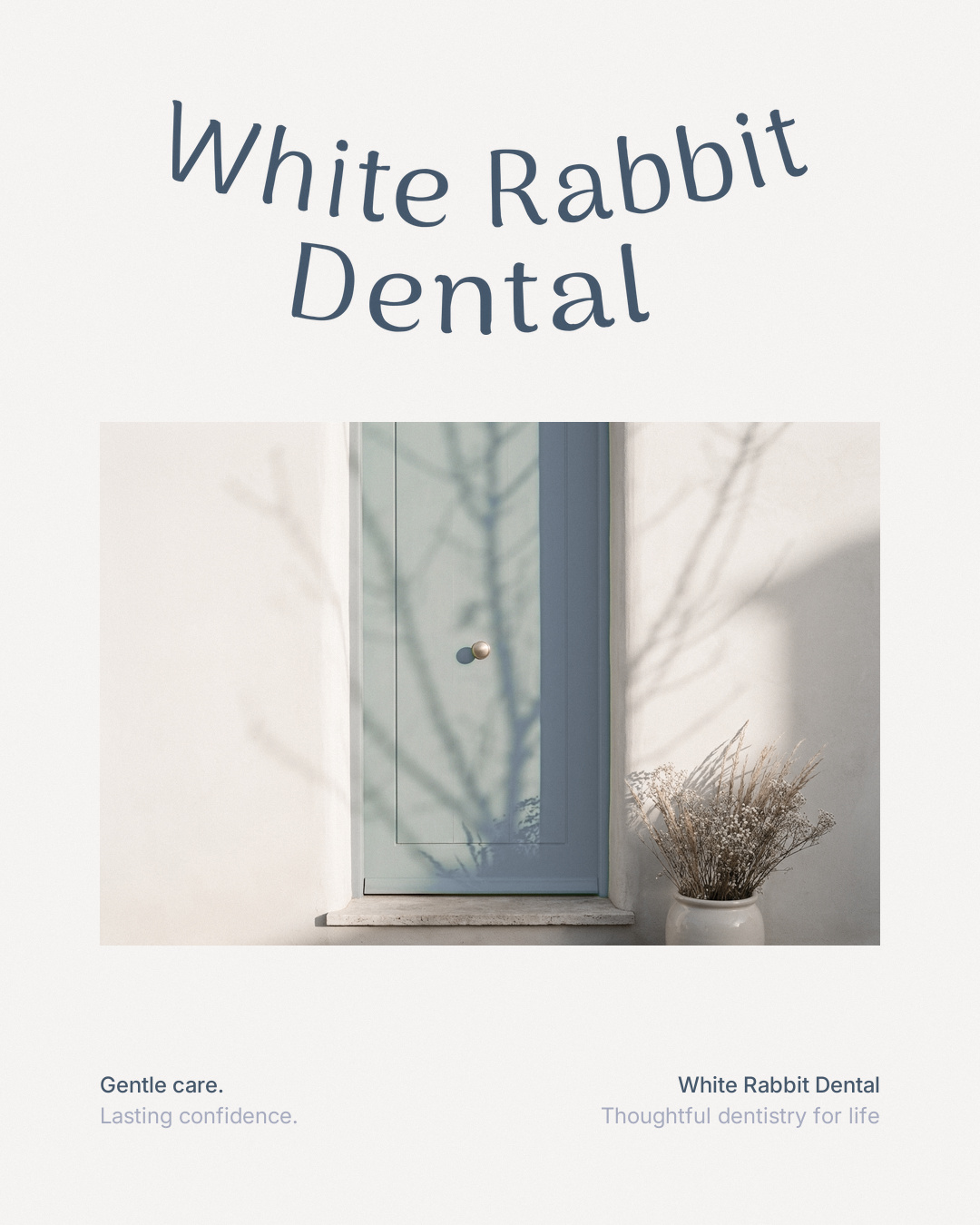
Repeated, the mark stops being a rabbit. The ears read as a row of small ticks across the tape and the box lining, and only up close does the molar come back.