Branding for an industrial company: where the brand is really seen.
An industrial company is rarely seen on a screen. Its brand lives on a sign by a gravel road, on the front of a truck, on a hard hat and on a sheet of paper that travels with a rock sample. The people who see it are working, often moving, sometimes wearing gloves. Here is what an identity has to do for them, shown on the one I designed for Aurevia, a Stockholm mining and materials company with its pit and plant in the Atacama.
Start from the place
Mining brands reach for the same pictures: a pickaxe, a crystal, a mountain. Aurevia started from something everyone on site knows from the cab: the haul road. Seen from above, a road that turns back on itself forms an A, and the name, Au for gold and via for road, says the same thing in words. A mark taken from the work itself needs no explanation to the people who do it.
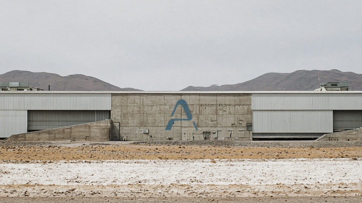
Signs are read from a moving cab
A driver has a second or two to read a sign. So on Aurevia's signs the pit number is set large, the distance and the haul road small, and every sign, panel and marker points with the same arrow. Learn one sign and you can read all of them.
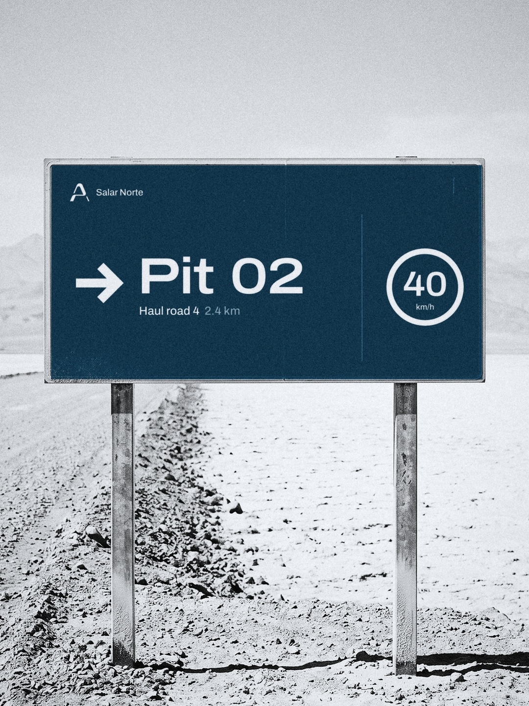
The logo once, the system everywhere else
Putting the logo on every surface turns it into noise. At Aurevia the A appears once on each thing: the hard hat, the truck, the plant wall. The rest is carried by fine parallel lines at a fixed spacing, which bend like the haul roads and run off the edge. They are painted on a concrete wall, sewn into the reflective tape on a jacket and printed on the paper tag of a sample, so a worker or a sample is recognisable without the A on it.
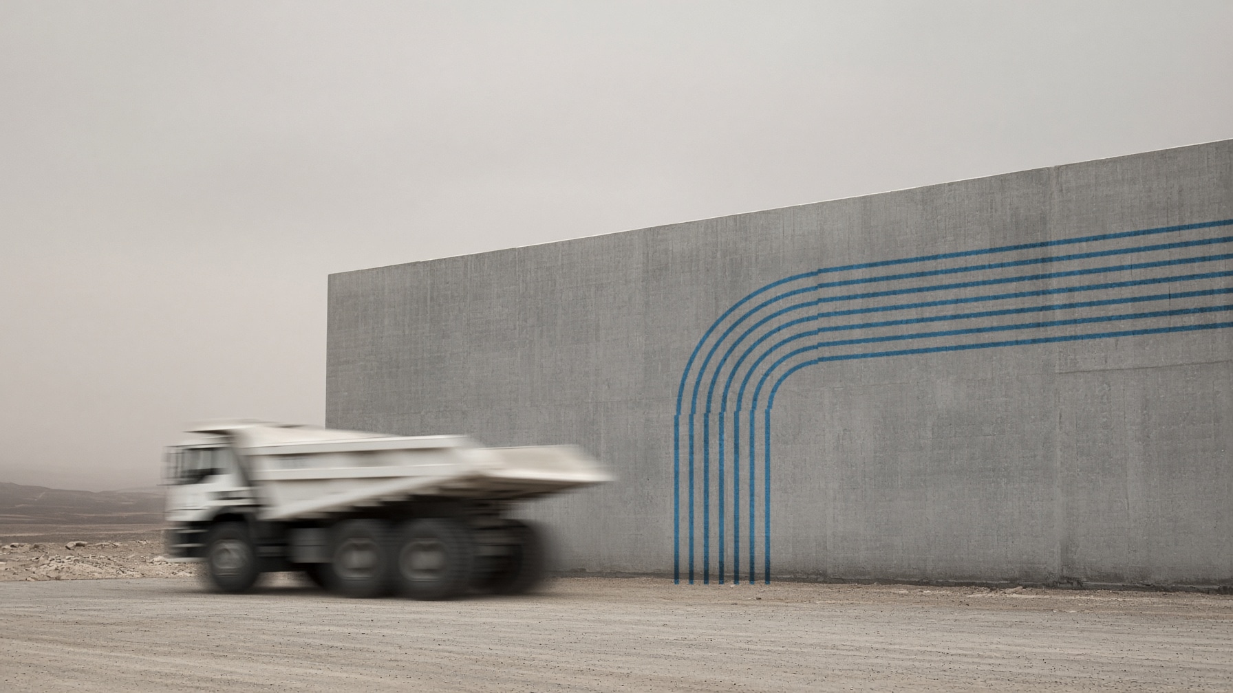
Colours from the site
Aurevia's palette is taken from the place: paper, deep teal, sand, haze, clay and asphalt. Colours like these sit well next to dust, steel and desert light, and they stay calm in an annual report as well as on a truck. One strong colour and a few quiet ones are easier to keep consistent across suppliers than a bright set that every printer and painter mixes differently.
The same parts on paper
The head office uses the identity in a reduced form: the paper ground, the teal, the wordmark and one road line, on badges, letters, the annual report and the record card for each sample. Paper is where buyers, investors and authorities meet the company, so it should look like the same company they would see on site.
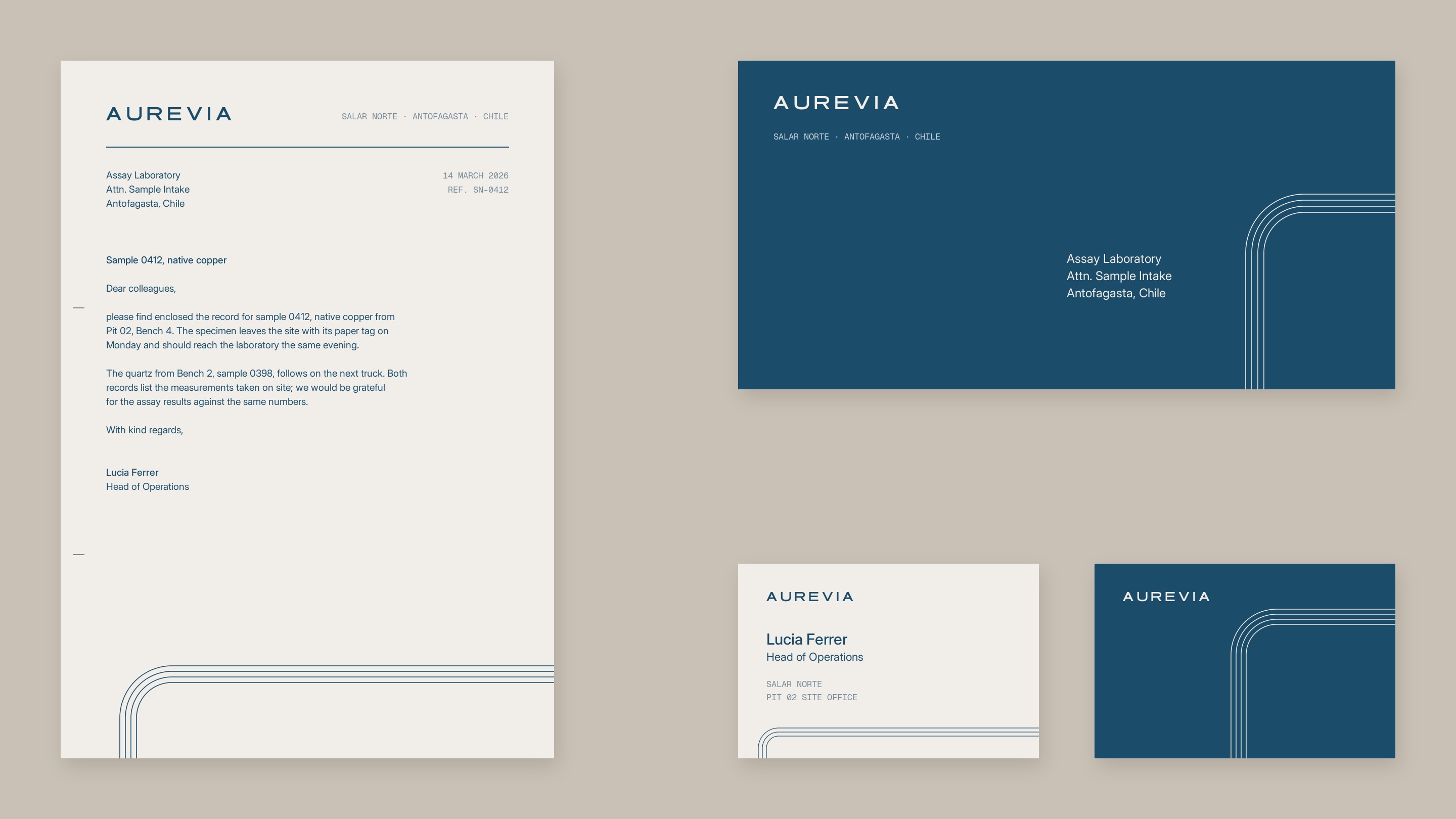
Built for the people who pass by
The same rule works outside mining. TIER's brand was seen for a second or two as a scooter went past, so the system kept few parts: a wide wordmark that reads on a moving scooter, two colours and one ribbon that bends like a road. An industrial brand is judged in the same short moment, by someone who has something else to do.
A good identity for an industrial company comes down to a few parts that people learn once and then recognise on the road, on the machine and on paper.

Brand identity for industrial and logistics companies · Logo and brand identity