Refresh the logo or start again: how to tell.
Many companies that write to me about their logo are not sure what they are asking for. They have a mark people know and a feeling that something about it is off. The first question is always the same: is it the idea that is wrong, or only the drawing?
When a refresh is enough
A refresh keeps the idea and redraws it. It is the right job when people recognise the logo, the name is staying, and the complaints are about how it looks: it blurs when it is small, the spacing is uneven, the letters come from a typeface nobody can find any more.
A technology company in Tennessee came with a concept it liked and the sense that it was not finished. The job was to make it clearer and give it more weight without turning it into something else. A company on Long Island asked for the same thing in more formal words: structural optimisation of an existing concept, and then the versions around it.
What actually changes in a refresh
Less than people expect, and that is the point. Lines are redrawn so that curves run true and corners meet. The spacing between letters is set by eye. Stroke weights are evened out so the mark survives at 16 pixels and as embroidery. Then come the versions most old logos never had: a simplified one for small sizes, one in a single colour, one for a dark ground.
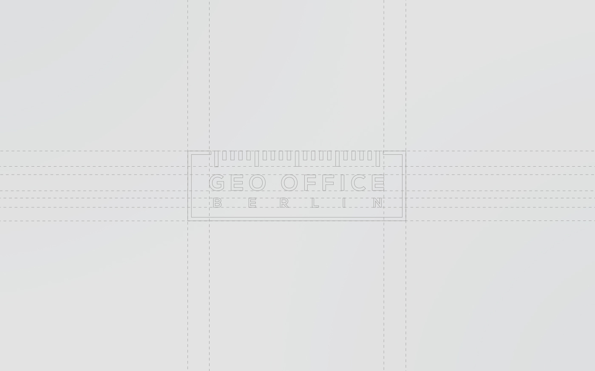
This is what a constructed logo looks like before the colour goes on. The Geo Office Berlin mark was new, but a refreshed logo is checked against the same kind of grid.
When the rules cannot move
Some organisations cannot change their name, their wording or their colours, and still need to look better. A statewide cybersecurity agency in Florida was in that position. The required text had to stay in the mark and the colour system was fixed. Inside those limits the logo was redrawn in the manner of a government seal, so that it reads as an authority and as people who know technology.
When the logo is only a draft
Sometimes there is no old logo, only a sketch the founders made themselves. A company in Essen had such a draft. It became a proper word and picture mark, the symbol on the left and the name and claim to its right, in two versions: one drawn in lines, one in dots.
When to start again
A new logo is the better investment when the name changes, when the company now does something the old mark cannot stand for, or when the mark came from a template and three competitors carry its twin. It is also time when the logo is the only thing holding the brand together and there is nothing around it worth keeping.
And sometimes the logo stays and everything around it is rebuilt. A non-profit company in Heilbronn kept its logo, had it refined, and then got what it had been missing: a visual world, a type system, and one structure for the umbrella brand and the brands beneath it. The same question, at a larger scale, was behind the redesign for Silk Way Airlines, where the parent brand and its sub-brands were drawn as one system.
How long it takes
A refresh is quicker than a new identity, though it starts the same way: within a week, often sooner, you see directions, from a careful redraw to a bolder one. The rest of the schedule is set around your deadline.
If you are not sure which of the two you need, send me the logo. I will tell you honestly what I would keep.

Brand identity · A new brand identity for a company anniversary · A new brand identity when the business changes hands