Branding for a café or a bakery: what it really needs.
A café does not win people with the logo on its website but with the cup in their hand, the bag on the counter and the poster in the window. So an identity for a small shop has to be built differently from one for a company. Here is what it needs, shown on three examples: Walkin' Coffee in Munich, the sourdough bakery BRUTAL in Copenhagen and Forester Coffee in New York.
One picture that comes from the shop
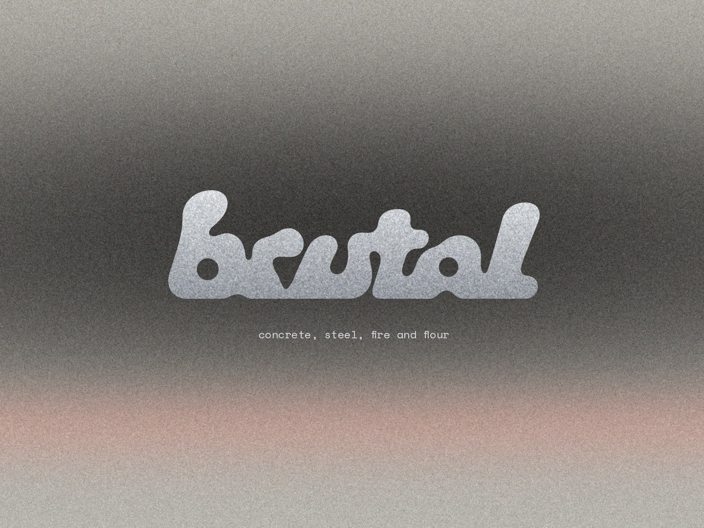
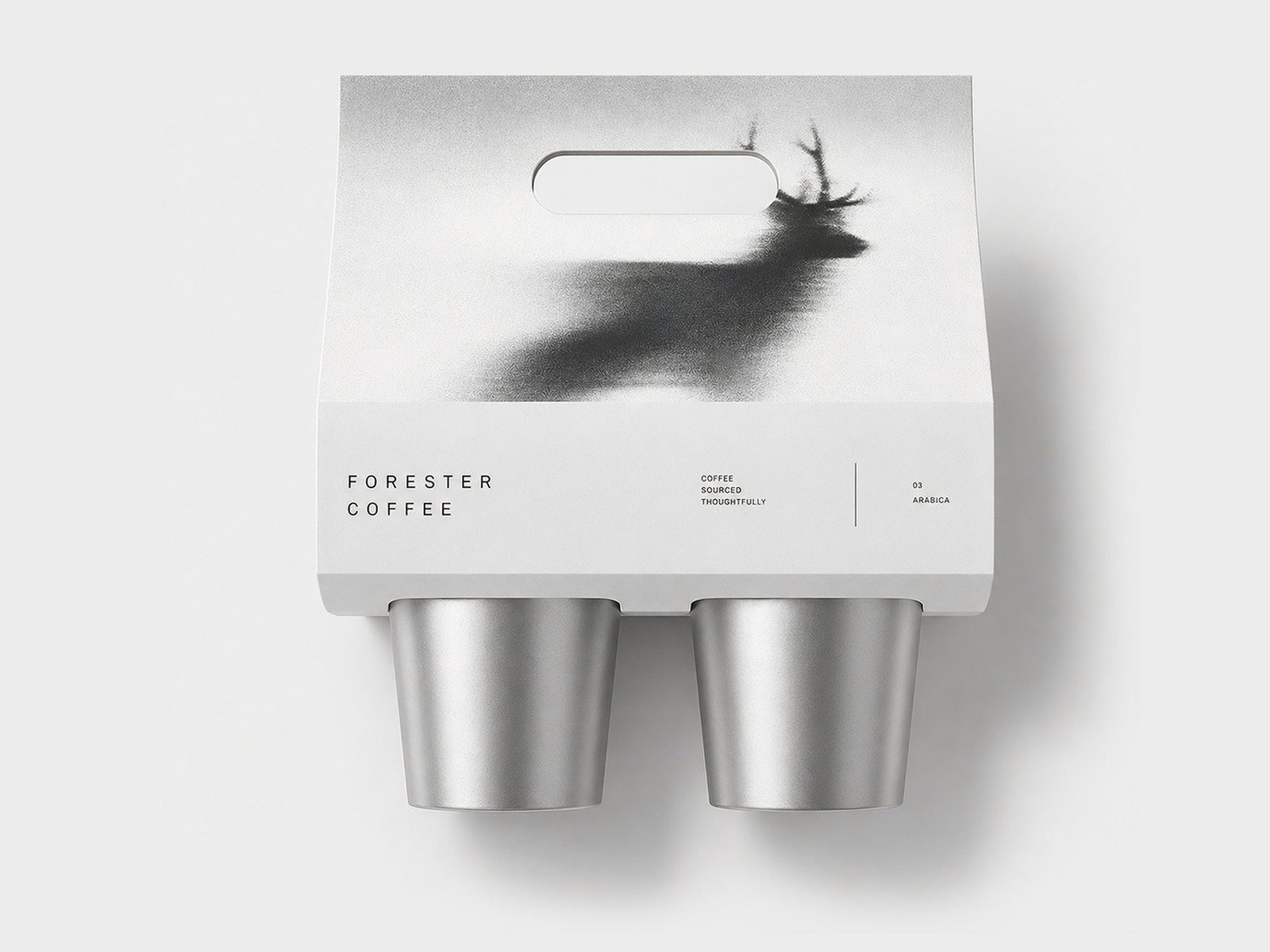
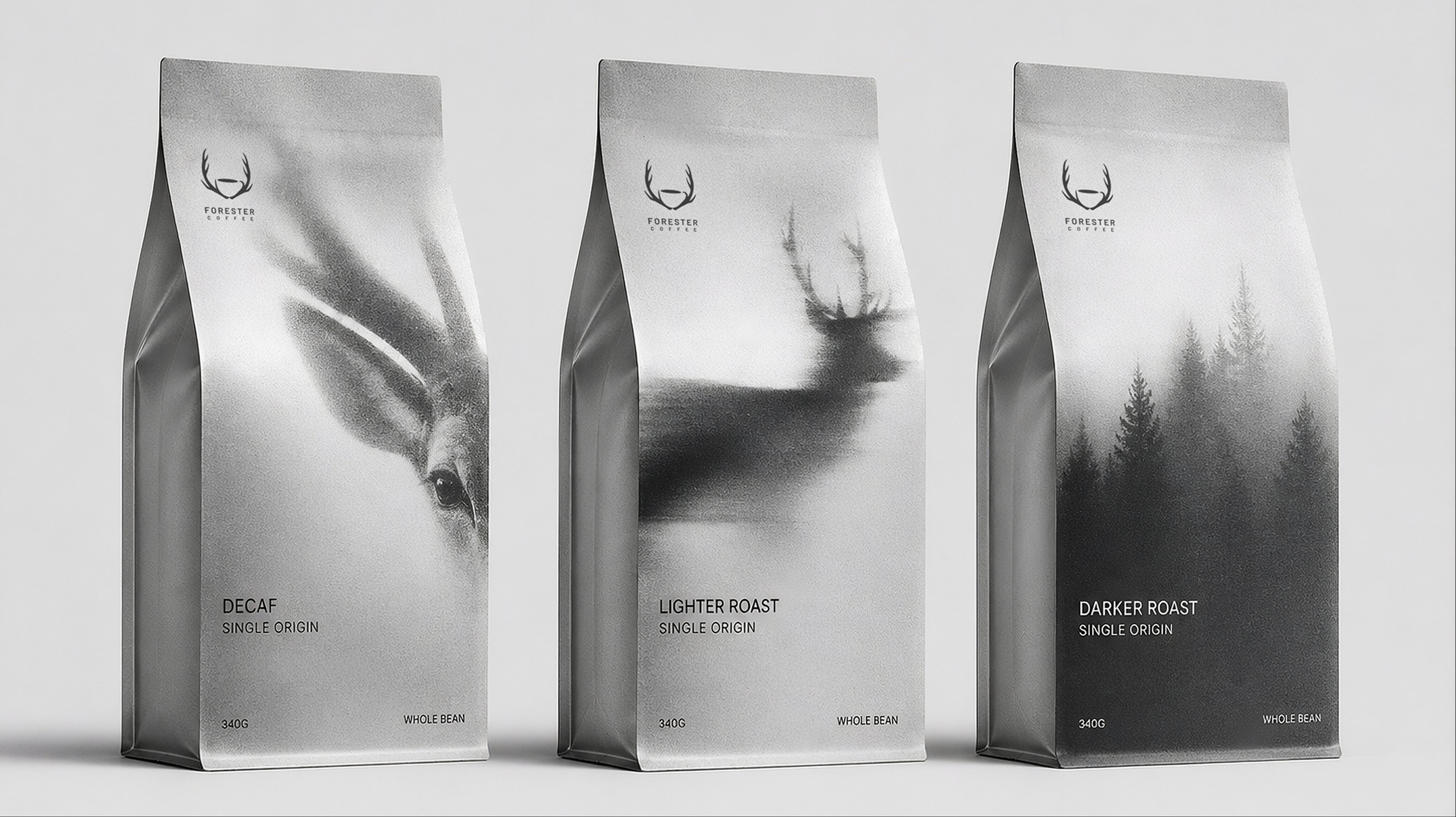
The strongest café marks tell how the shop works. At Walkin' most people take their coffee with them, so the cup in the logo walks. At BRUTAL the letters are soft and round like dough on its second rise, in a room of concrete and steel. At Forester antlers grow out of a cup. Everything else follows from that one picture, from the packaging to the poster.
It has to work small
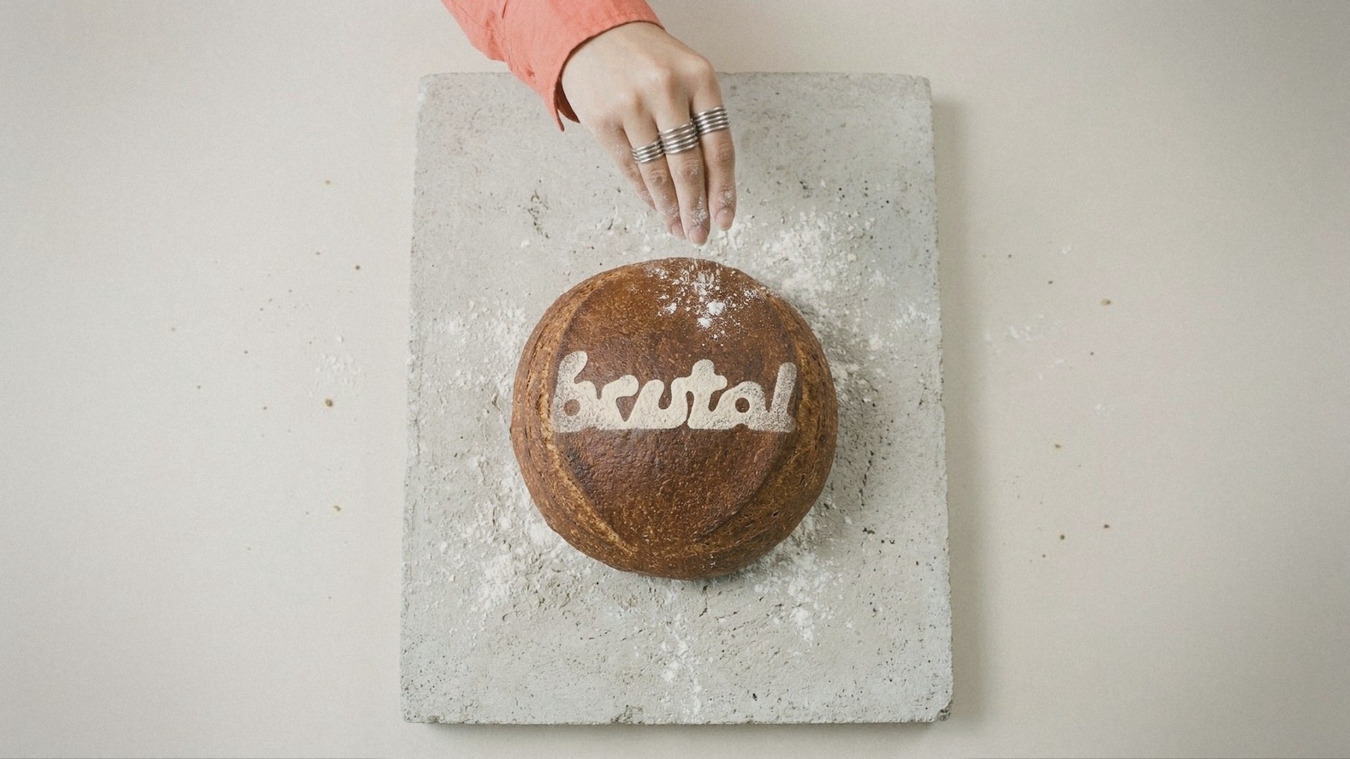
A café's mark is rarely big. It sits on a cup, a stamp, a paper band. At Walkin' the cup is printed small on the blue band that closes every bag. At BRUTAL the logo is stamped by hand in brown ink on the bread bags and sifted in flour through a stencil onto the loaf just before it goes into the oven. A mark that only looks good large is the wrong one for a café.
Packaging: plain, with one thing that carries it
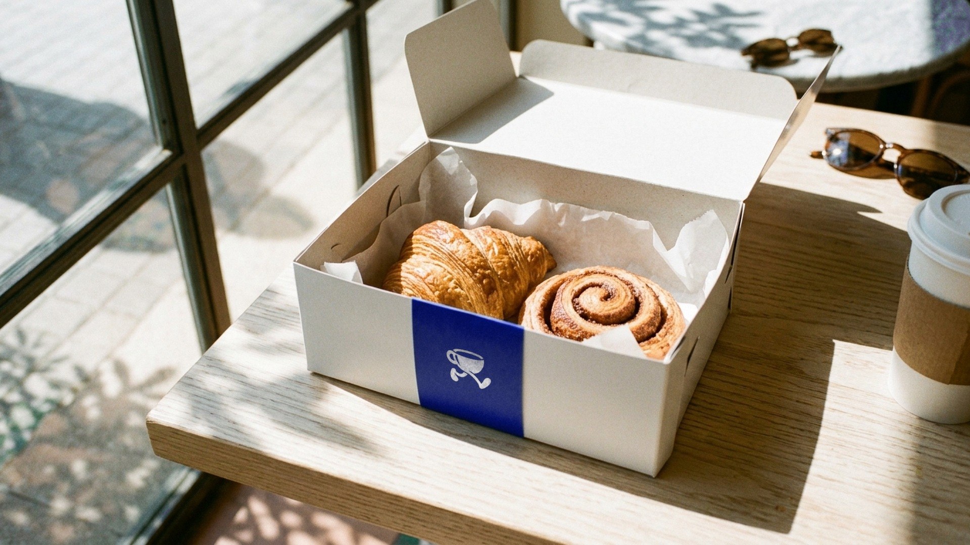
Cups and bags printed all over in colour cost a lot and soon look busy. At Walkin' the packaging stays white, and one blue paper band with the small cup closes every bag and box, so a stack of orders on the counter still reads as Walkin'. Forester goes the other way and makes everything the same aluminium grey: coffee bags, cups and tableware.
Small things people keep
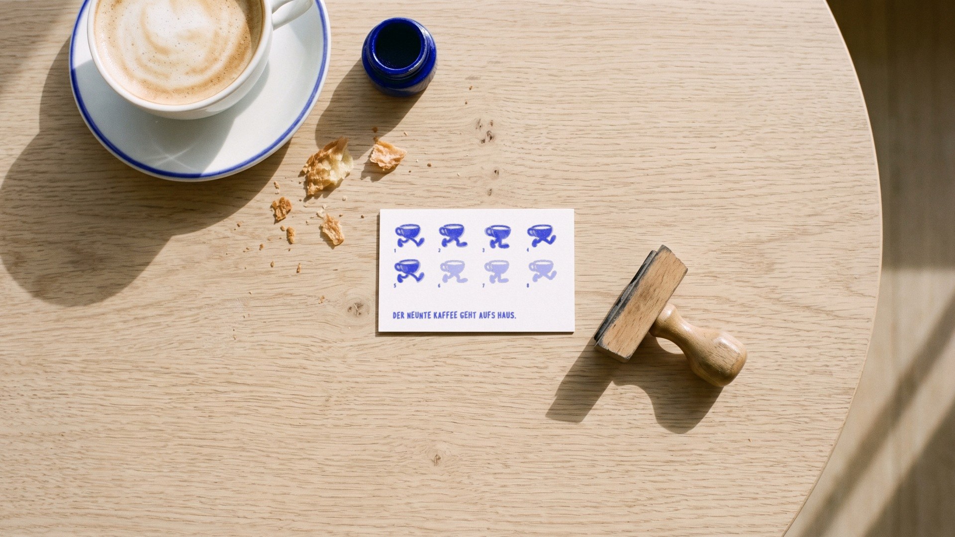
The loyalty card is often the piece of the brand that stays longest in a wallet. At Walkin' the cup on it takes one more step with every coffee, and the ninth is on the house. Price tags, menu and pictograms are drawn with the same pen as the logo, so the counter reads as one piece.
Short lines, not advertising copy
A poster in a café is read in passing. "Baked at three. Gone by noon." says everything about fresh bread at BRUTAL in six words. At Walkin' a drawn pastry sits next to one short line, the way people talk at the counter.
The room is part of it
Colours and materials work best when they come from the shop itself. BRUTAL's palette is concrete, chrome and dark walnut, with coral as the only warm colour. At Forester metal antlers hang above the entrance and behind the bar. That way the room, the packaging and the Instagram feed belong together.
Movement for Instagram
These days a café is often found on a phone first. A short clip in which the mark does something stays longer than a photo: at Walkin' the cup walks for eleven seconds across different surfaces, one step per picture.
Good branding for a café is not a thick manual. It is one picture, a few colours and a typeface that work equally well on the cup, the bag and the poster.