A new brand identity for a company anniversary.
Ten, twenty-five or fifty years: many companies use an anniversary to change how they look, and in my work it is one of the most common reasons a project starts. The date is fixed, customers and staff are paying attention anyway, and the founder or the next generation wants to show that a new chapter is beginning. Here is how to use the anniversary for a new identity without losing the company's history.
Why the anniversary is the right moment
A logo drawn twenty years ago was made for a letterhead, a business card and a fax. Today it has to work as a small profile picture on a phone, on a website most people open on their phone first, and in an Instagram post. That is why many older identities look tired, even though nothing about them is wrong. Customers notice before they can say what it is.
The anniversary gives the change a reason everyone understands. A new logo out of nowhere raises questions. A new logo for the twenty-fifth year tells a story: the company has been around for years, and it plans to stay.
Anniversary logo or a new identity
These are two different things. An anniversary logo is an addition for one year: "25 years" next to the mark, on the commemorative brochure, the letterhead and the vehicles. Then it goes away. A new brand identity stays: mark, type, colours, website and templates for the next ten years.
The two work well together. The new identity launches on the anniversary, and the anniversary mark is built from the new elements, so the celebration year already shows the brand that will remain.
What to keep from the old look
Long-standing customers should still recognise the company. There is usually something they connect with it: a colour, a shape in the old mark, the story behind the name. It is worth keeping and drawing more clearly. Replace everything at once and the company starts to look like a new one, which after twenty-five years is rarely the goal.
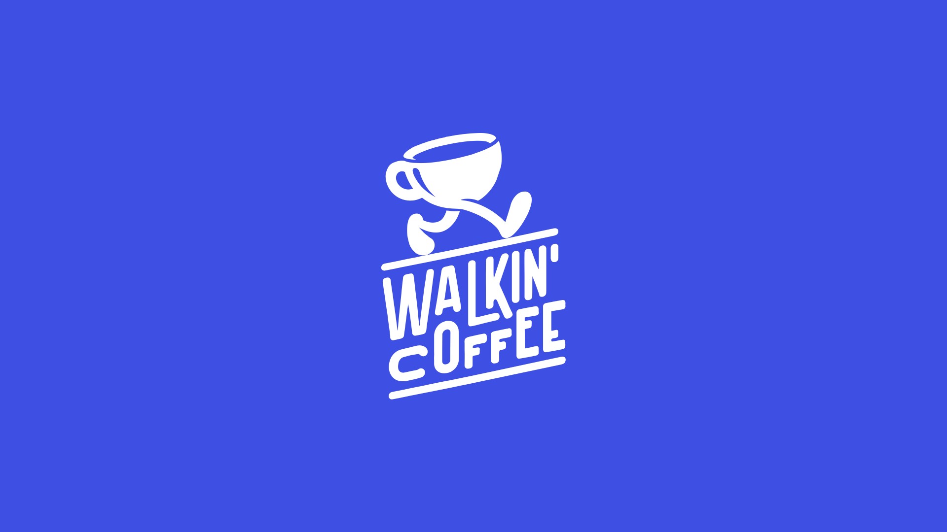
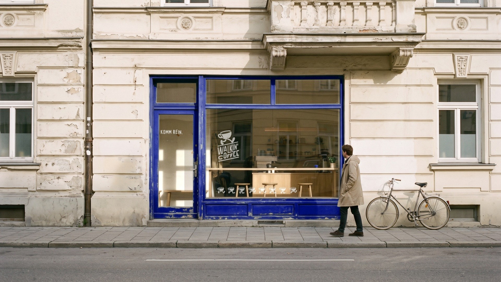
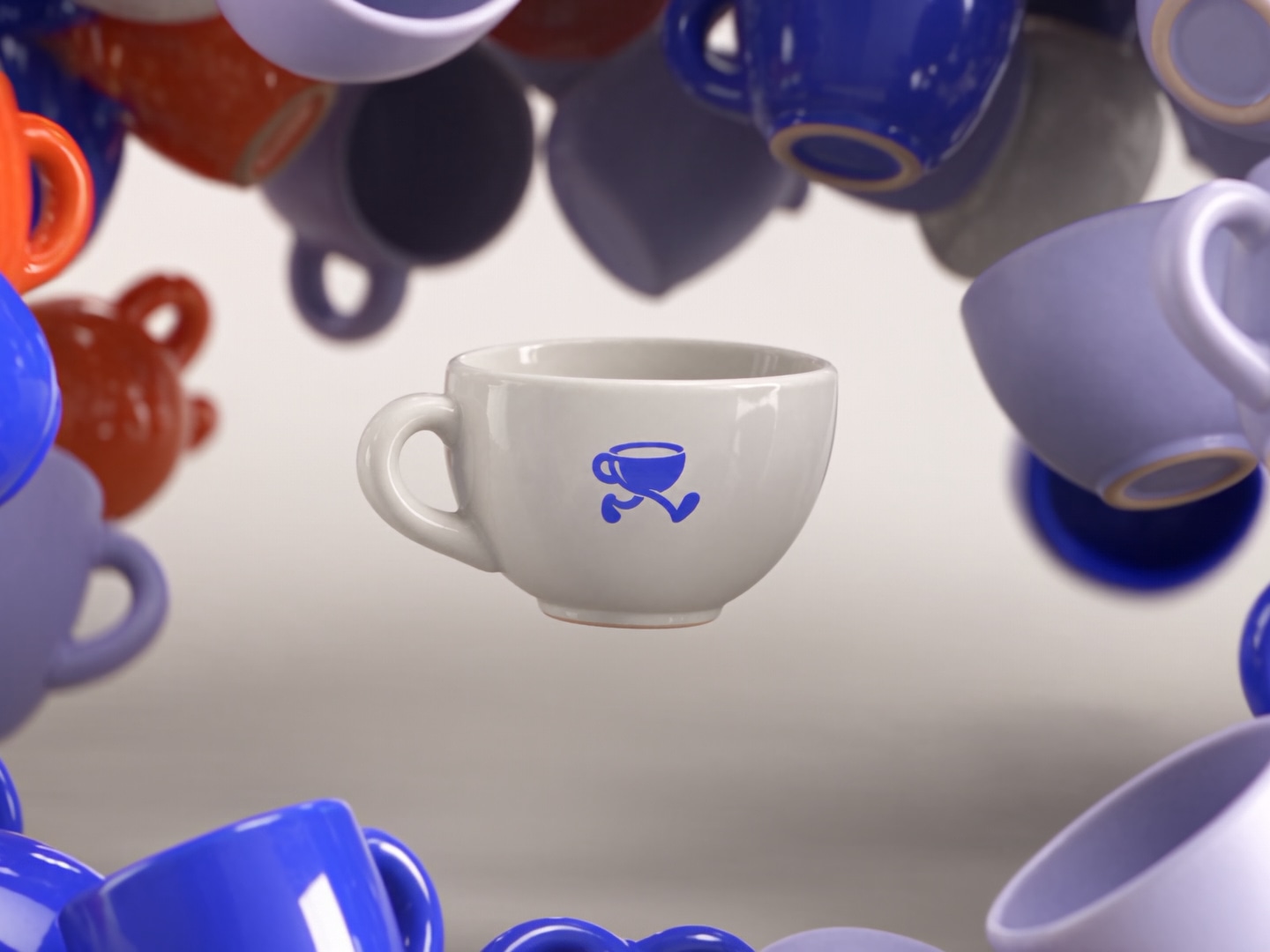
At Walkin' Coffee in Munich the logo already had one stride in it: a cup that walks. The new identity draws the rest of the step, four positions of the same cup, and uses them on everything the shop prints. The familiar mark stayed, and a whole system grew out of it.
What can change
Type, photography, the website, templates and the way the company speaks. This is where it shows that the company keeps up with the times. A new look also reaches people who overlooked the company until now: younger customers, new markets, and skilled staff who look at the website before they apply.
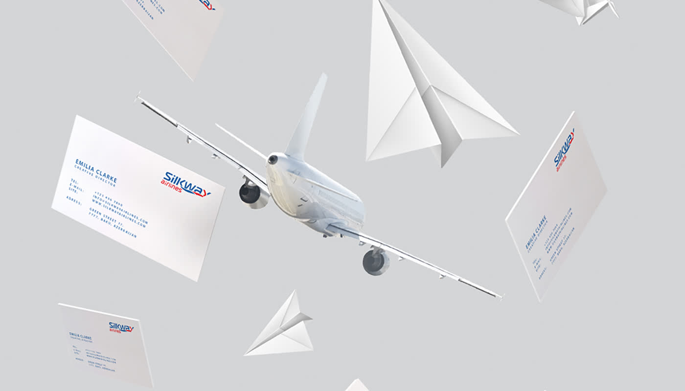
Silk Way Airlines shows how far a new identity can reach. It is the air cargo company of a group with 26 enterprises in aviation, and the whole structure was redesigned: the parent brand and the sub-brands Silk Way Airlines and Silk Way Ground Handling, in one system and still told apart. The identity builds on what defines the group: its position on the old trade route between Europe and Asia, shown in a modern, restrained form.
Plan backwards from the date
The anniversary date does not move, so the plan starts from the date and works backwards. The design itself is quick: my first concepts come within a week, and most identities are finished in three to five weeks. What takes longer is everything after that. Signs, vehicle livery, workwear, print and the new website all need lead times and coordination.
So it pays to start about six months before the anniversary. That leaves time for printing and production, and everything is ready on the day.
Show the new identity on the anniversary
On the day, everyone is watching. That is when the new website goes live, customers and partners receive a short letter explaining why the company is changing its look, and social media shows the old and the new mark side by side. Vehicles, signs and print can follow over time, as they are replaced anyway.
Your own staff should see the new identity before anyone else, with a few sentences on why the company is changing. They are the first people customers will ask about it.
If your anniversary falls within the next twelve months, now is a good time for a first conversation.
Brand identity · Brand identity for industrial and logistics companies · Website and brand identity for construction companies · A new brand identity when the business changes hands