Trizon Timing
A single line that keeps the clock for endurance races.
2026
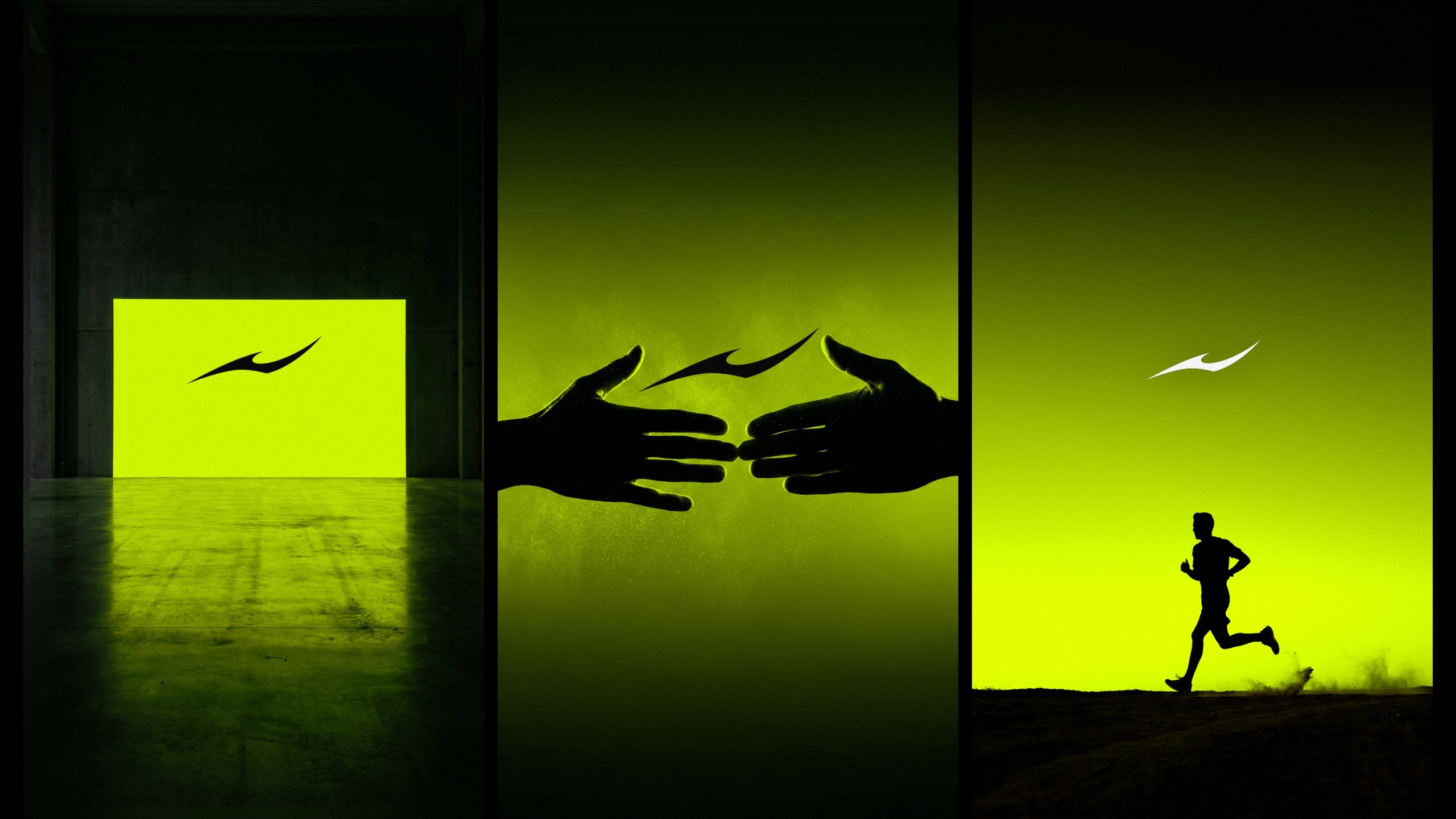
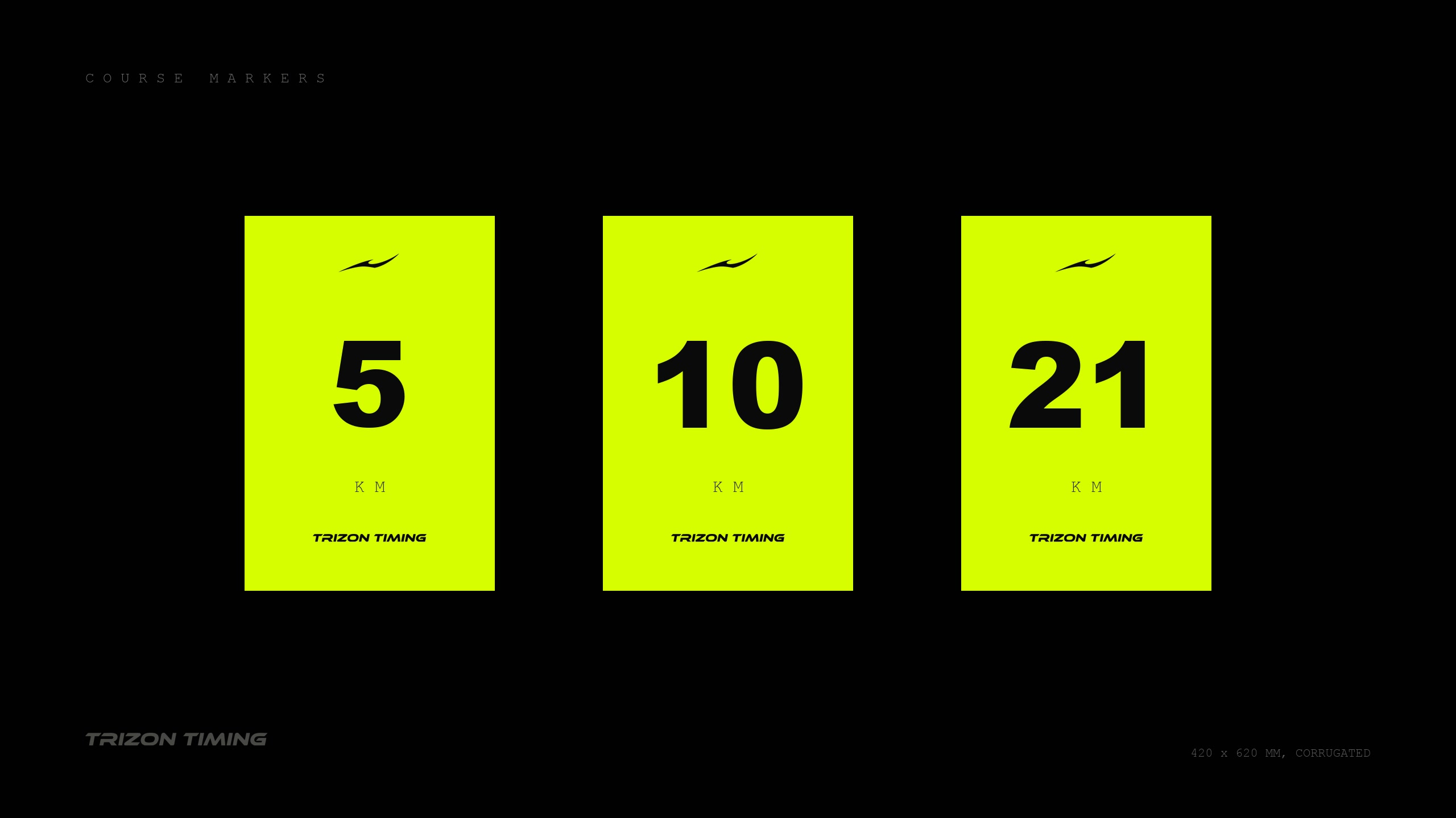
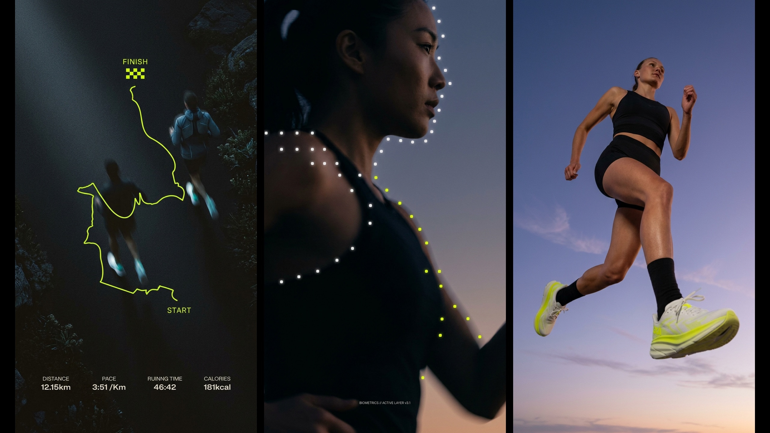
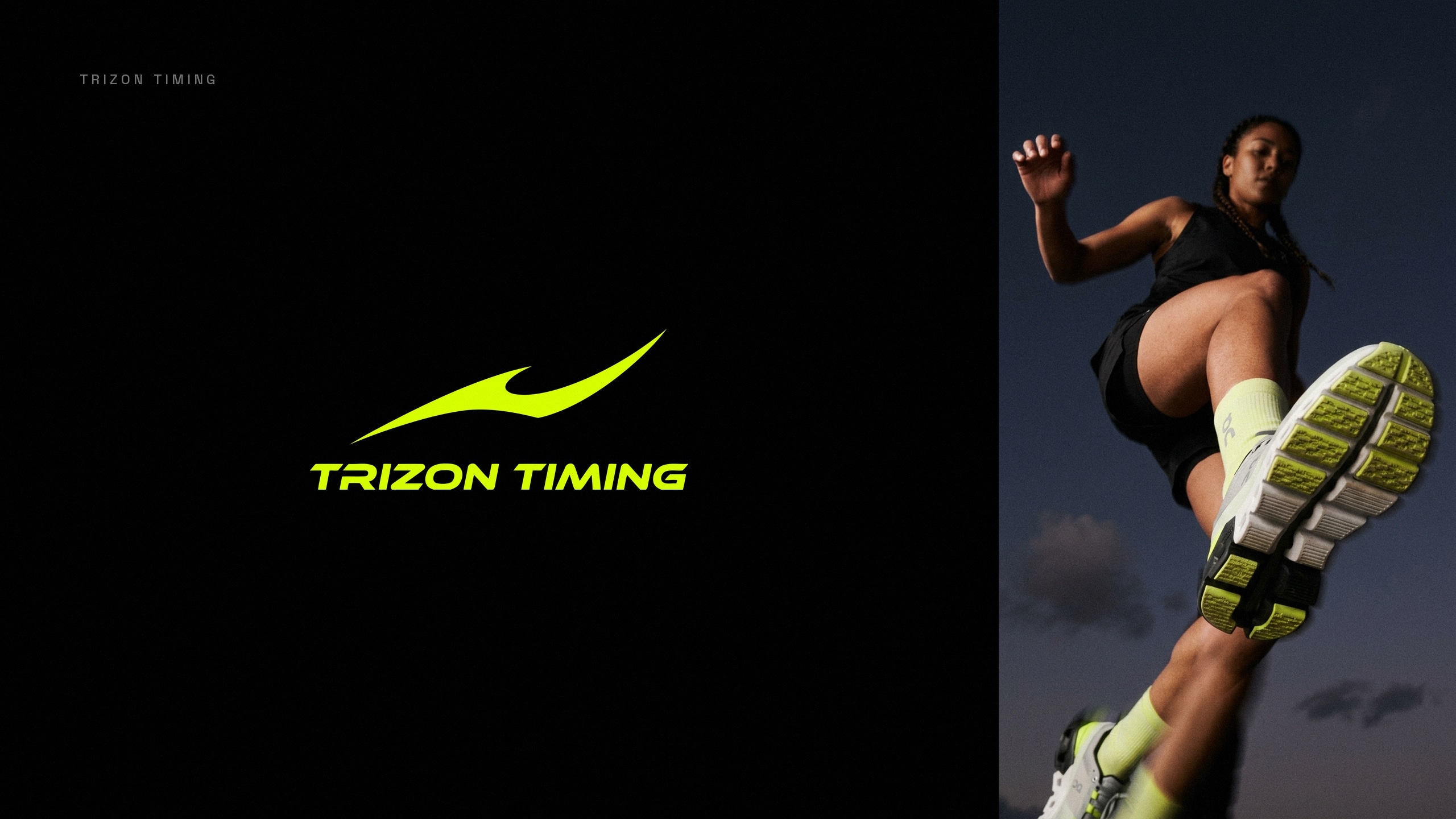
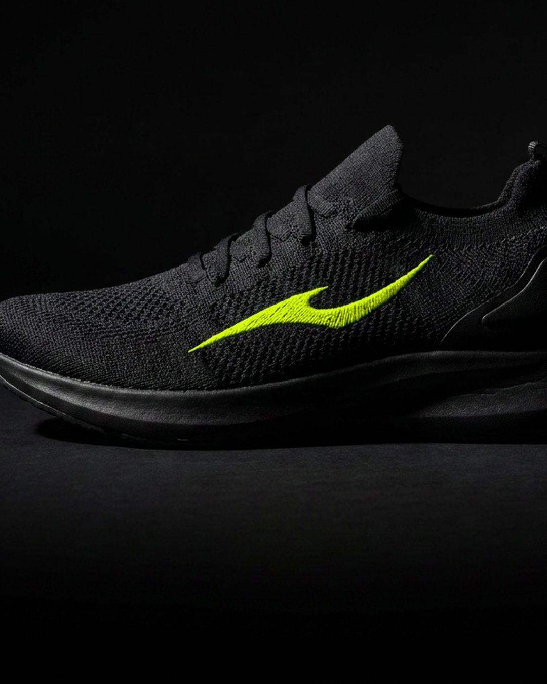
Trizon Timing keeps the clock for endurance races in northwest Mexico. The identity runs on a single line, drawn once as the shape of a body leaning into speed, and used from there as the mark, the logotype and the motion.
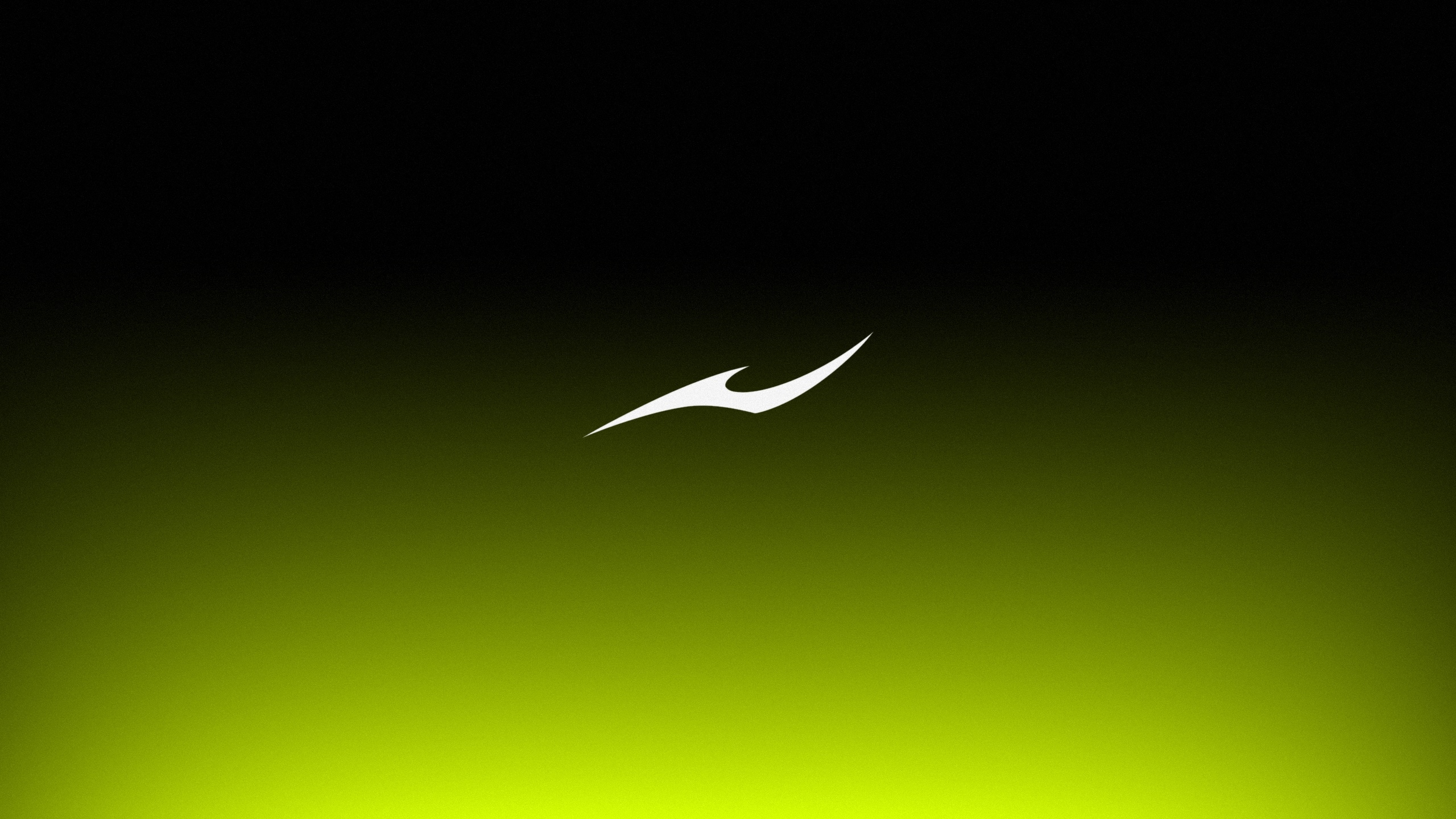
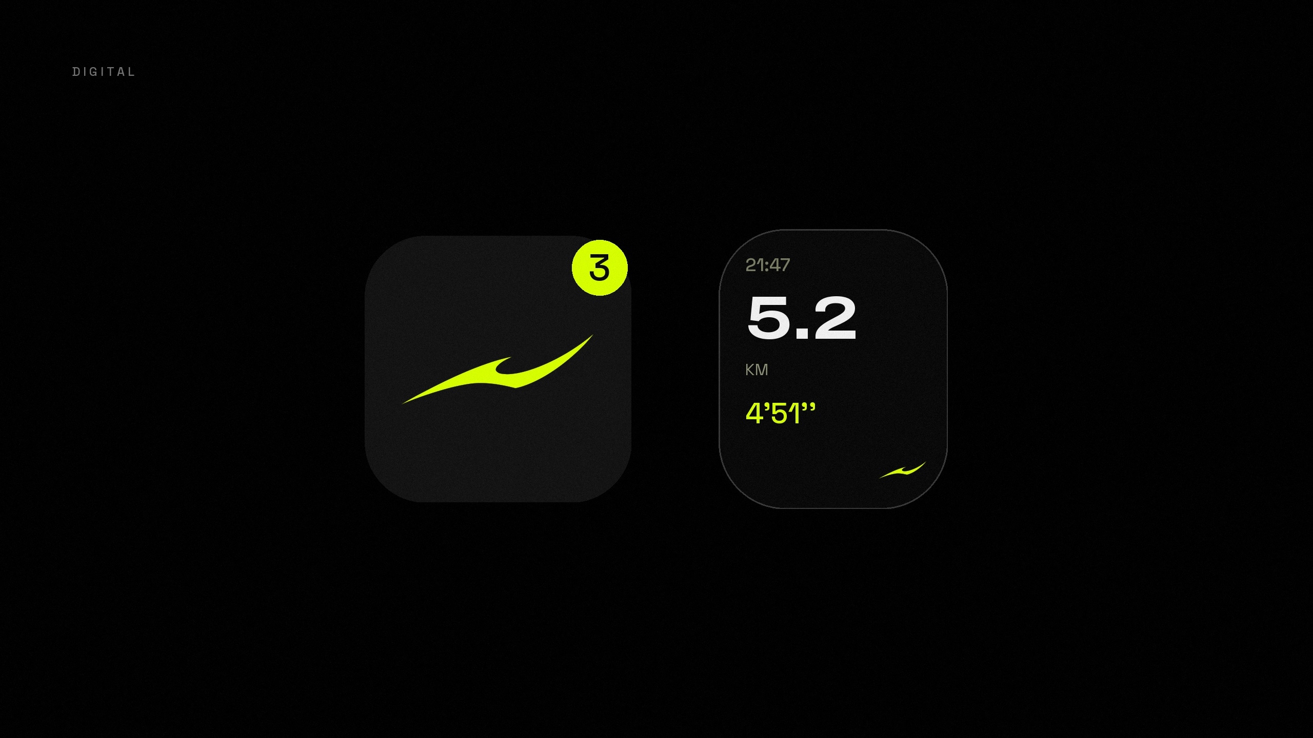
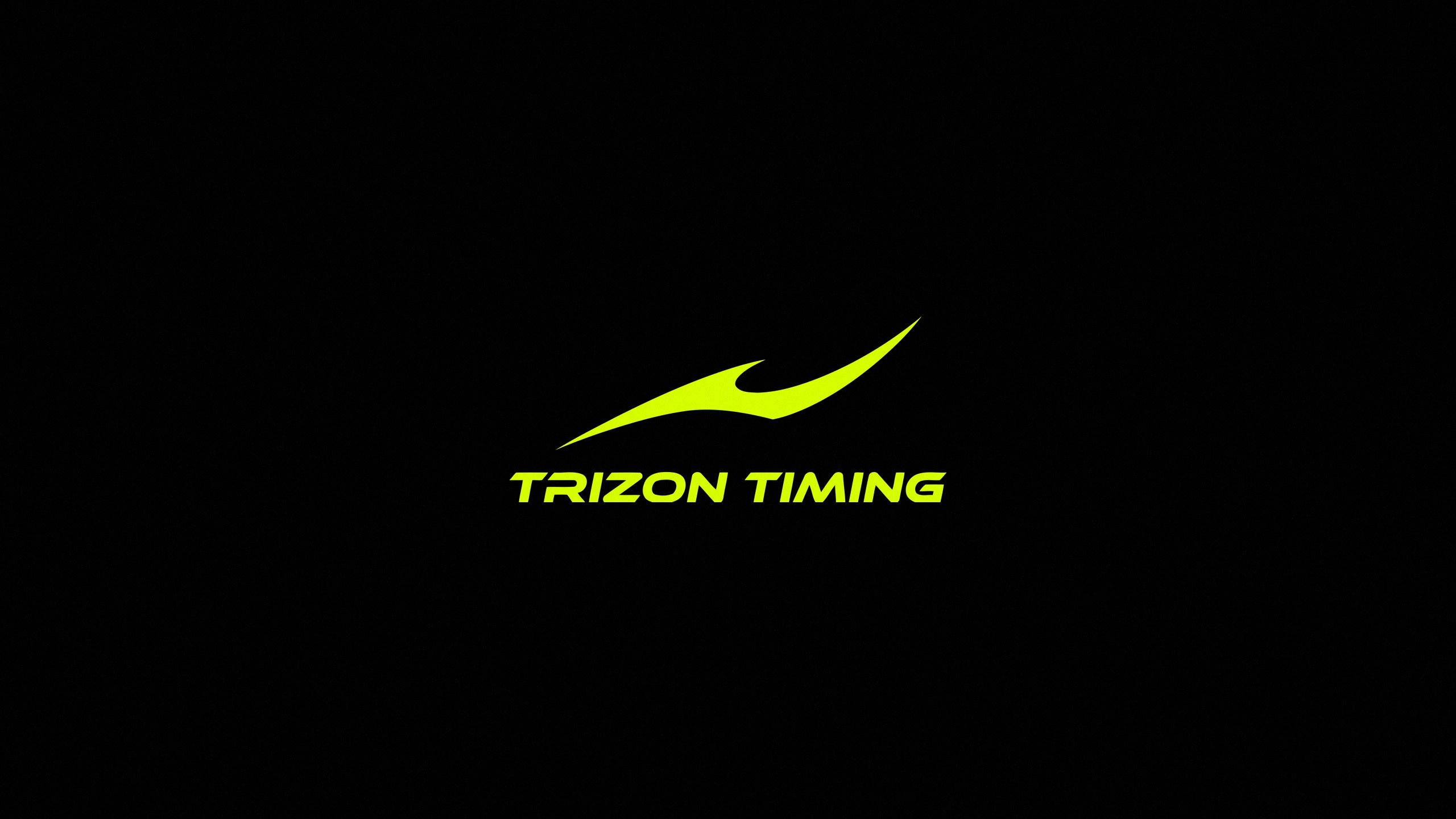
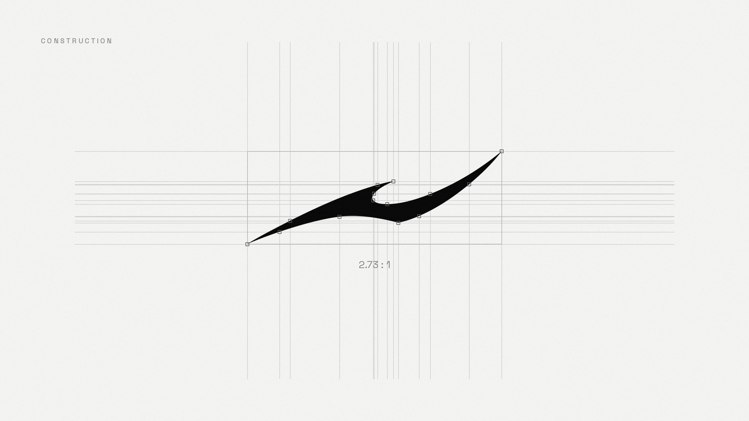
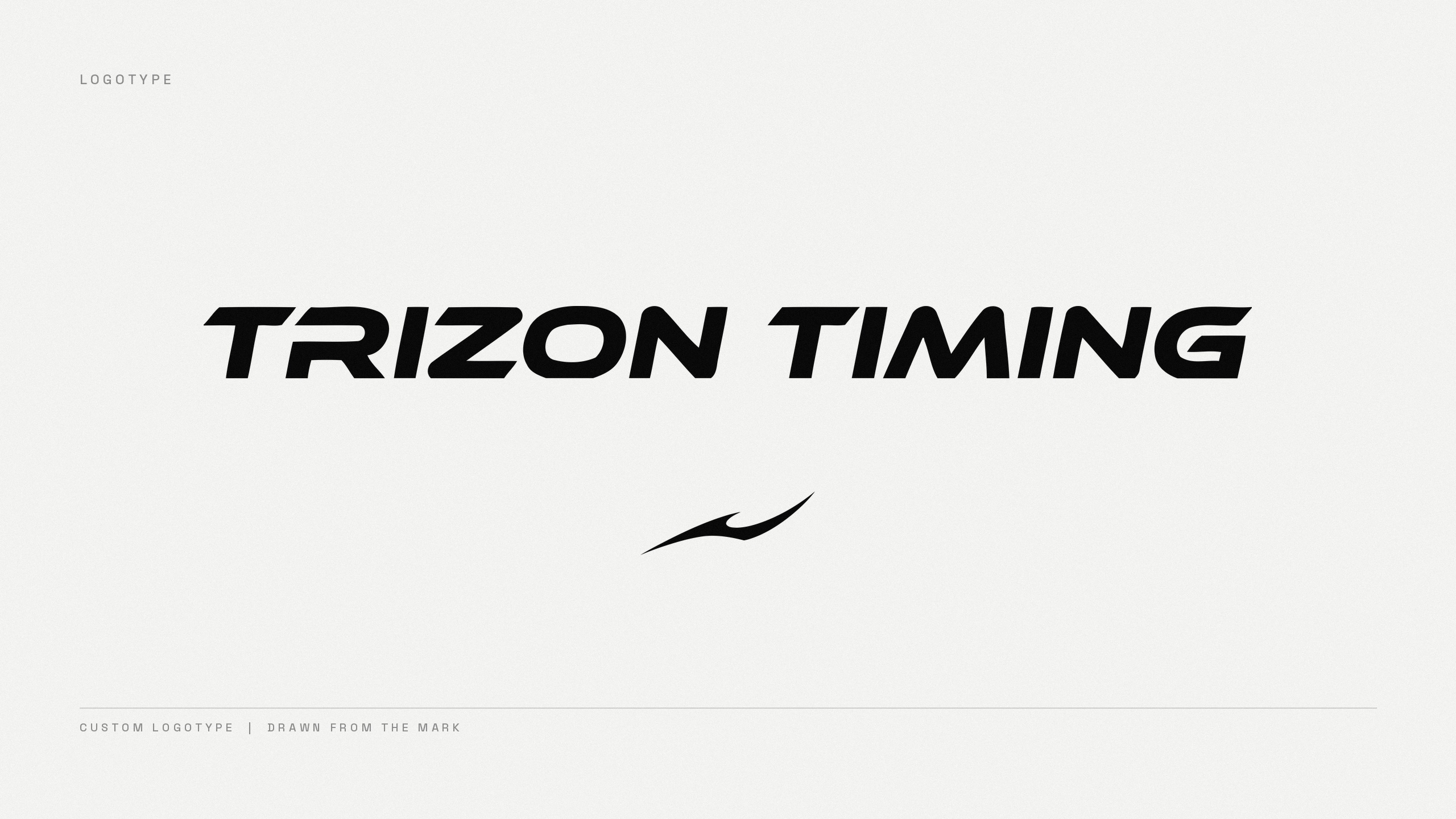
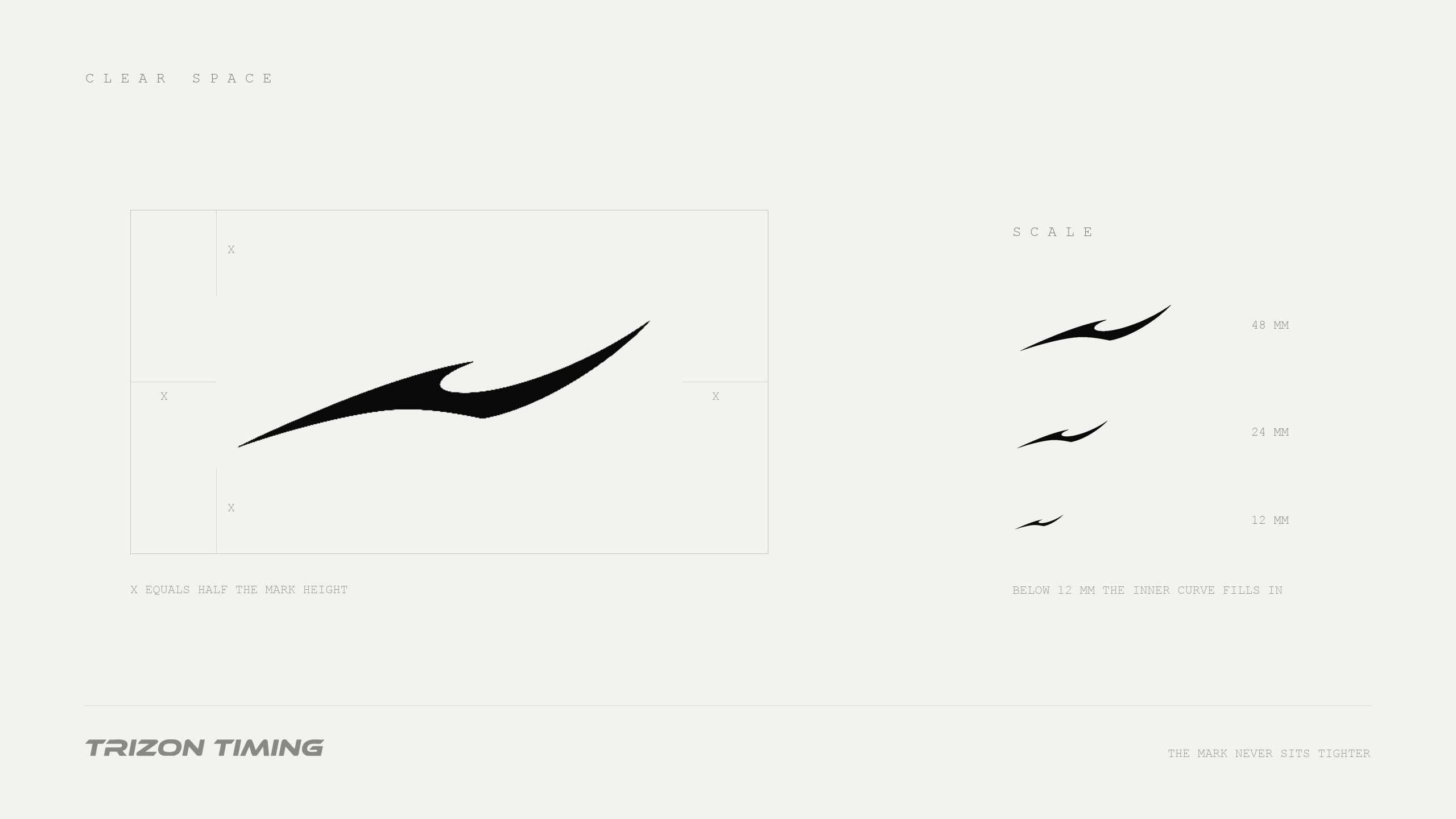
The curve is constructed on a fixed grid so it holds the same tension at any size, from an app icon to an embroidery on a shoe. The logotype is custom and cut from the same geometry, italic and tight, and sits under the mark in the full lockup.
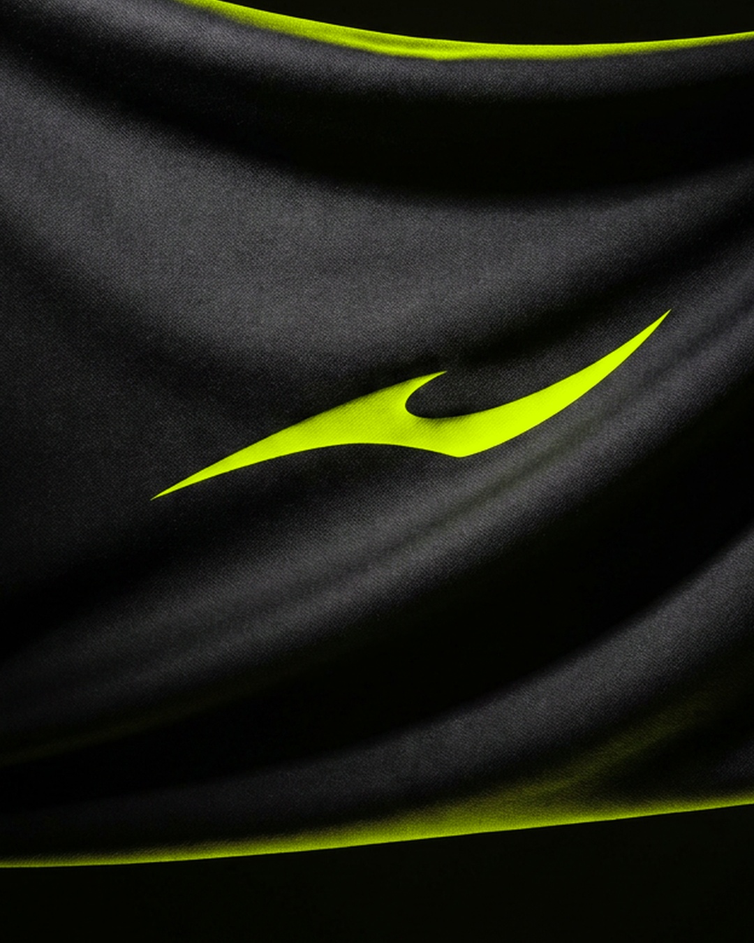
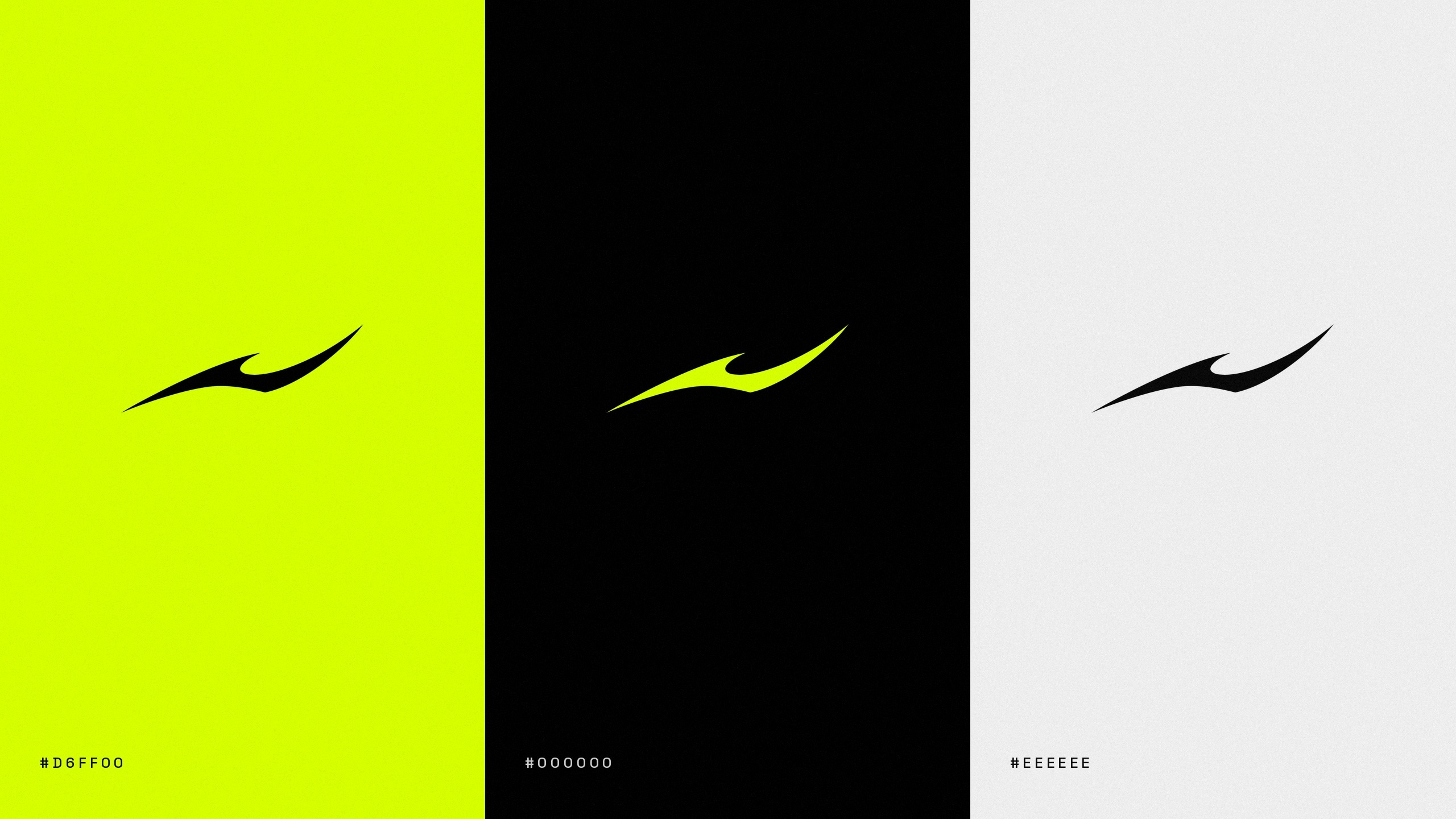
Three colours carry everything. Fluorescent lime does all the signalling, black holds the night events, off white takes print. In motion the line draws itself, then becomes a timing counter and a lap sweep, so the brand and the clock end up the same shape.
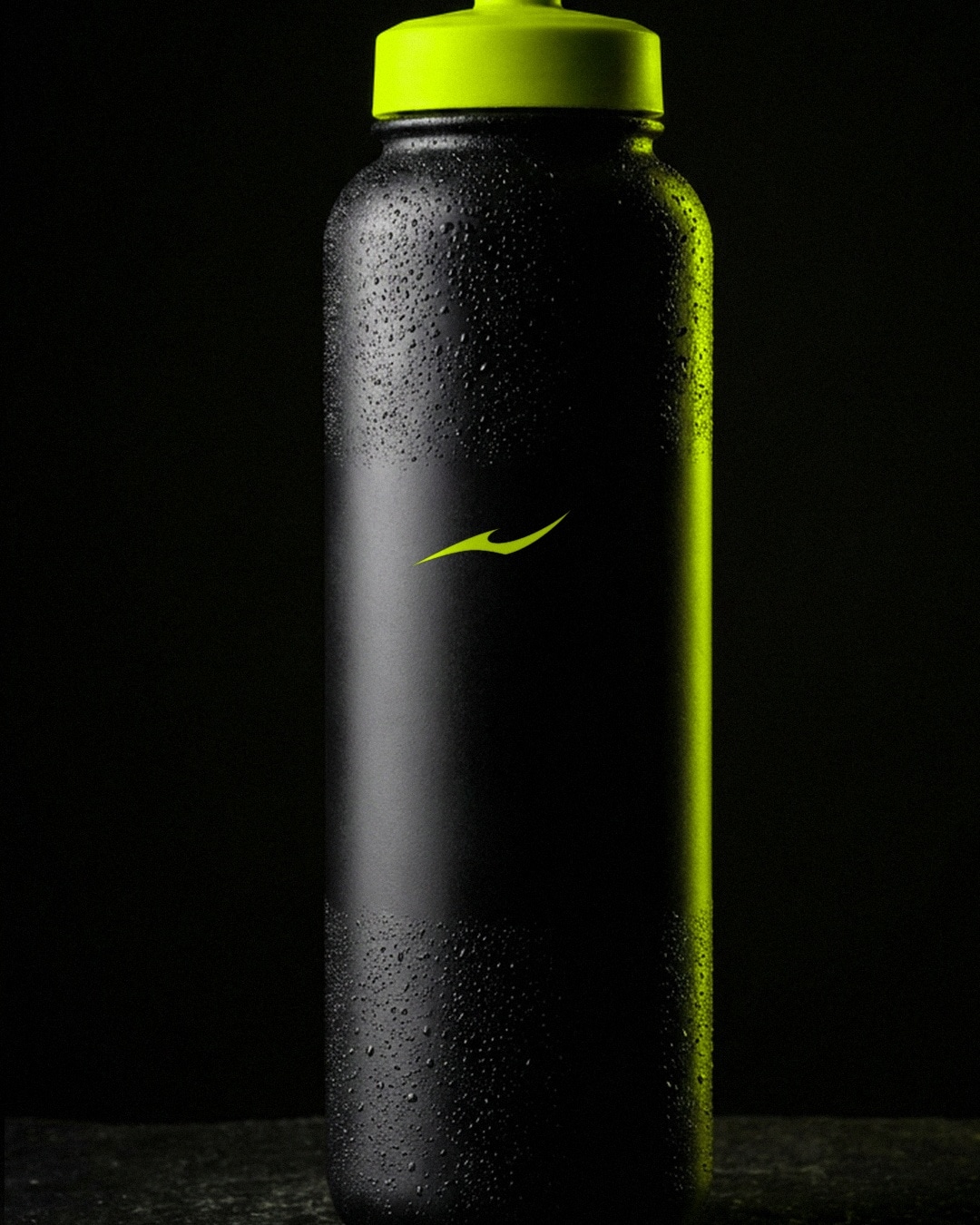
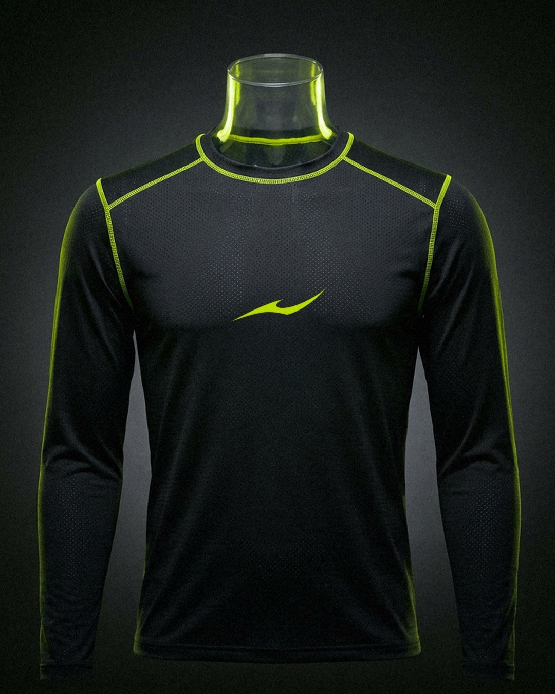
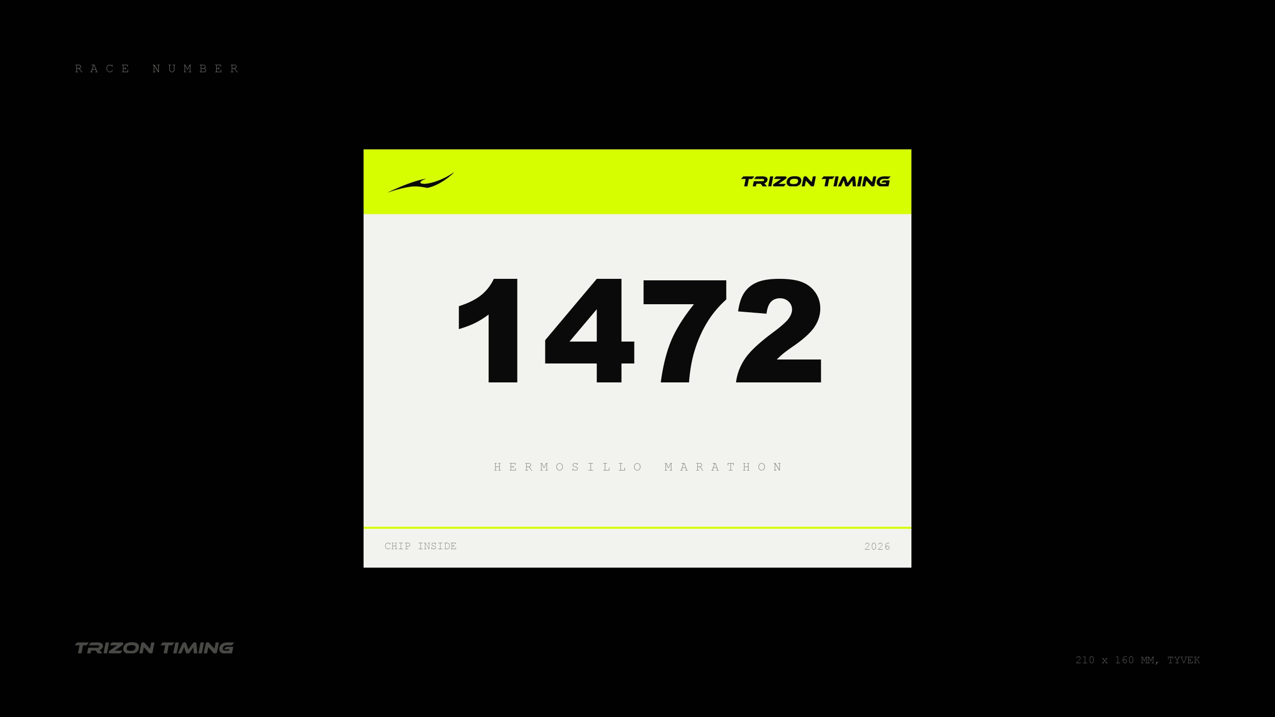
The bib is the hardest test. It gets pinned on crooked, soaked and photographed at speed, so the line sits alone on white with nothing around it to blur.