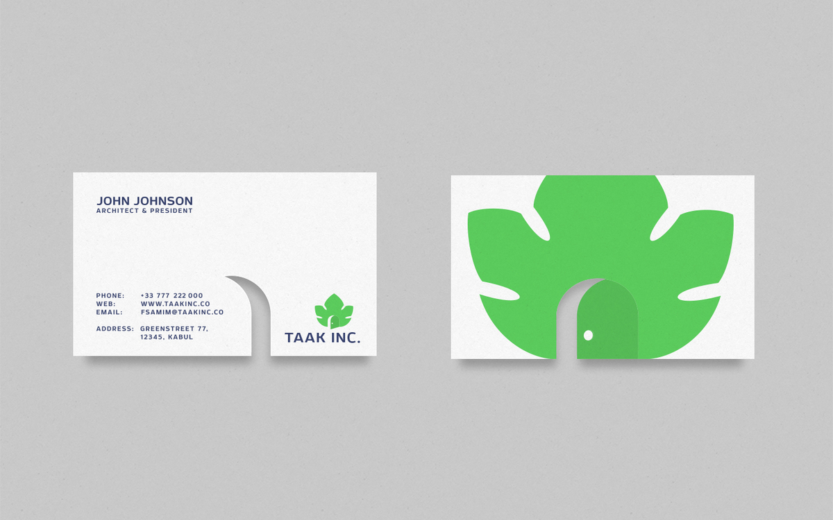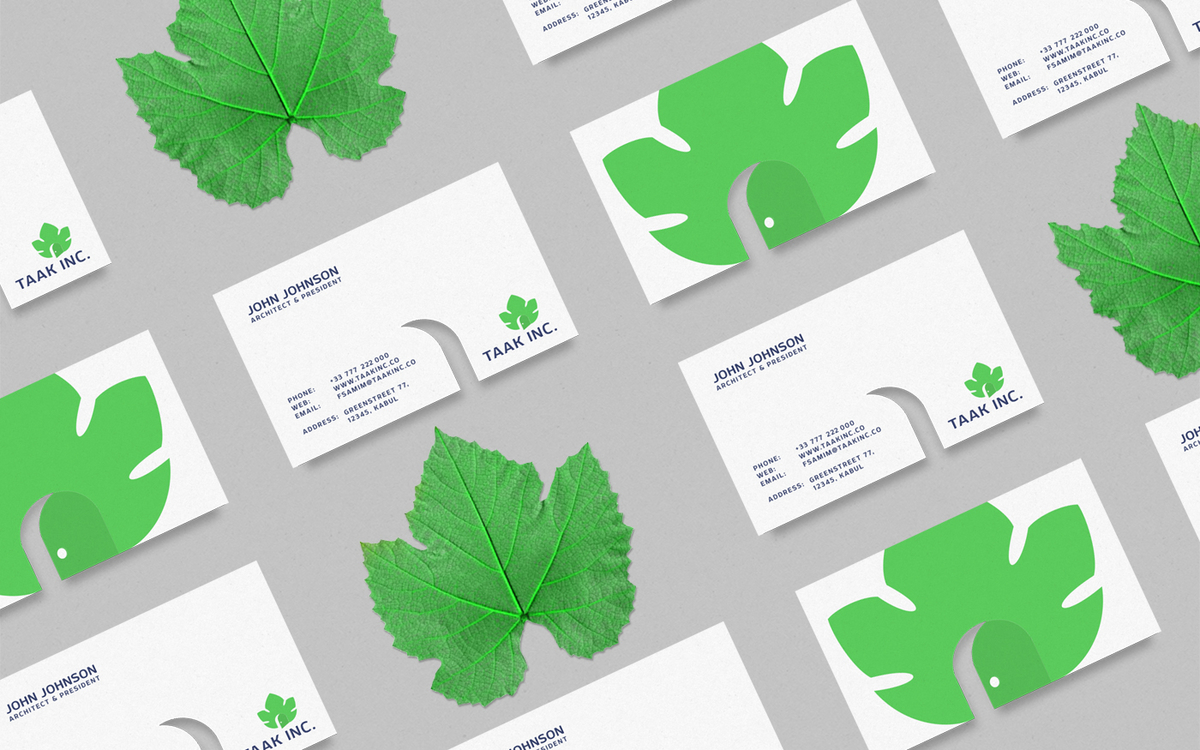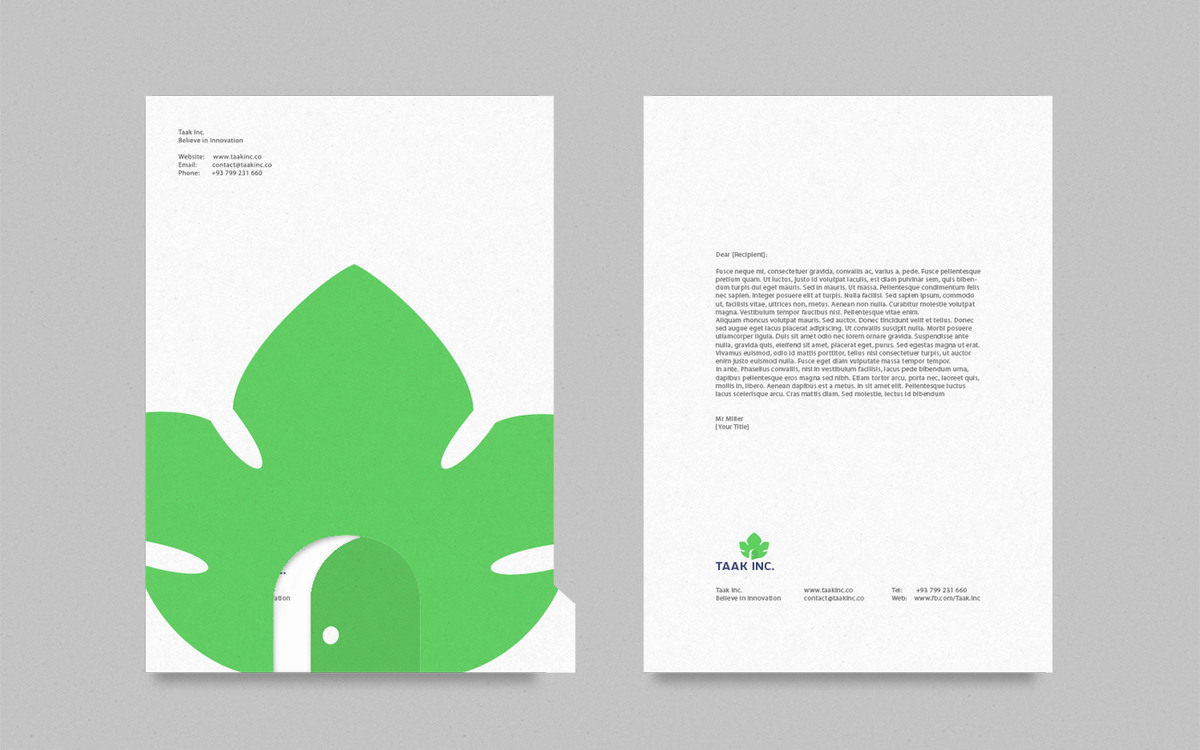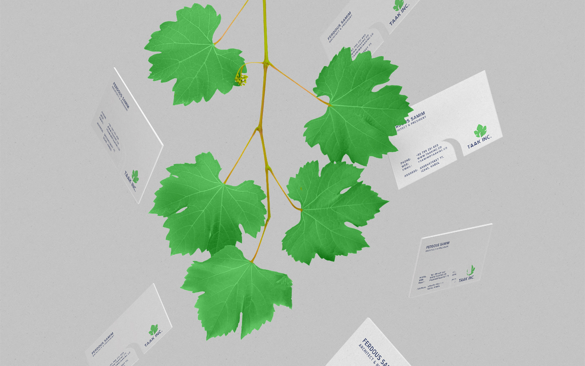
Client
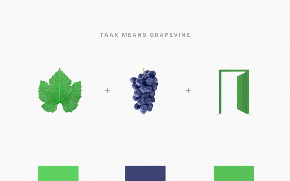
Taak Inc. is an Architecture and Construction company.
Project goals
Communicate the company history, values and philosophy through its Identity, thus establishing a Brand Equity.
Creative solution
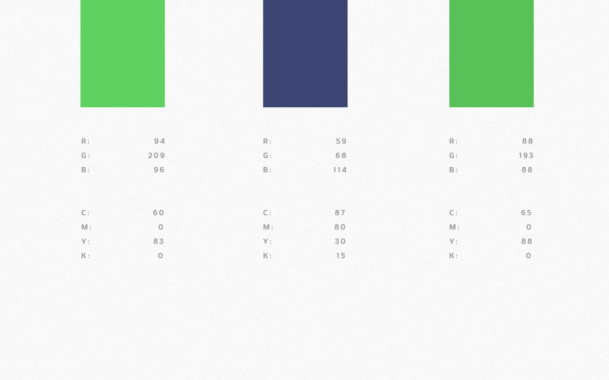
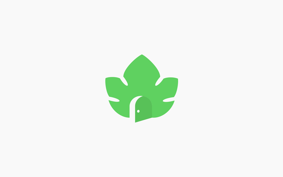
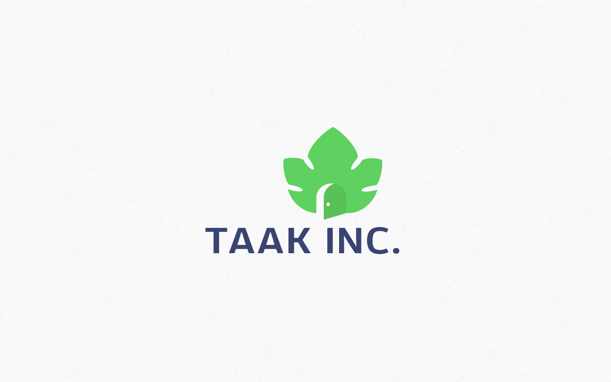
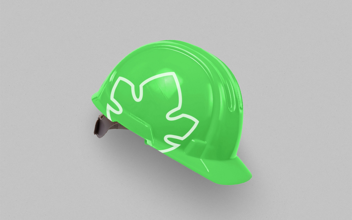
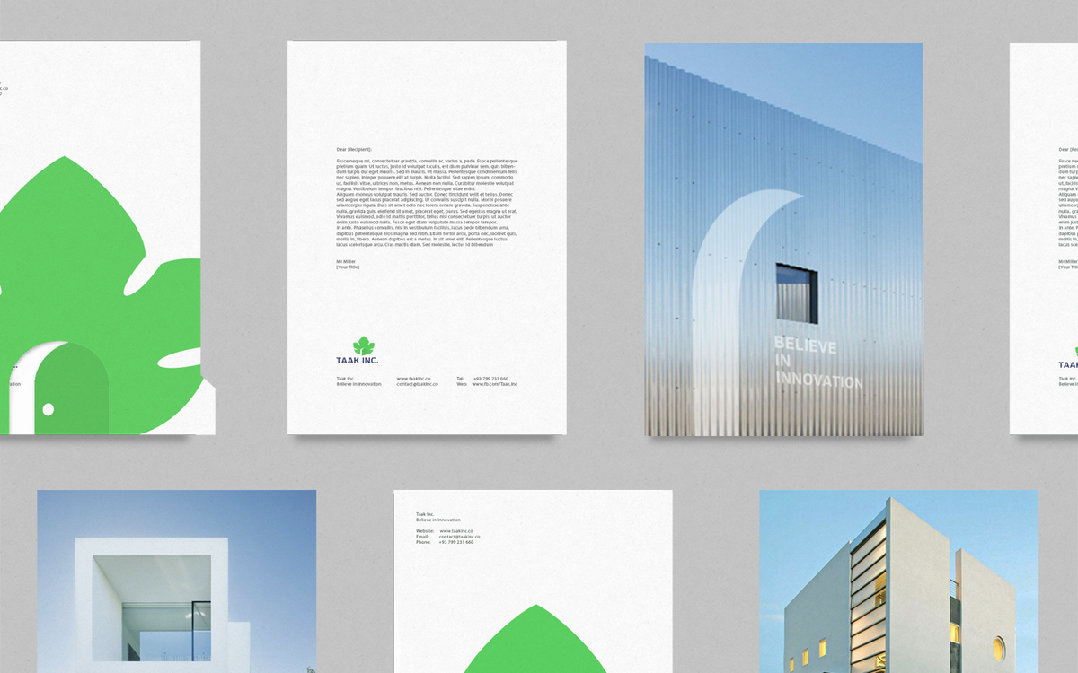
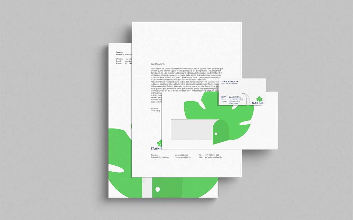
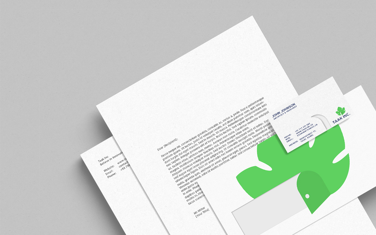
Taak Inc. is an Architecture and Construction company with many years of experience in its area. Given this situation, logotype identity should be relevant over the years. The word Taak means grapevine in the persian language. So the task was to integrate a grapevine and company’s architectural activity into a logotype. As a result the sign combines a vine leaf and an opened door, thus embodying new opportunities and the company’s motto “Believe in Innovation”. The logotype colors are selected in accordance with the idea itself.