Client
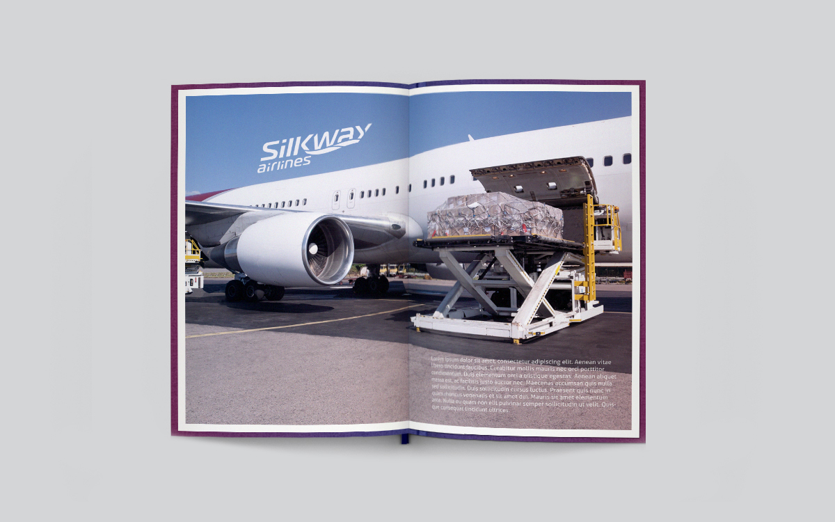
Silk Way Airlines, one of the leading companies in the airline cargo transportation industry. Silk Way Airlines is one of 26 enterprises, within the Silk Way Group mostly operating in the aviation industry.
Project goals
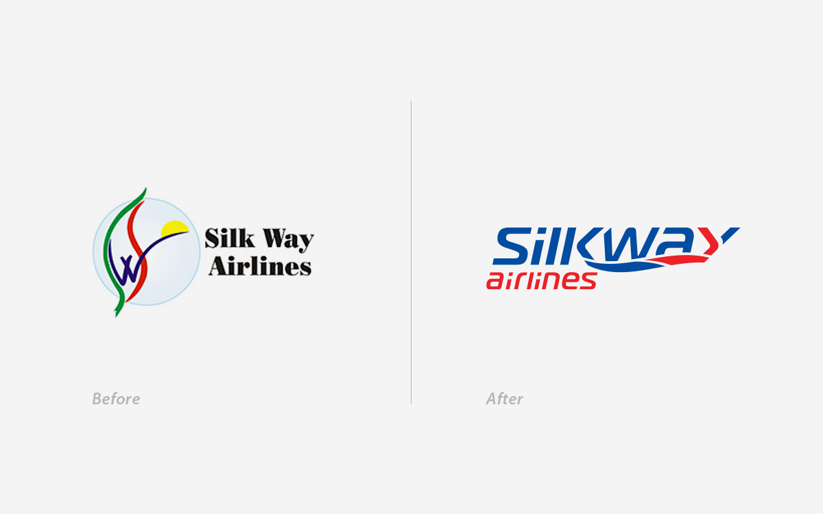
The main goal of the Rebranding project was to develop a brand architecture along with the Identity for the corporate brand Silk Way Group as well as for its’ sub-brands- Silk Way Airlines and Silk Way Ground Handling Company. The brand identity should reflect the main advantage of the company, its’ strategic location, and communicate the modern, high-end nature of services provided by each enterprise in Silk Way Group.
Creative solution
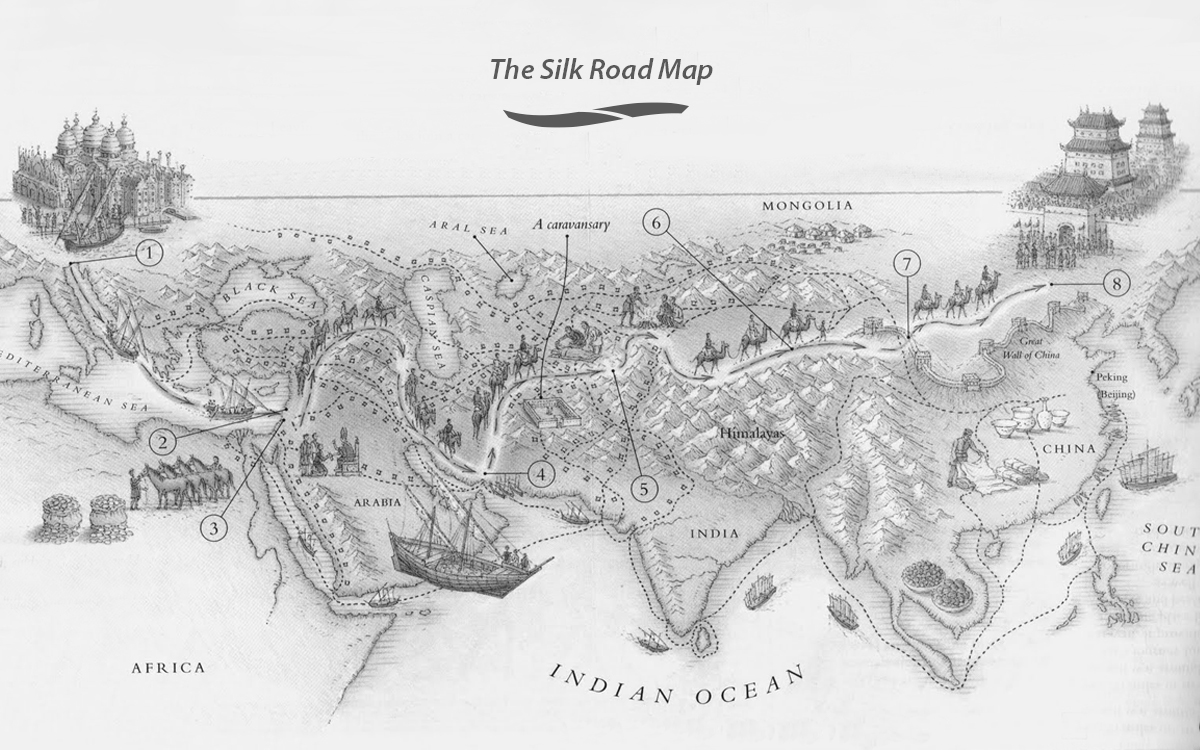
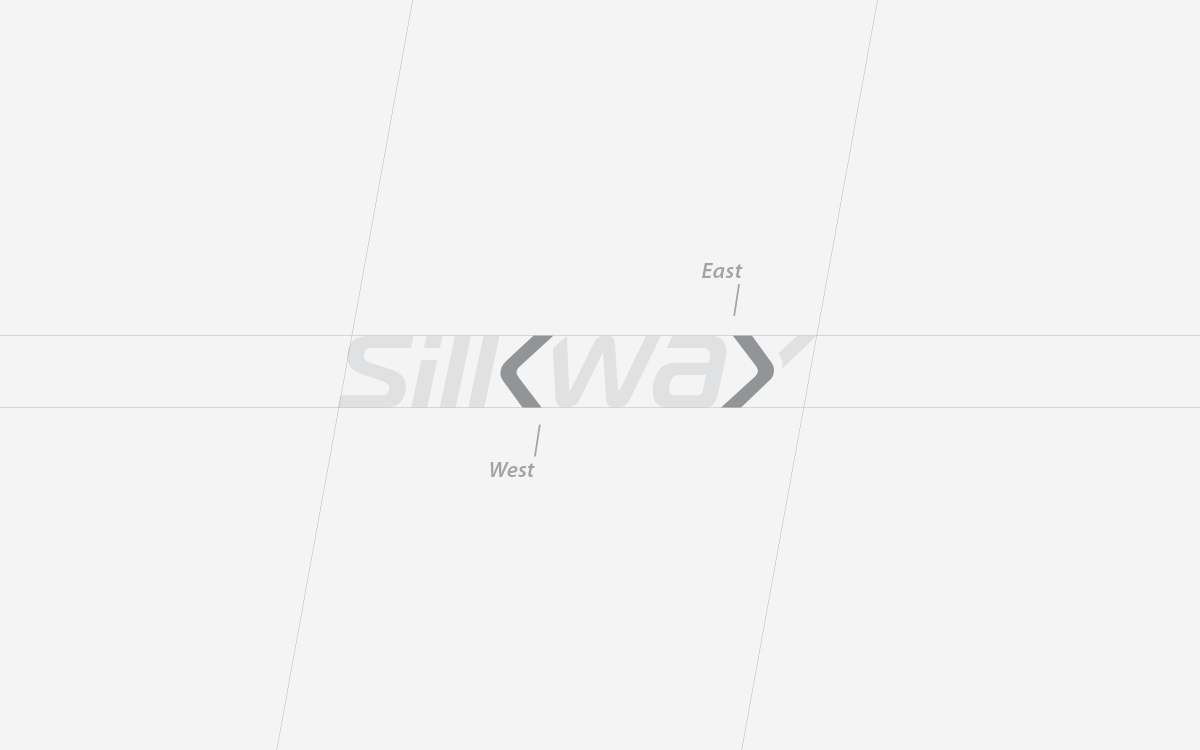
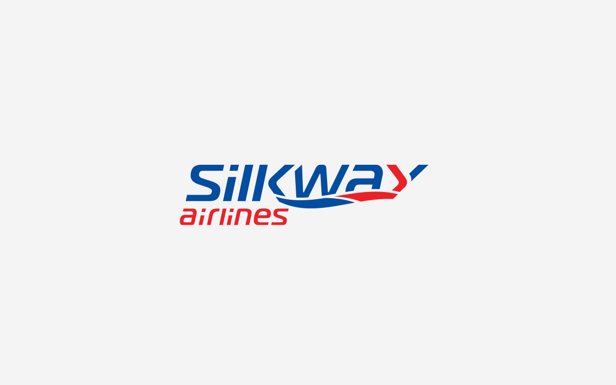
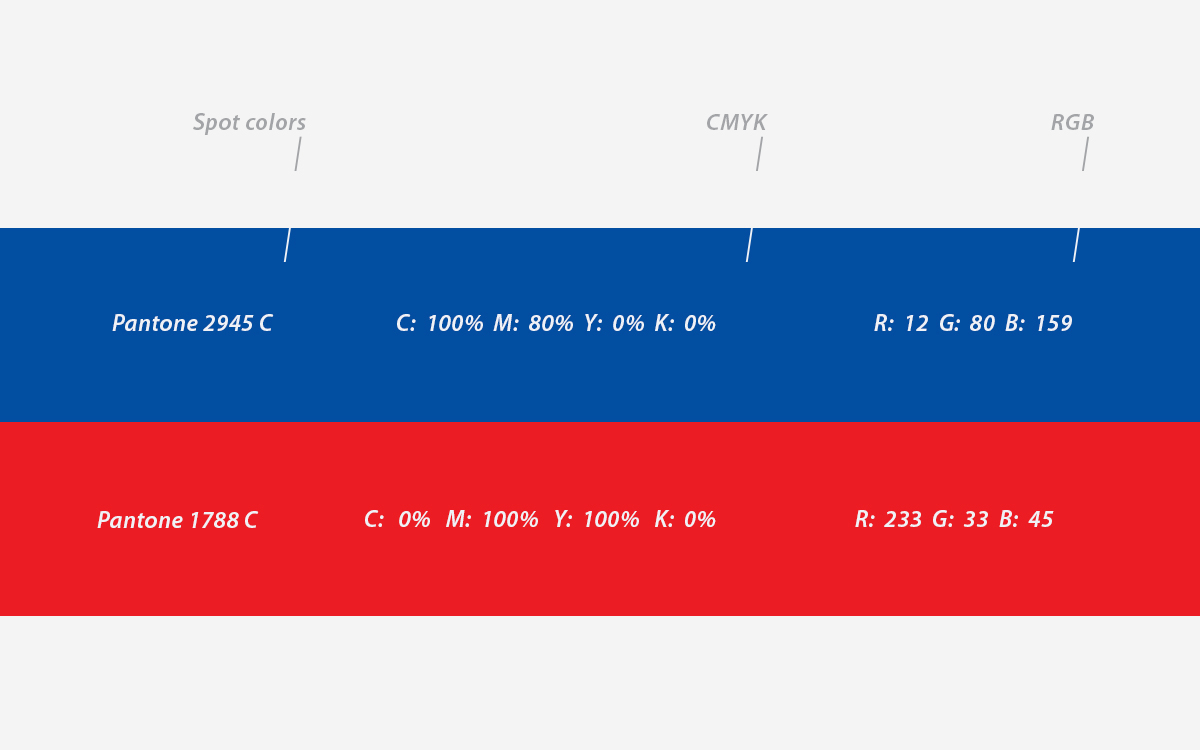
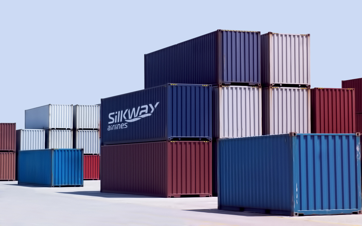
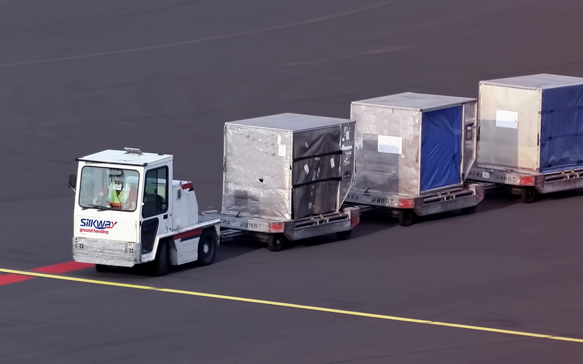
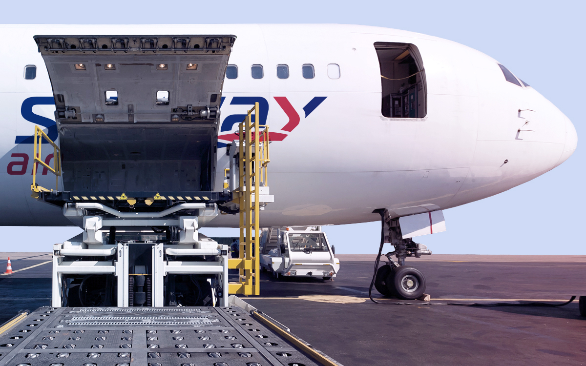
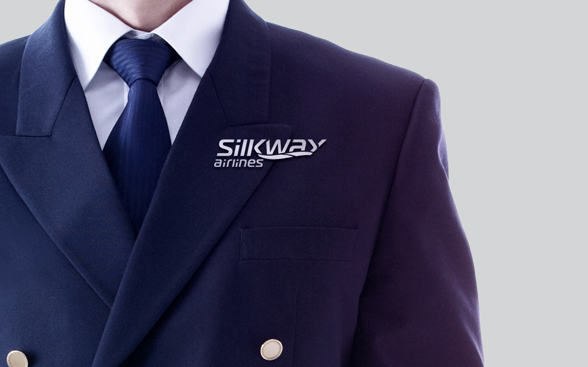
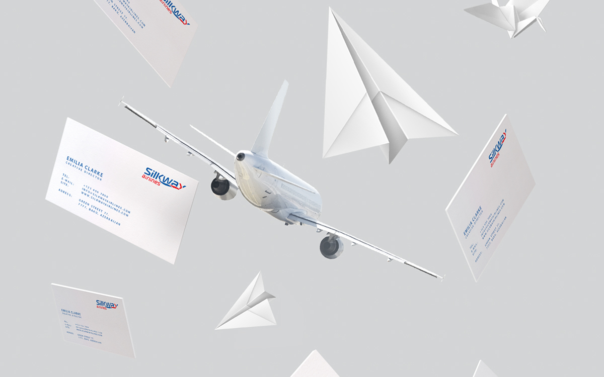
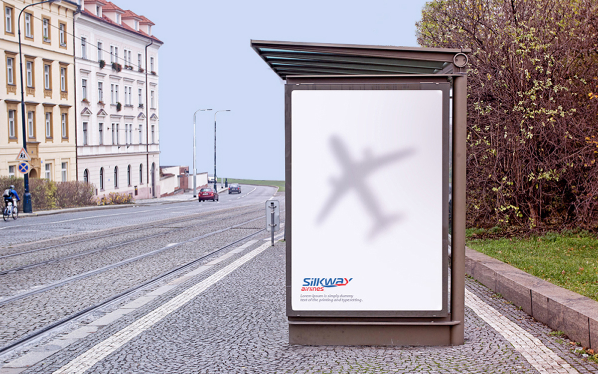
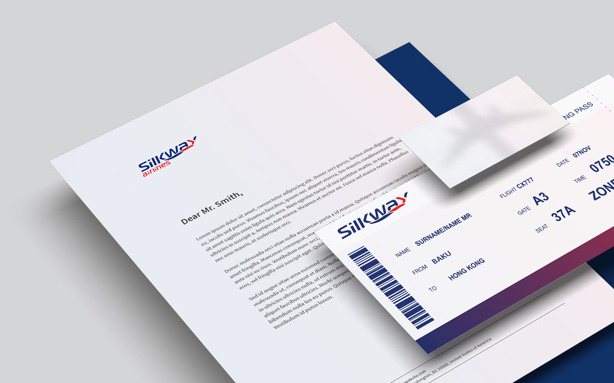
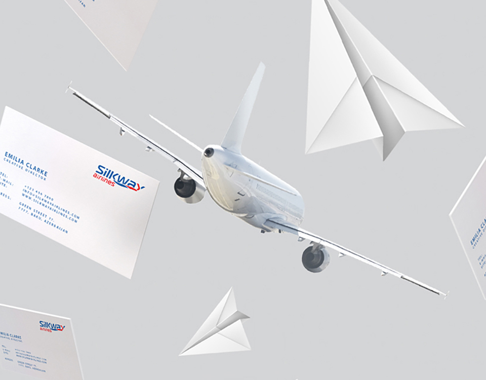
After preliminary brainstorming, the “family brand” architecture was chosen to systemize the Airline brands of the Silk Way Group. This way the enterprises within the brand give more unified appearance and the overall brand recognition is enhanced. As the central point in our brainstorming we used the history of Silk Road, the trade and cultural transmission routes that connected east with west for centuries. At the same time, the idea of silk road has the core value, what we wanted to communicate with brand identity. The arrows within the “K” and “Y” letters, symbolize Baku, the hub of Silk Way Airlines, being connecting point between East and West. The identity of the corporate brand, Silk Way Group, reflects its’ upper position in the brand architecture and gives overall the modern, high-tech feel to the brand. The Red and Blue colors in the sub-brands such as Silk Way Airlines and Silk Way Ground Handling stand for North and South regions covered by Silk Way Airlines.