Client
AMAIÒ is a forward-thinking swimwear brand from Los Angeles, CA.
Project goals
Communicate the company history, values and philosophy through its Identity, thus establishing a Brand Equity.
Creative solution
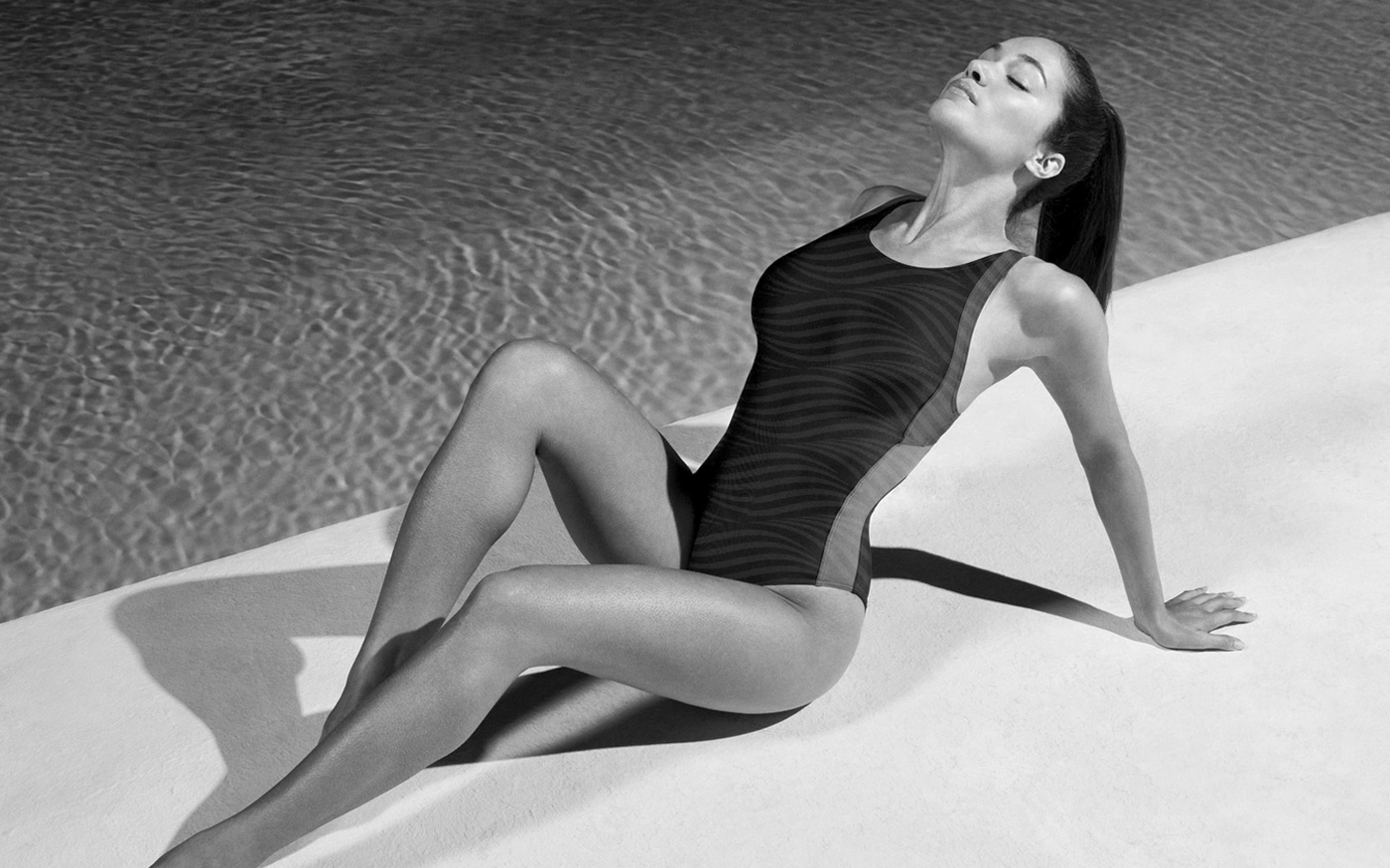
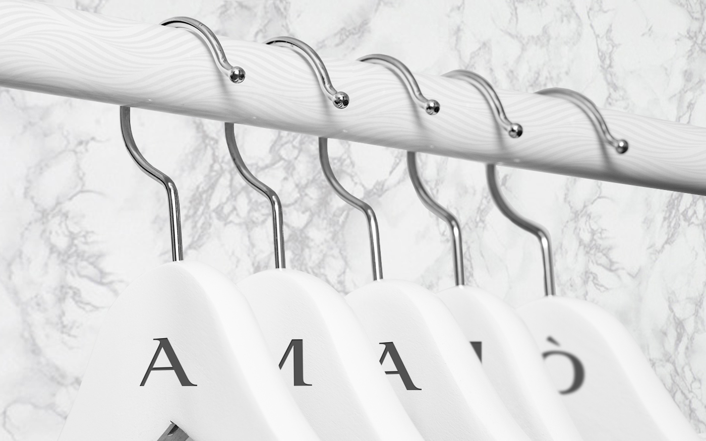
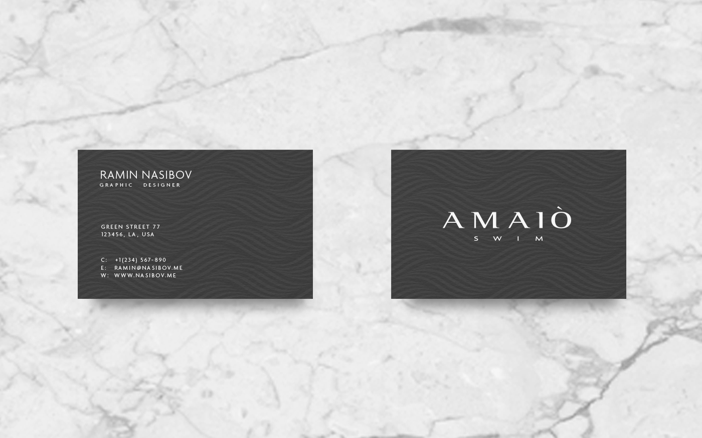
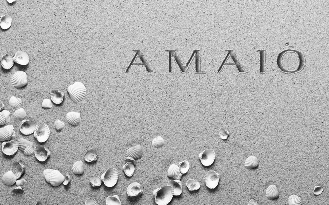
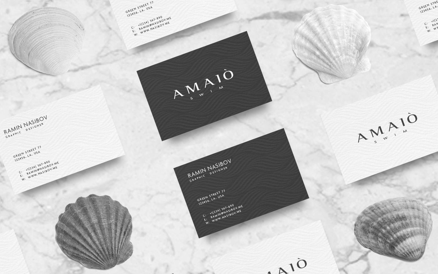
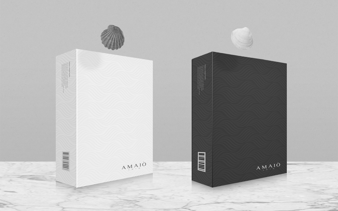
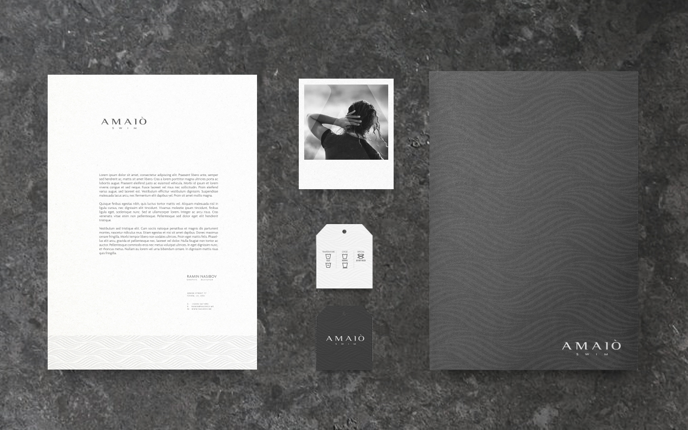
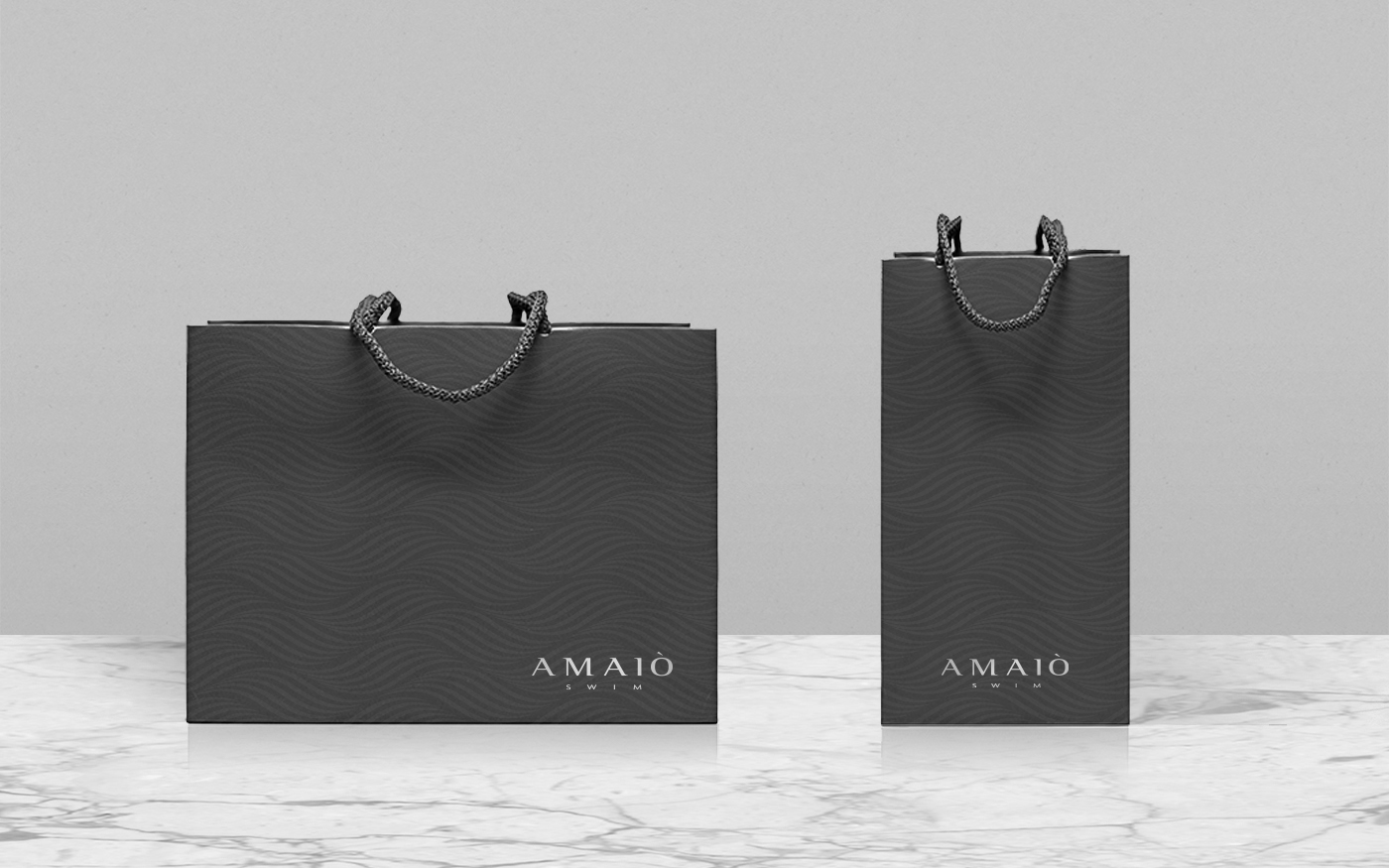
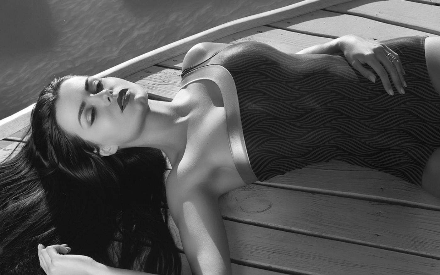
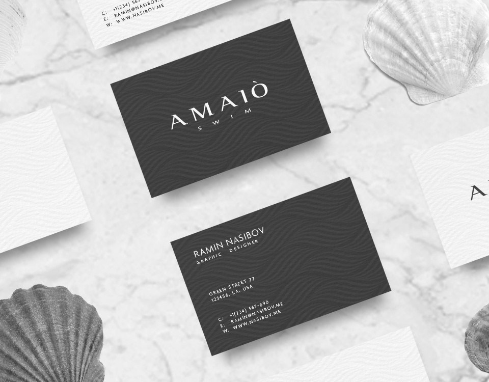
The company is called AMAIÒ. It means “Mother, Water”. “Amai” means mother in Shona (the indigenous language of Zimbabwe), and “iò” means water in Gallo (a dialect of southern France). I’ve chosen waves as the main idea of the concept of corporate identity, as wave is the best way to render independency, elegancy and power of water. Using serifs in the font, I shaped the trough and the crest of a wave. The wave theme has also been reflected in the corporate design. The fashion component of the brand embodies a classic, european elegance that is rooted in art, design, and couture fashion. To make it more prominent, white and dark gray colors are used.
